

Define
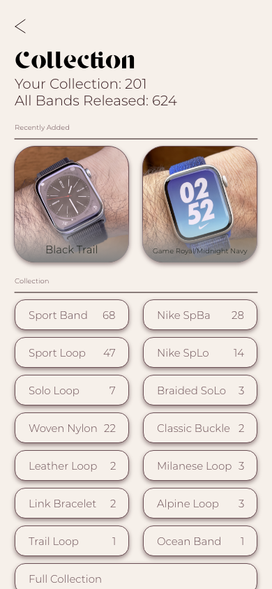
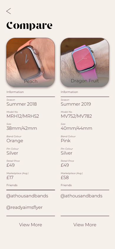
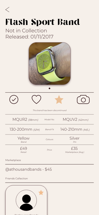
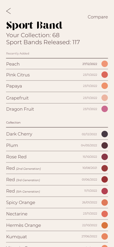
For the module DM7903, I decided to create and design an app that helps the user organise, update, sell and buy Apple Watch Bands. The user will be able to keep track of their collection, gain insights of trends, connect with friends, add to their collection or sell their collection to other collectors and add images to a private or public gallery of their own images. They will also be able to see all bands that have ever been released by Apple, including the partnerships between Nike and Hermes. They will also be able to learn about each band (date released, material, sizes, price etc.).
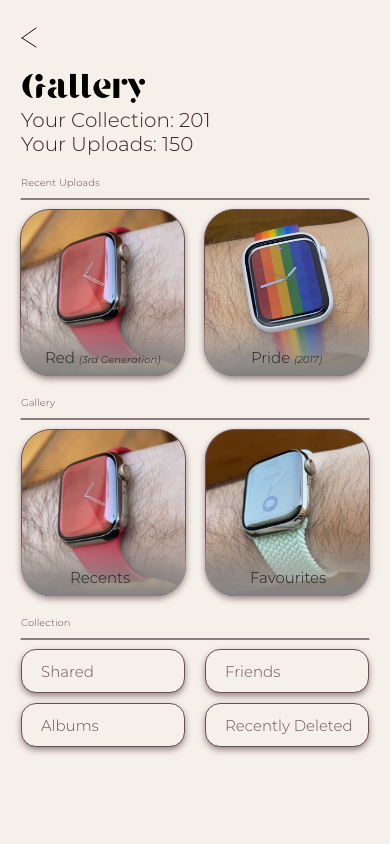
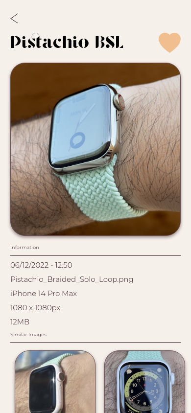
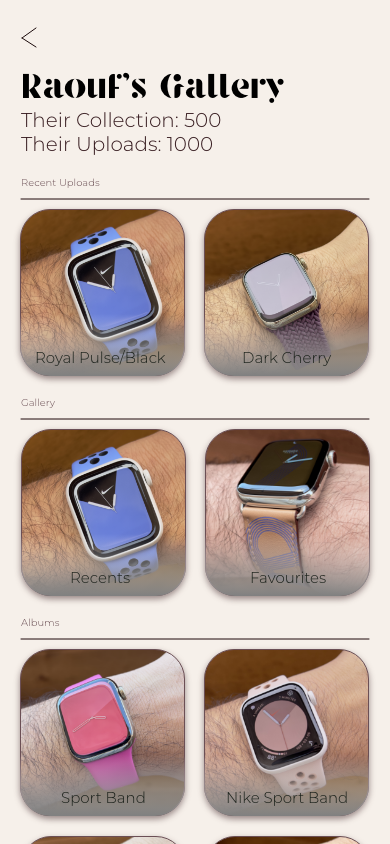
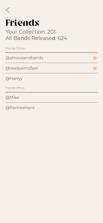
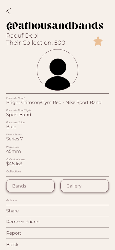
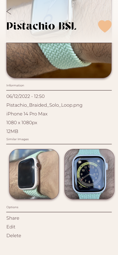
I aim to complete a working prototype on Adobe XD with most of the features but mainly focusing on the gallery and friends aspect of the app.
Planning
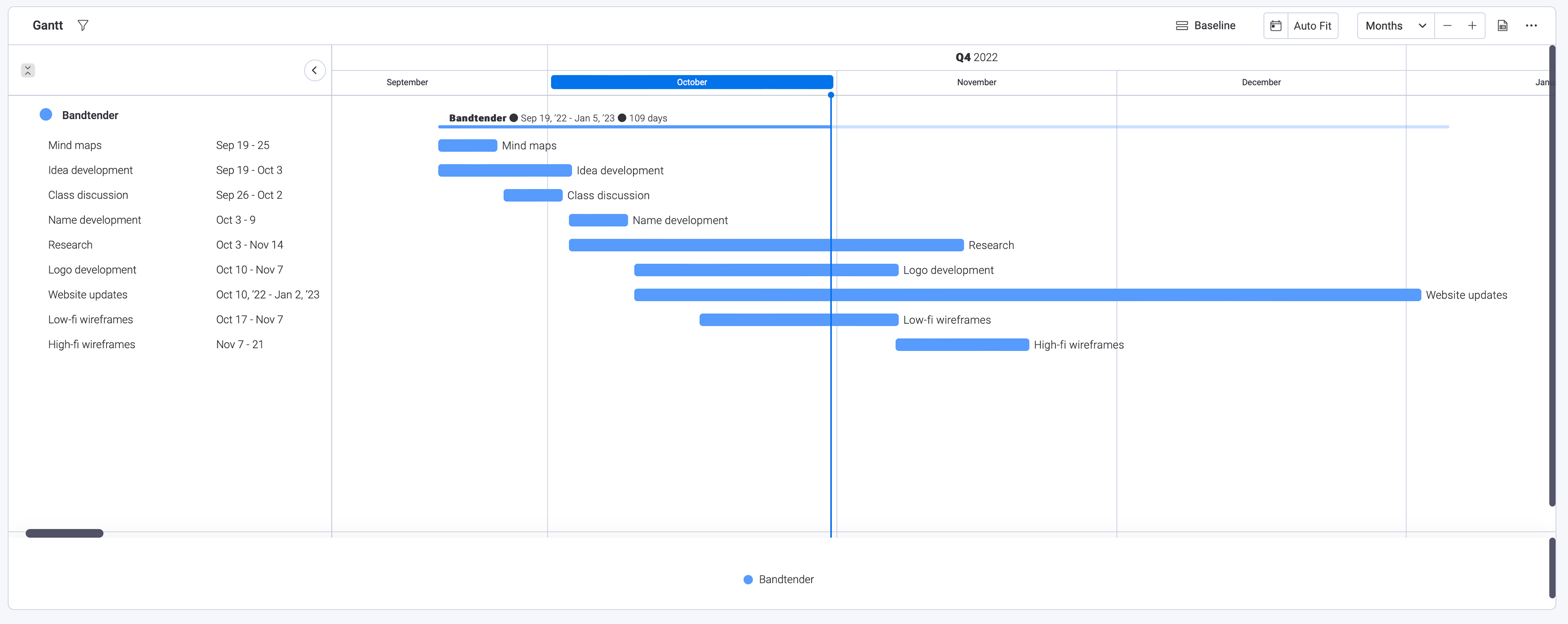
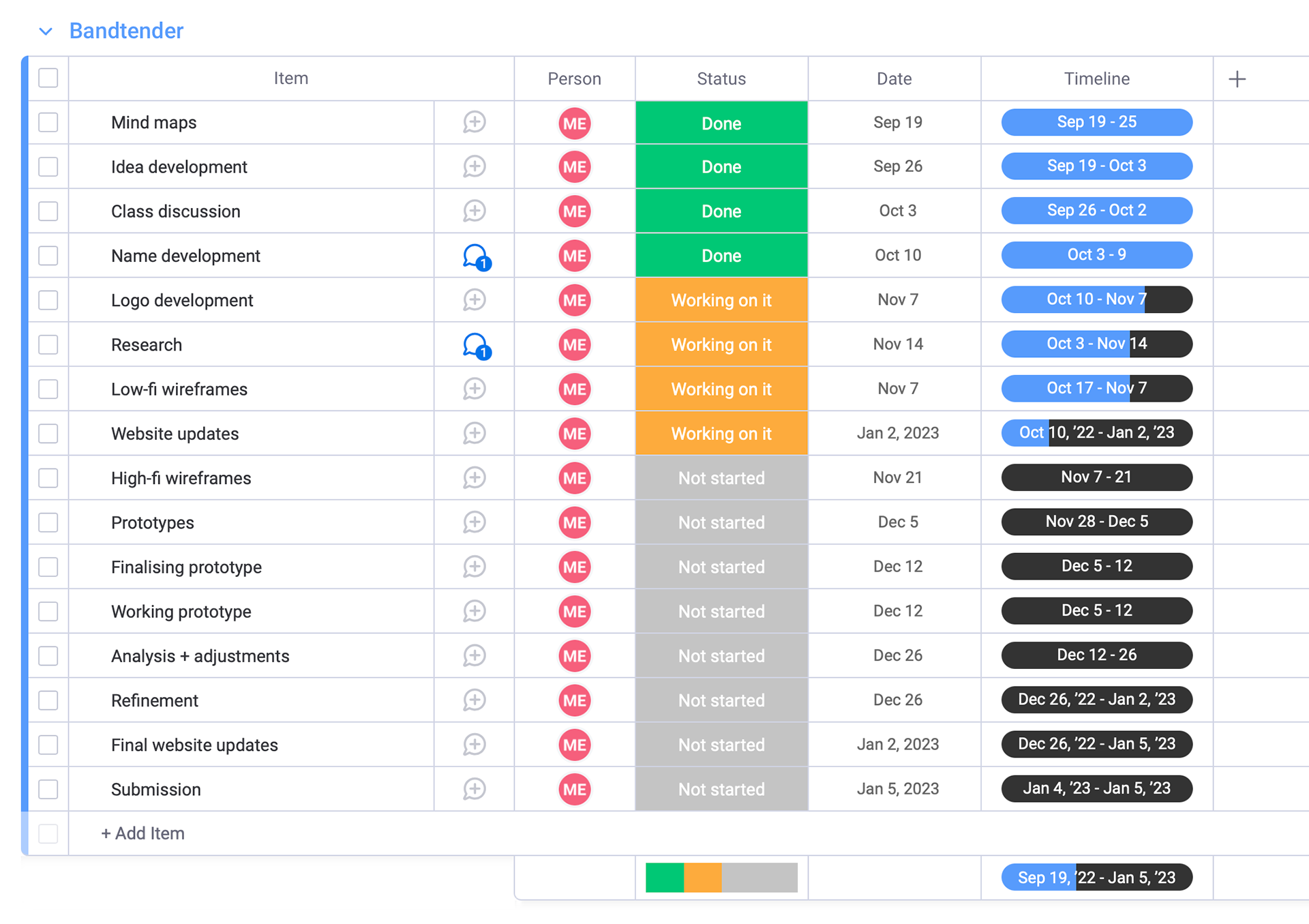
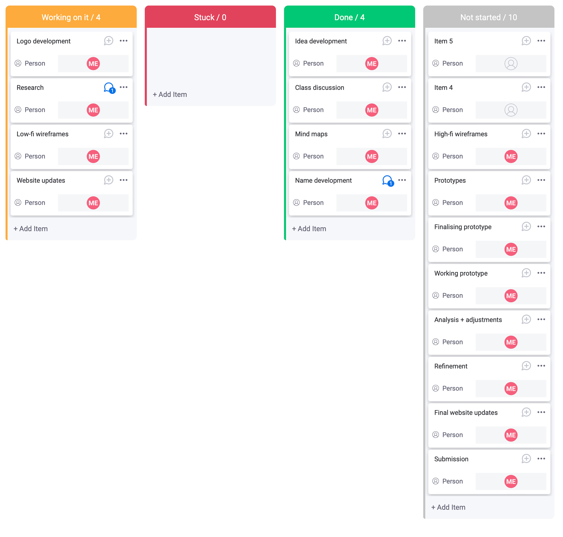
At the beginning of this project, I created a Gantt chart on Google Drive as an outline for the basic tasks that I needed to complete along with a timeline as. rough guide. I then later used Monday.com as a more in depth project manager with an accurate Gantt chart. This means I am able to mark when a project has been completed and if I am on track. I can also add notes and files to each task so I can organise my work clearly and have back ups of important files. Another good thing about Monday.com is that it has an automatic and live Gantt chart feature so I can see how I am progressing and how much time I have left for the project before submission, while also knowing what tasks are still left to be done. Along with a Gantt chart, I have used a kanban to view my task progress by category of completion and how many of each category, if I have made any notes on tasks and I would be able to see who else would be working on the task if it was a group project.

Research
Bandbreite
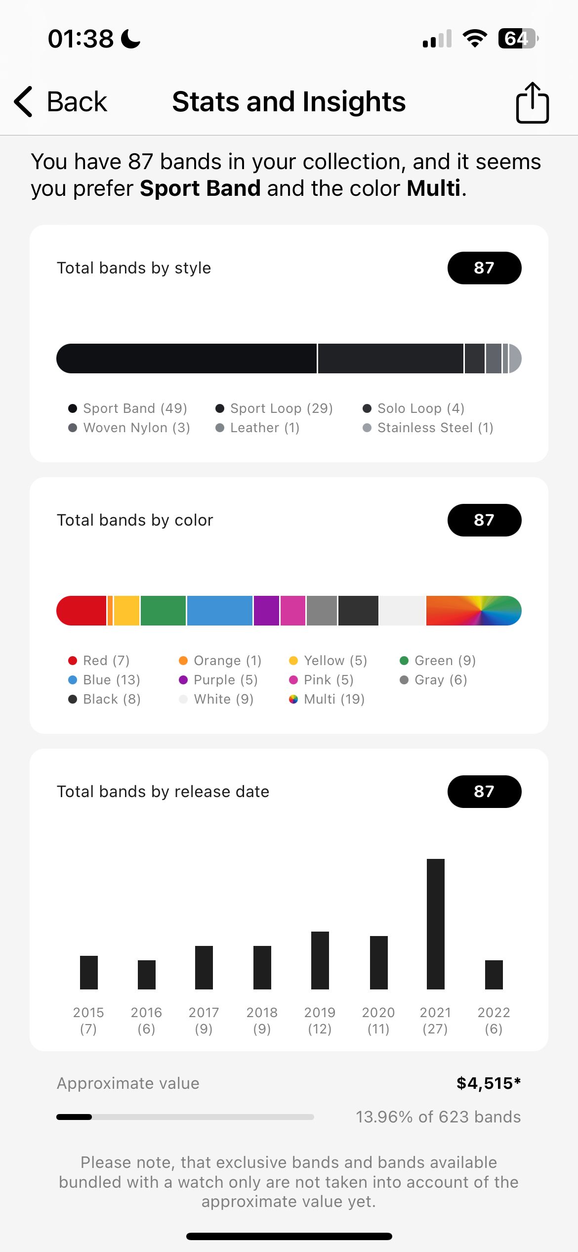
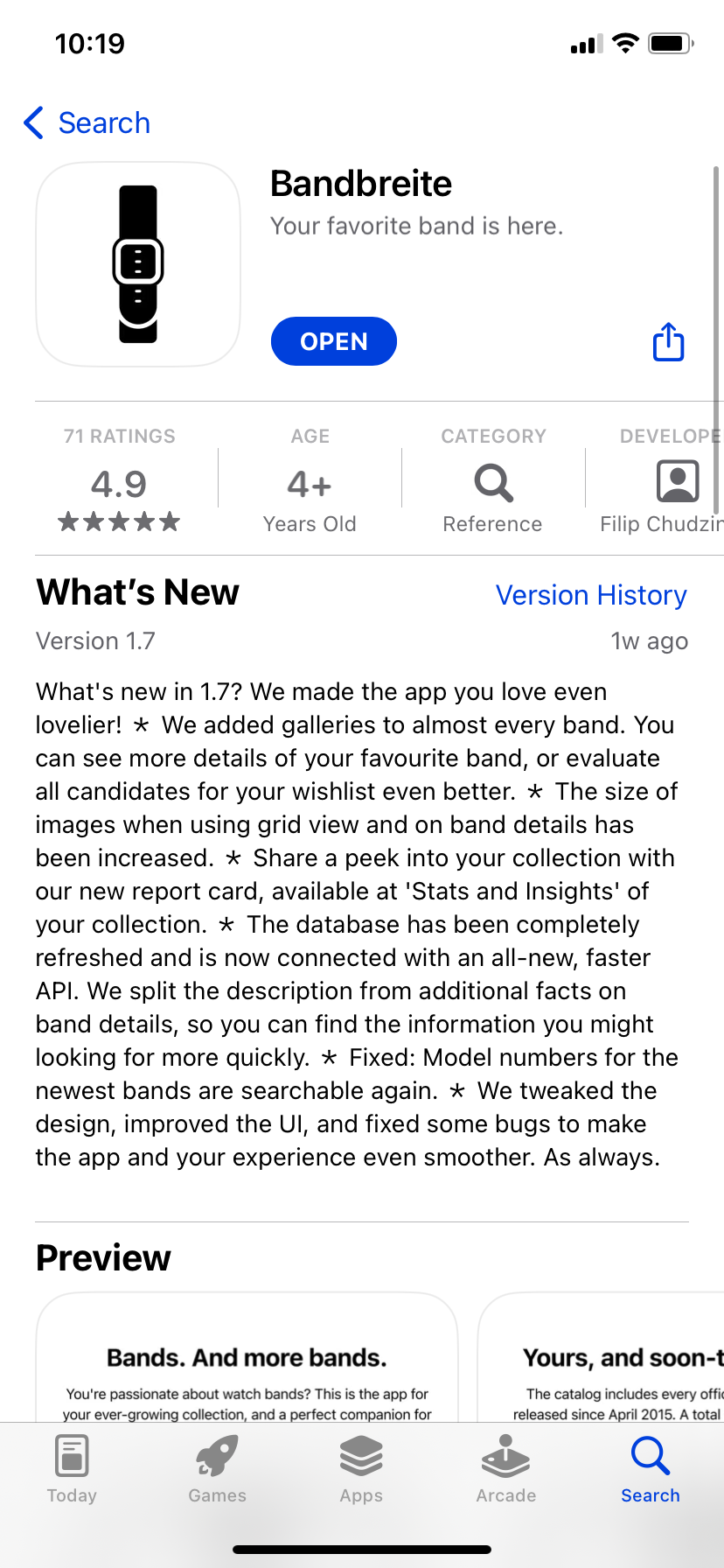
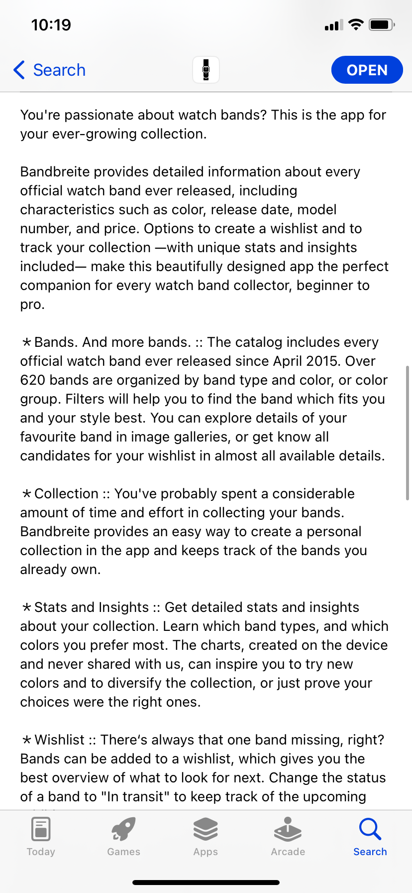
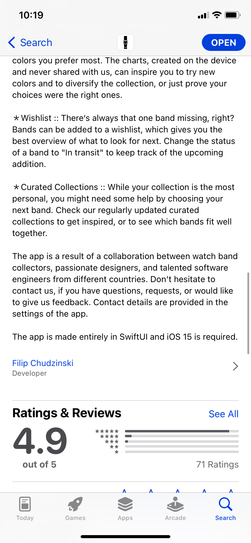
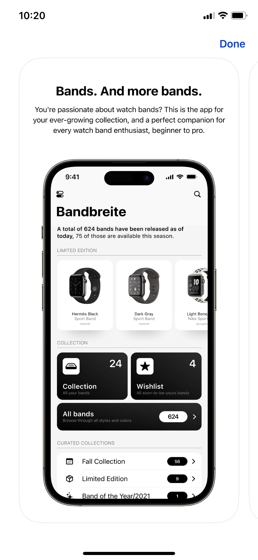
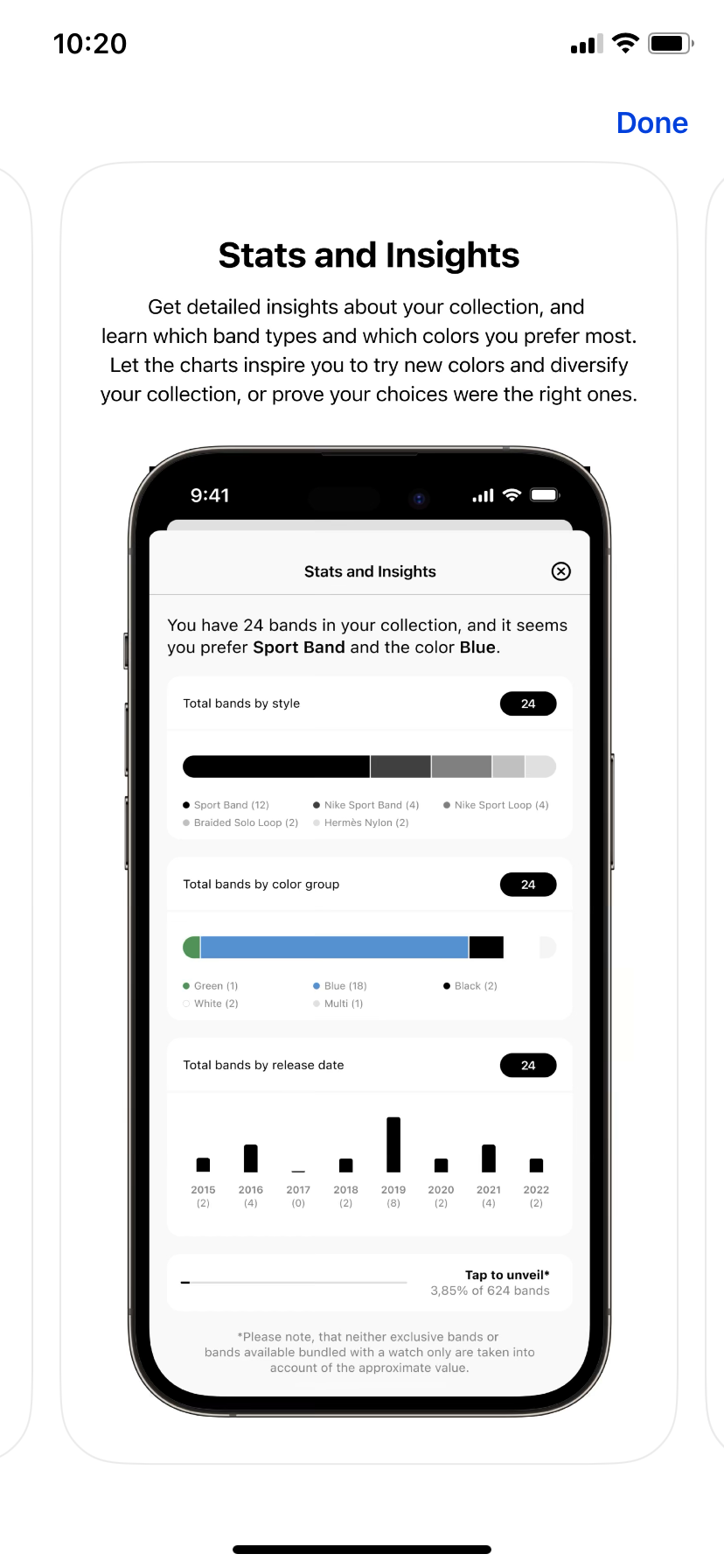
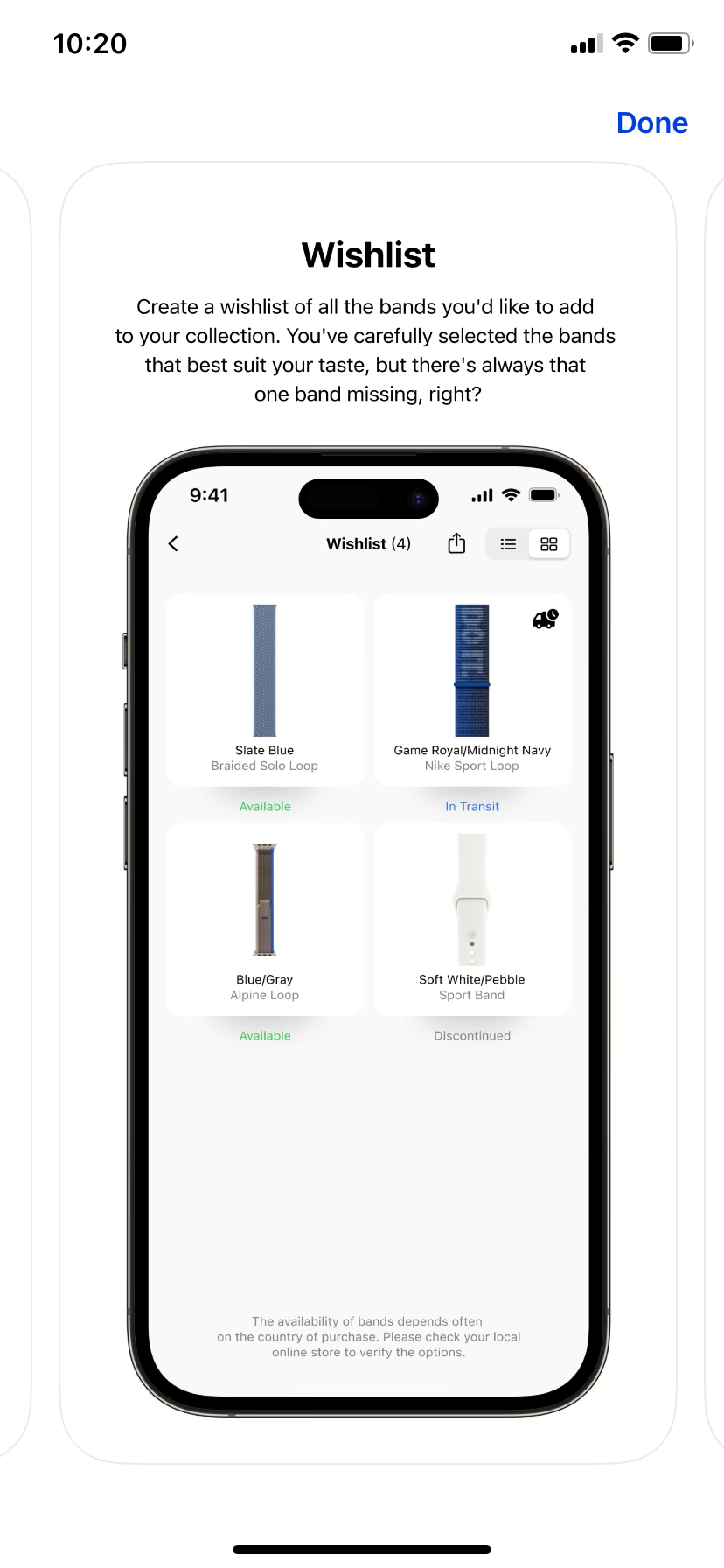
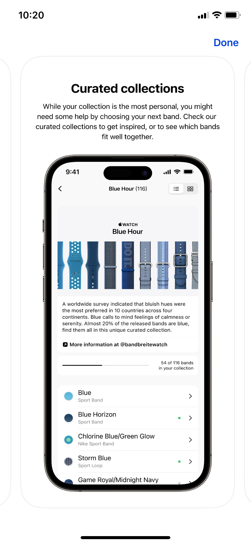
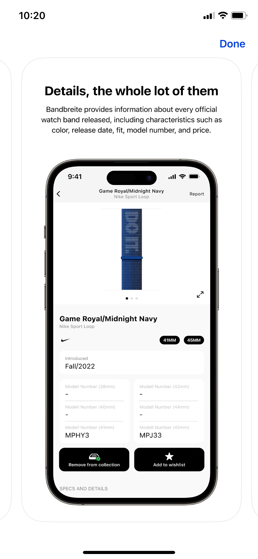
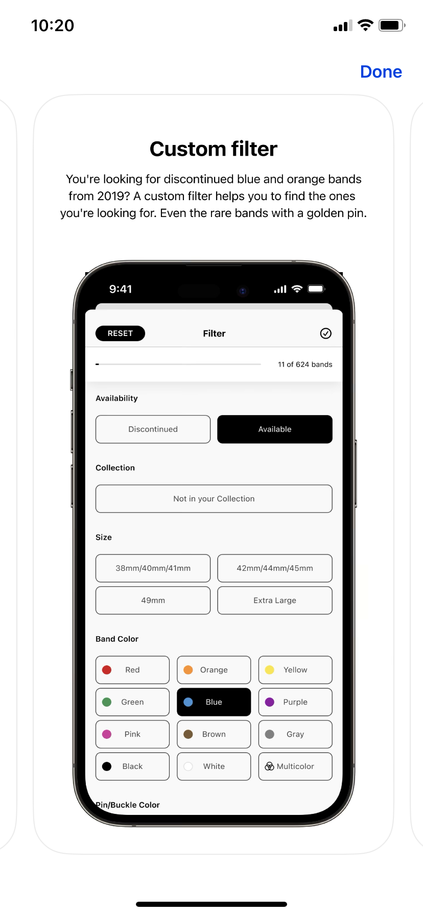
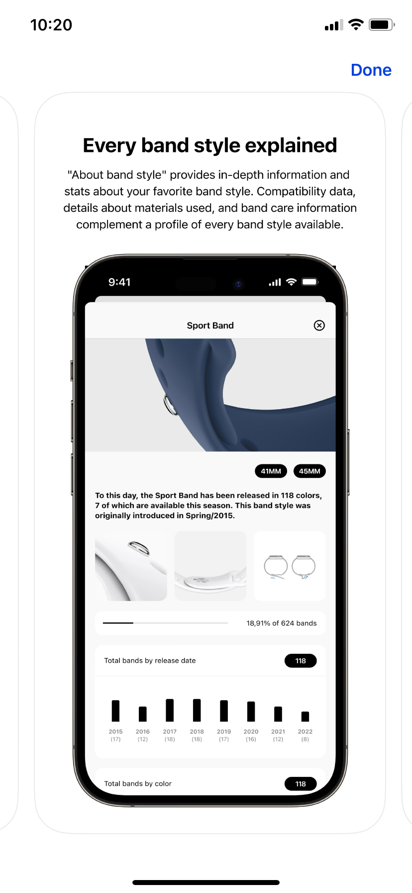
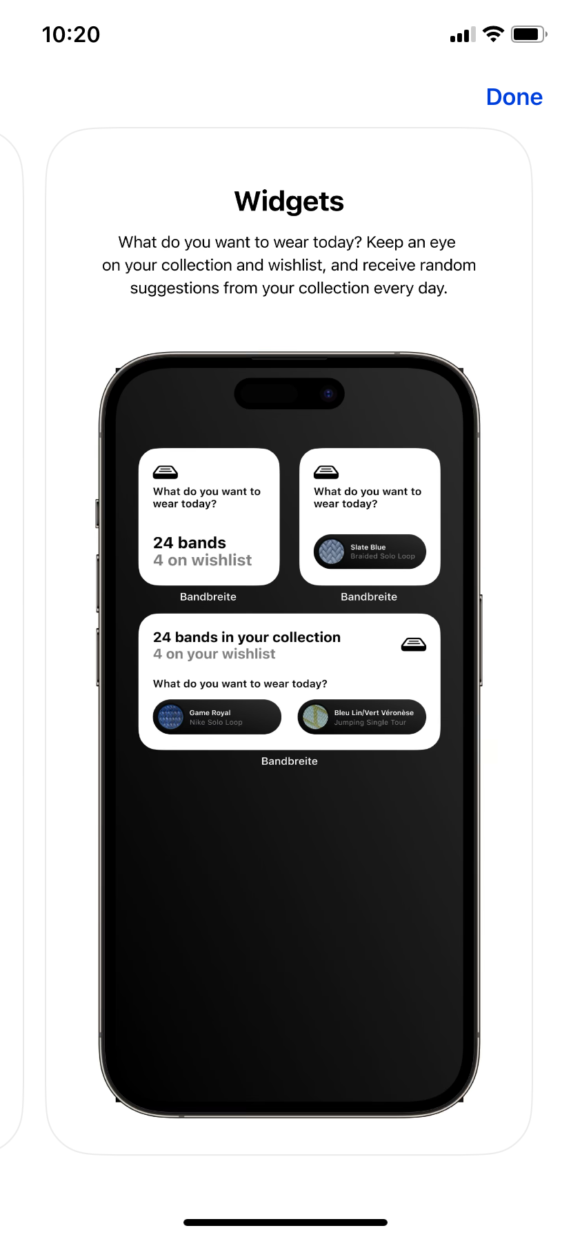
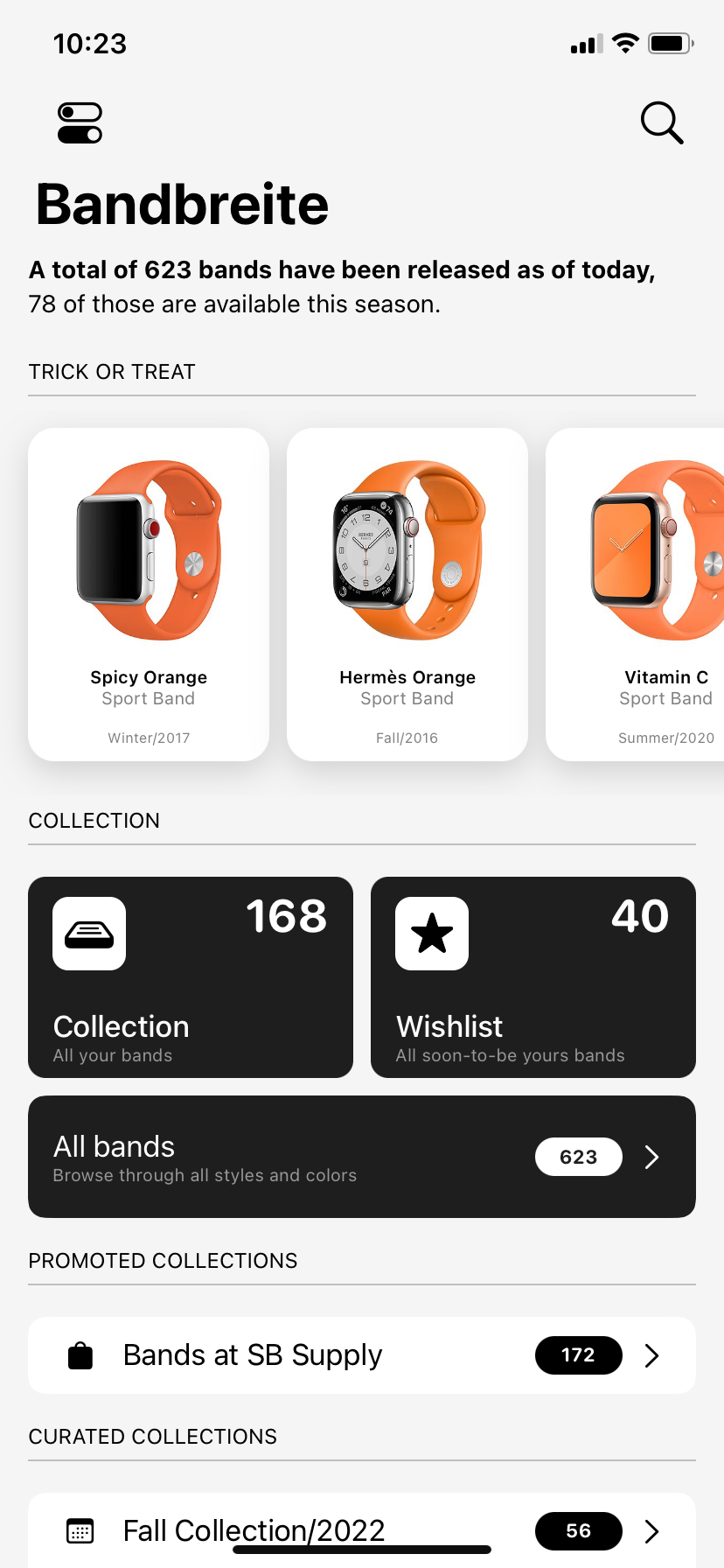
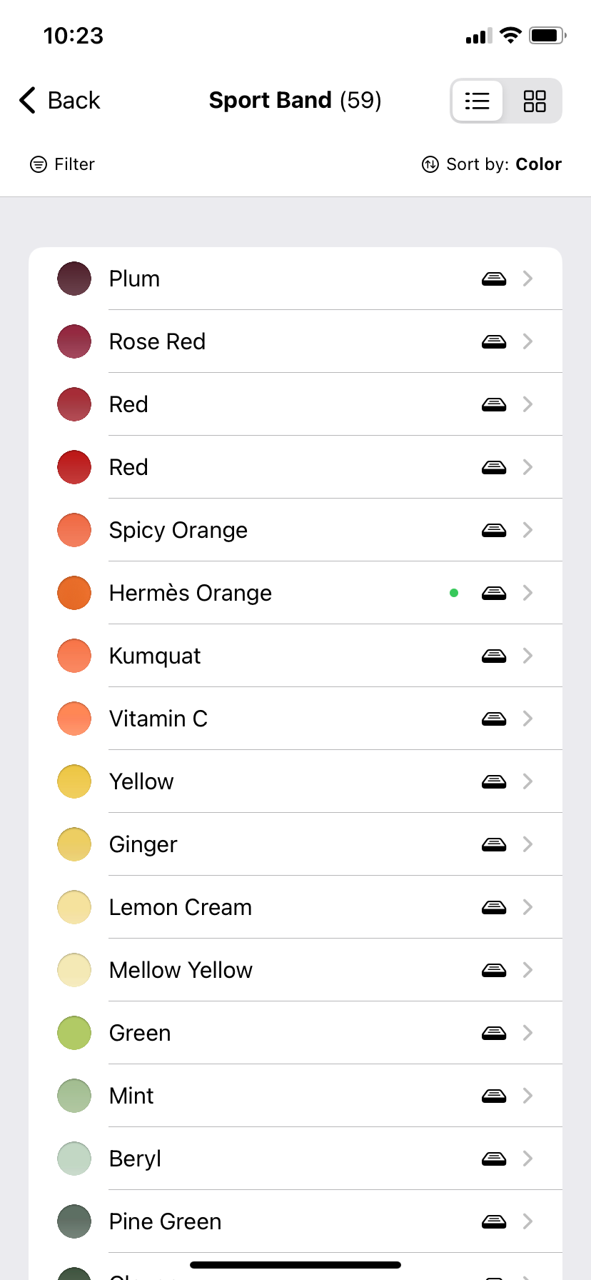
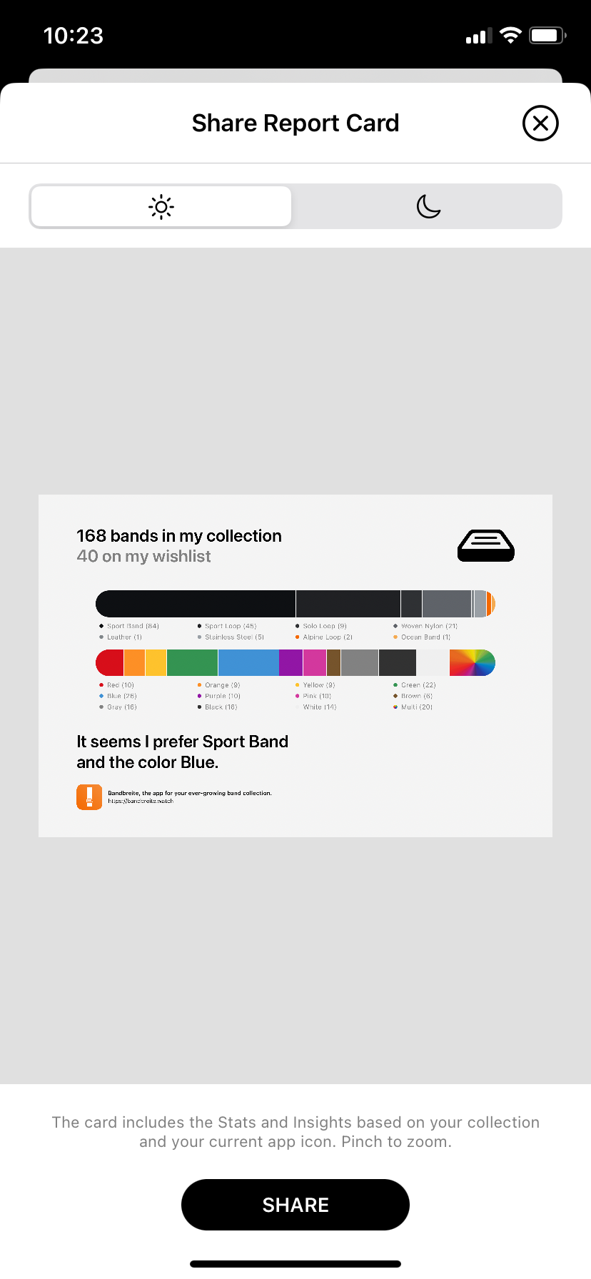
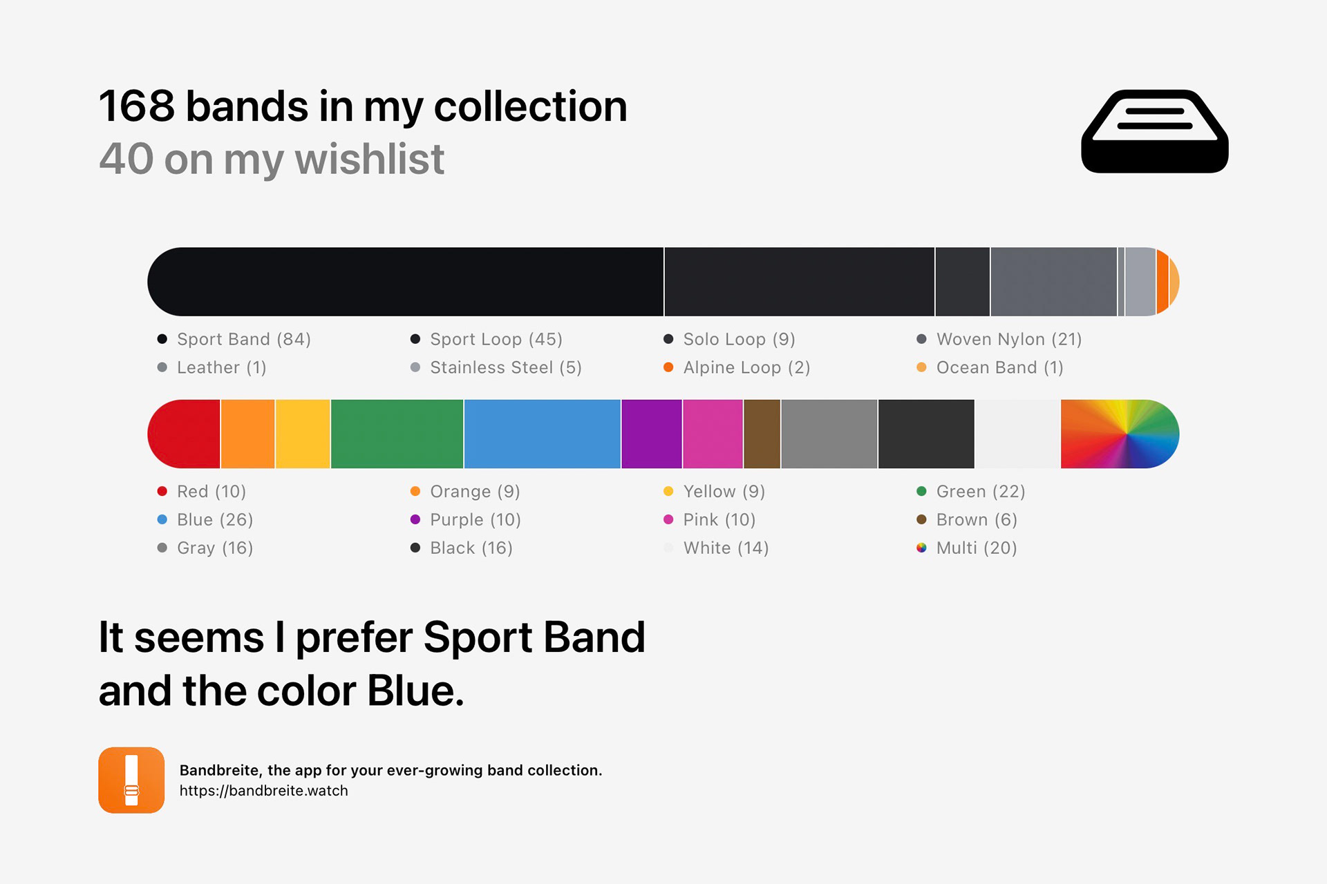
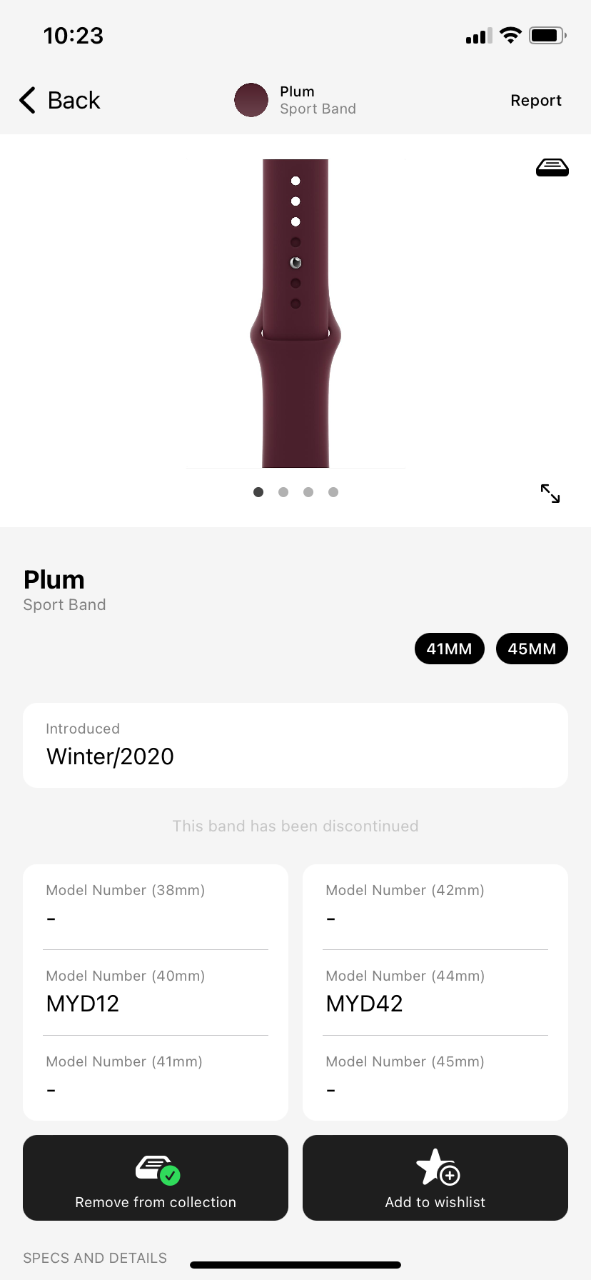
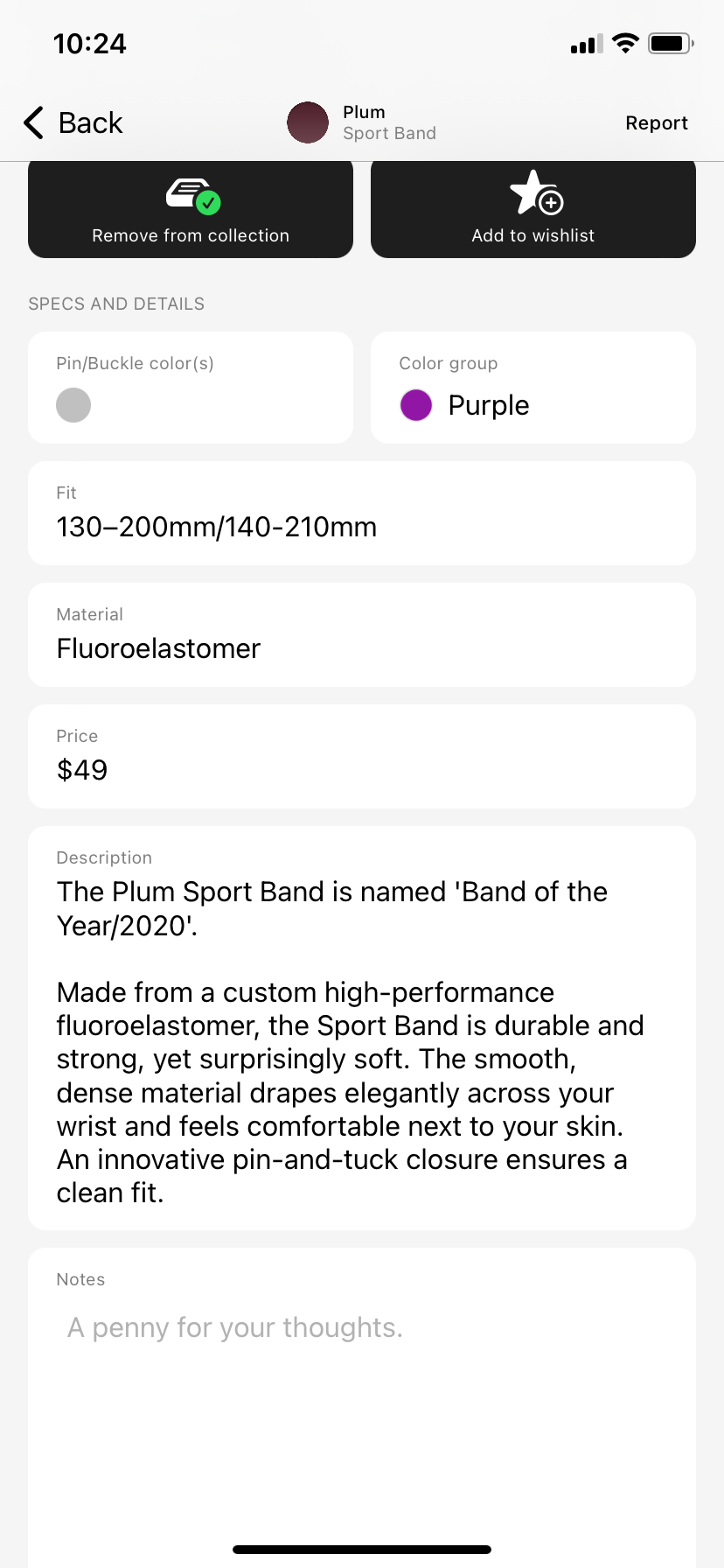
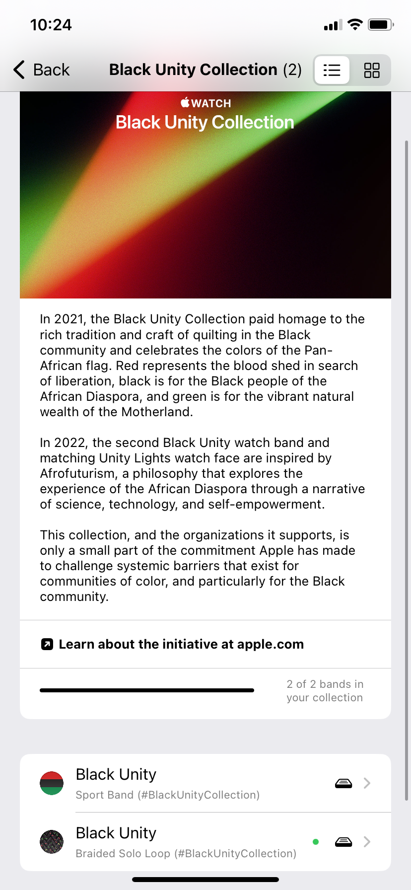
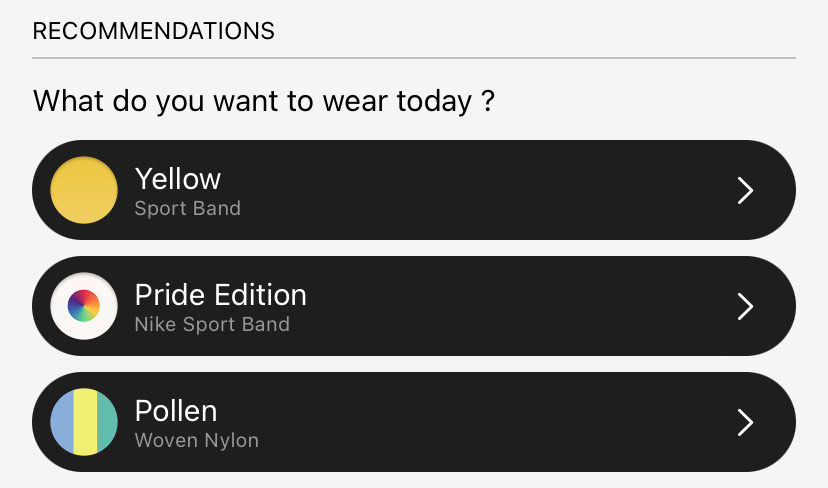
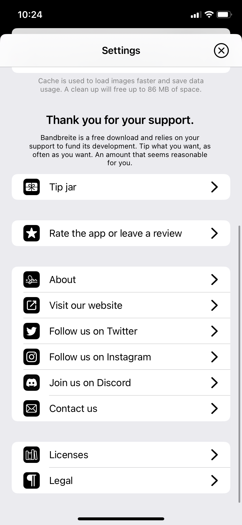
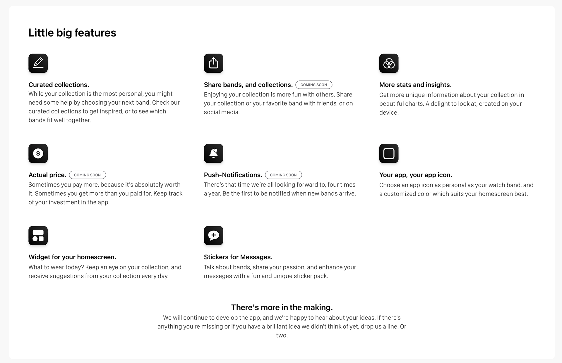
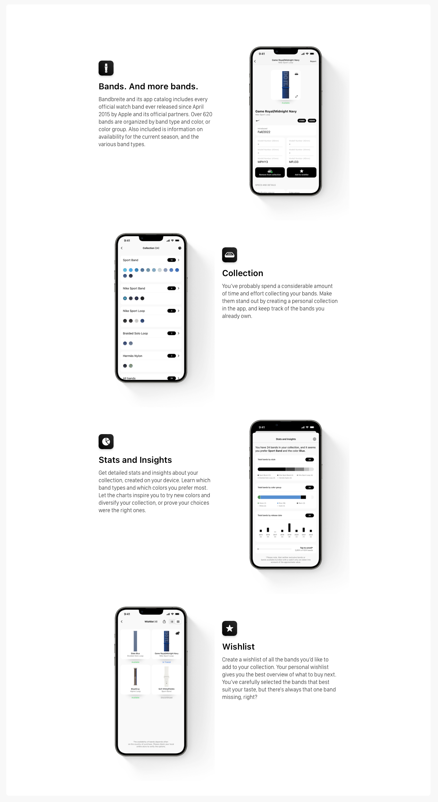
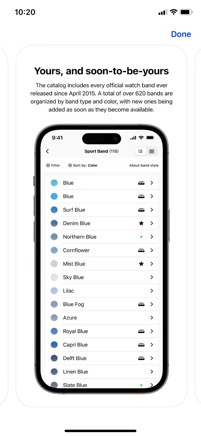
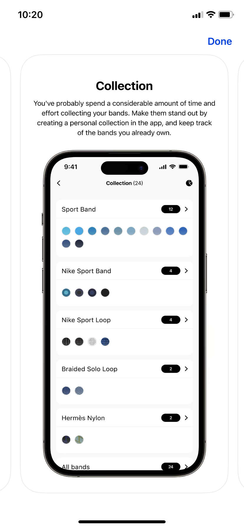
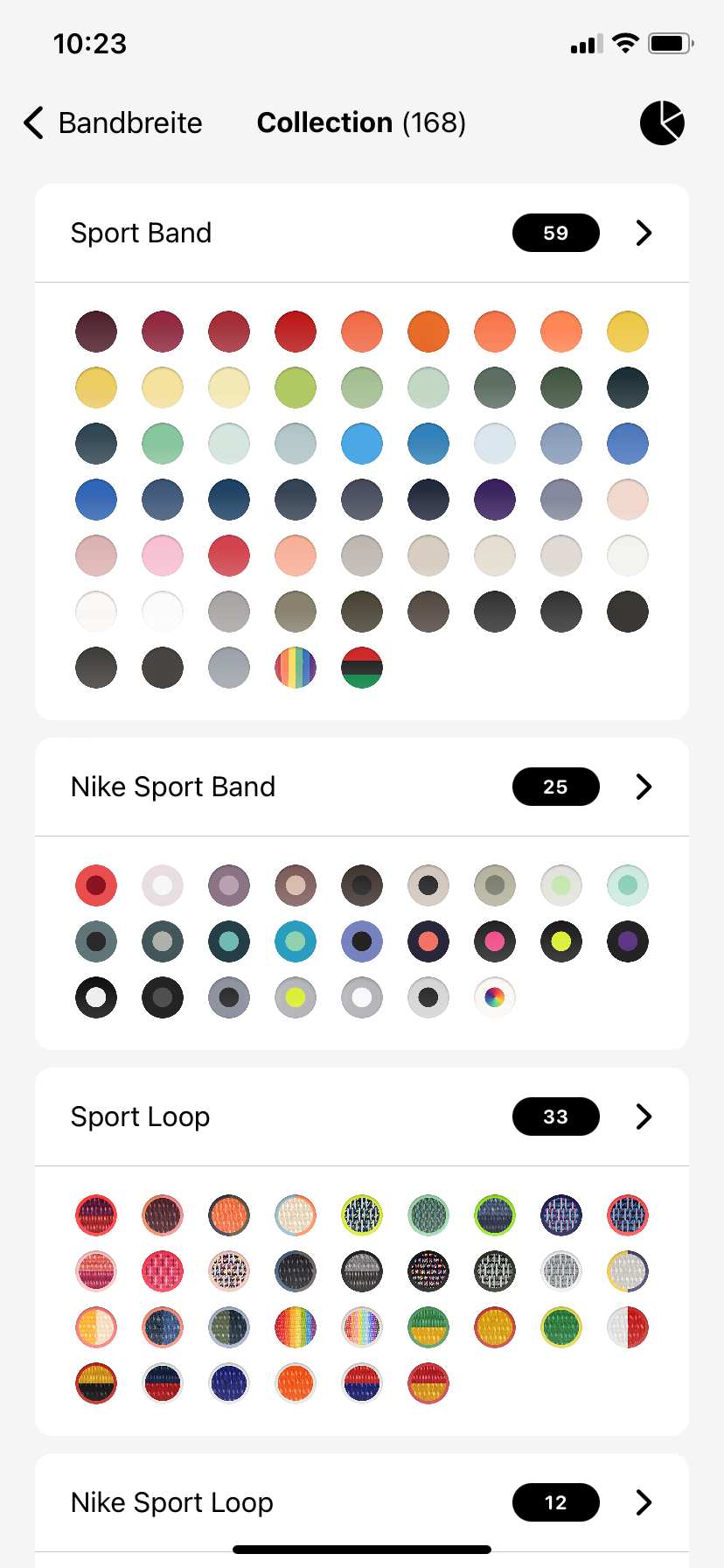
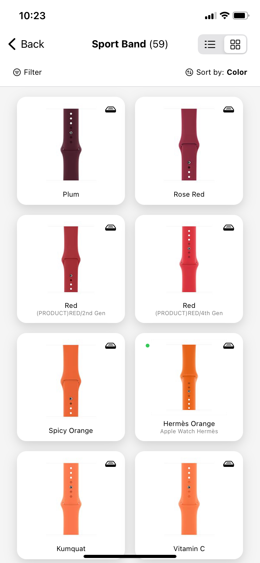
My main competitor is Bandbreite, which is a very similar app to the one I am creating. However, I want to implement more elements so that it is more community based. Bandbreite was created by other Apple Watch band collectors to keep track of their ever growing collections and it is run by a small team from three different countries, as stated on their website (bandbreite.watch). They have also created a printable PDF that contains all the Watch bands for those avid collectors.
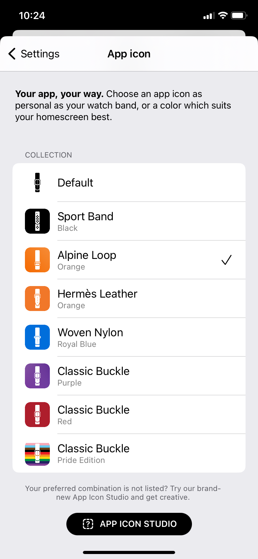
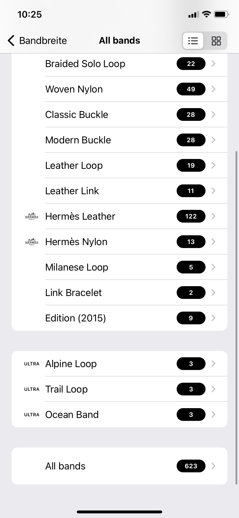
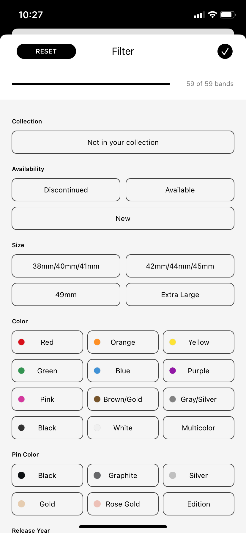
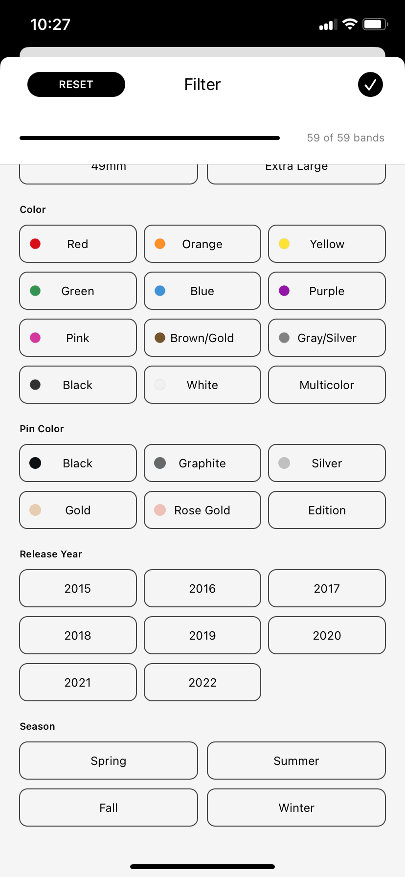
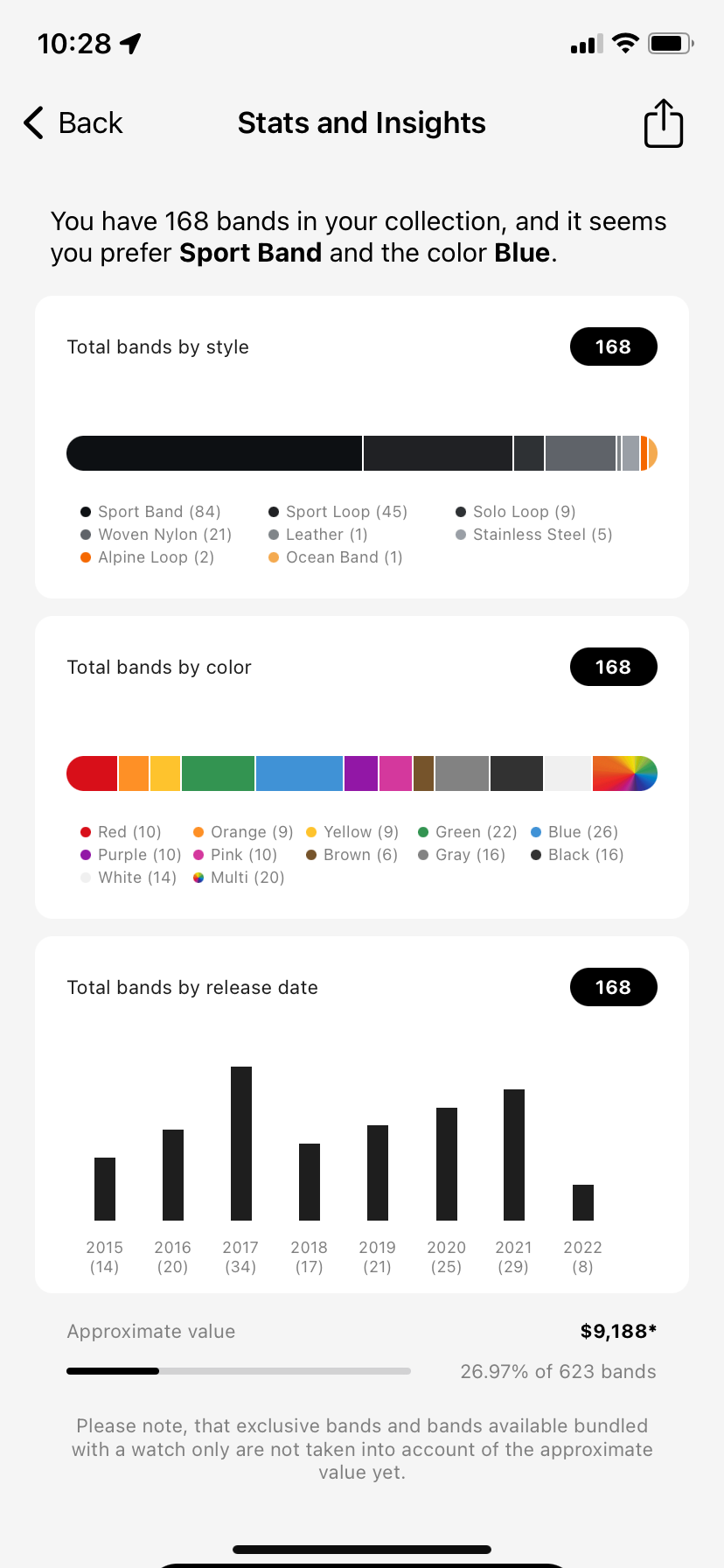
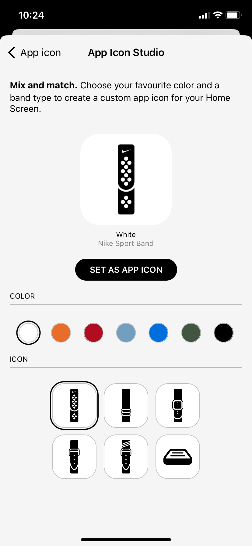
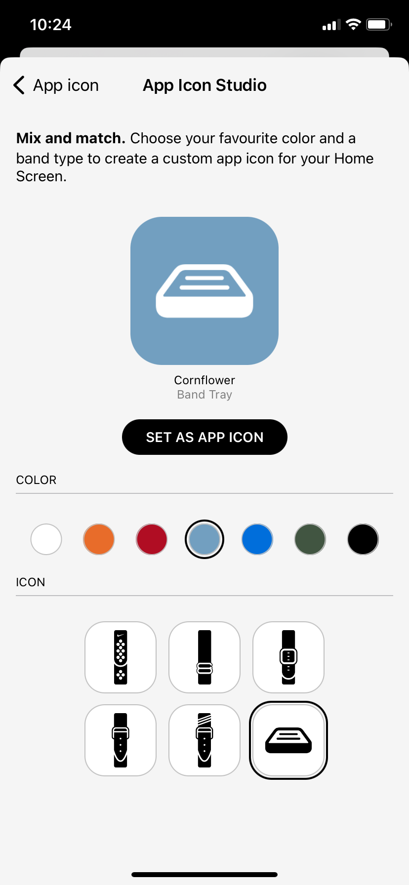
There are some levels to the customisation already within the app, such as being able to chose the app icon for your Home Screen, more of which are unlocked when the user 'tips' the creators. The user can also choose which colour is displayed on the logo, which are named after real Watch band colours. Another customisable feature is how the listed are presented, the user can either have a list view, which is more compacted, or a grid view, which is larger but shows off the stock photo image. Other than being able to create your own collection within the app these are the only features available to the user for customisation. They also provide a Light and Dark Mode which can be controlled within settings. My aim is to include these features within Bandtender, and more such as, being able to change the colour scheme of the app with multiple presets, more control on visibility, being able to control font size, icon size and grid size. I hope these features will make my app more accessible to those with sight impairments and colour blindness. However, for my prototyping, I will create my design using one colour scheme with examples of others and the same for font size.
Kindle
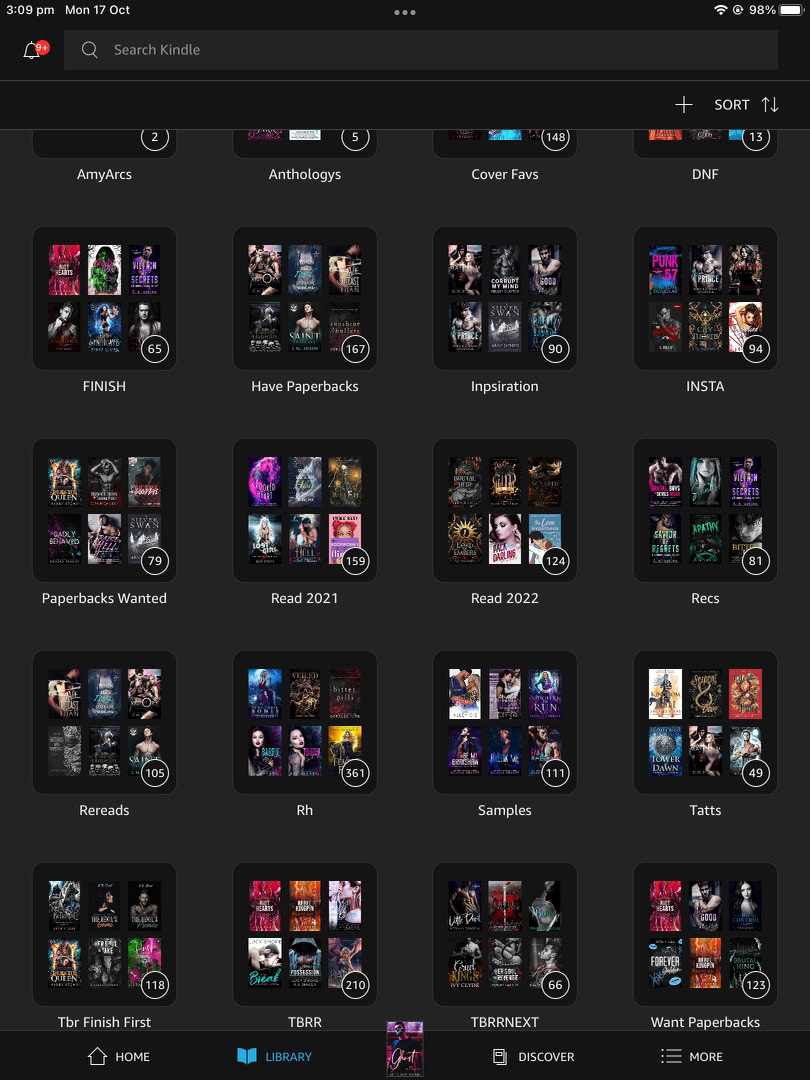
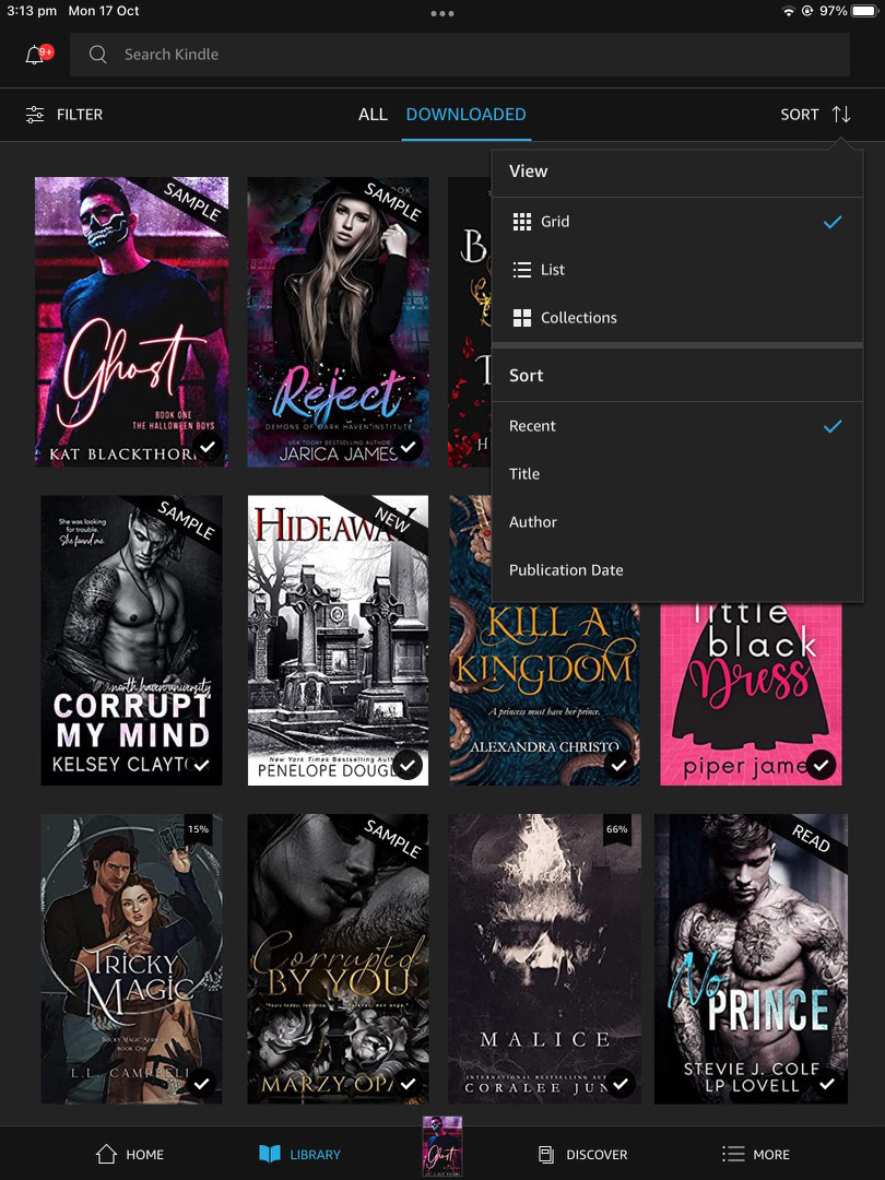
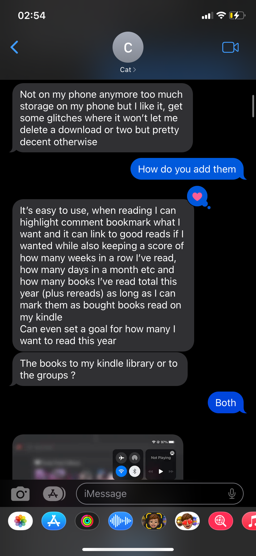
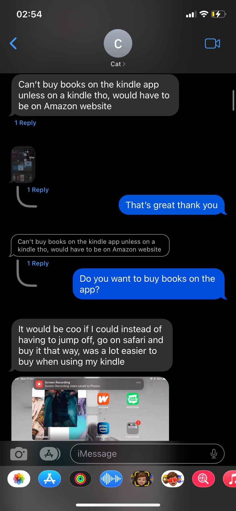
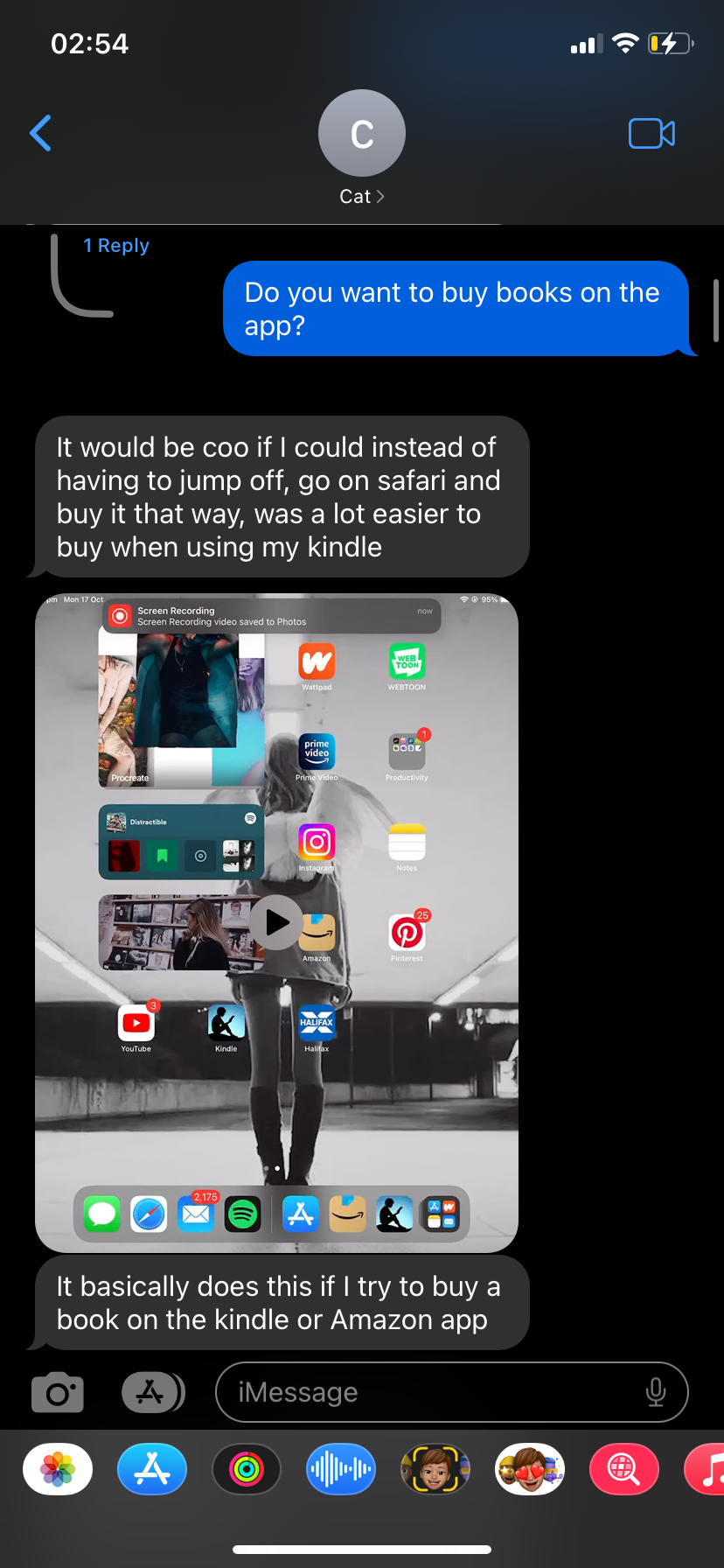
I also looked into other apps that provide a similar experience. One app I looked at was the Amazon Kindle app. This provides the user to organise their book collection into different categories or collections. It also offers the user to browse other titles that they might not yet own and provide a free sample, but the user has to exit the app and use Amazon to make a purchase and then return to Kindle to read the book. I have one friend who is an avid book reader and writer, who uses this app daily. I questioned them on their thoughts and experience of the app to see if I could get any tips for my own. Their main complaint was not being able to have one title in multiple collections if they fit a range of categories. They stated that when they want to reread a title, they struggle to remember which collection the title is in due the volume of their collection and how many categories they have created.
Ideation
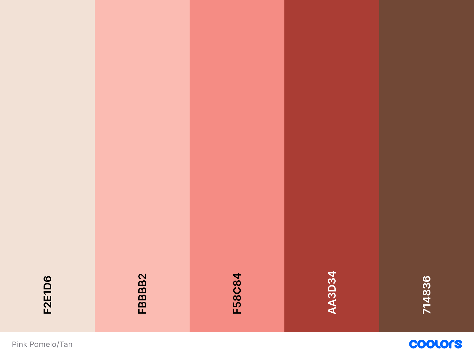
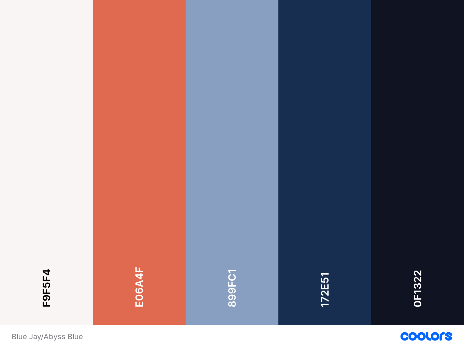
Sketches & Colour Schemes
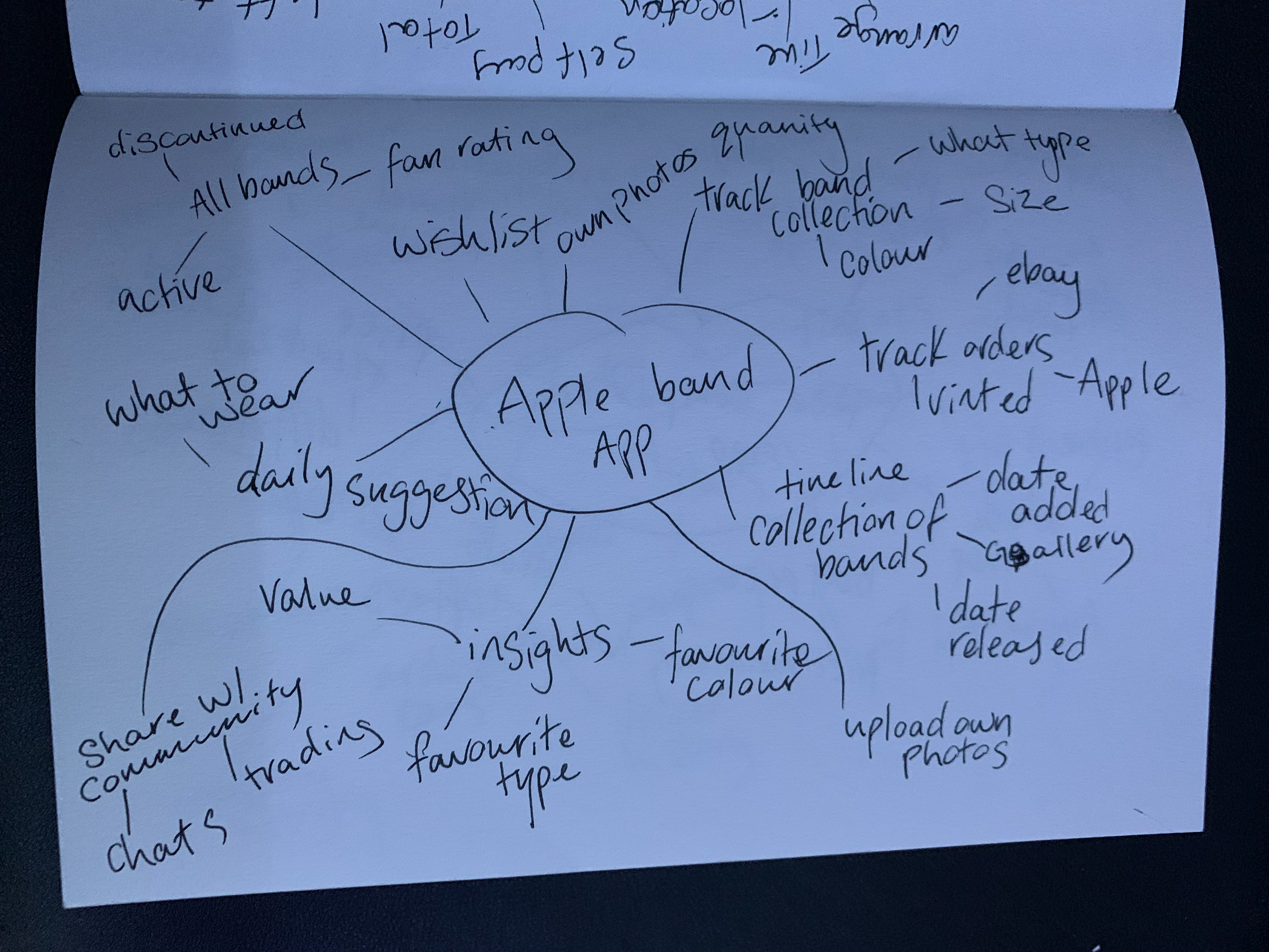
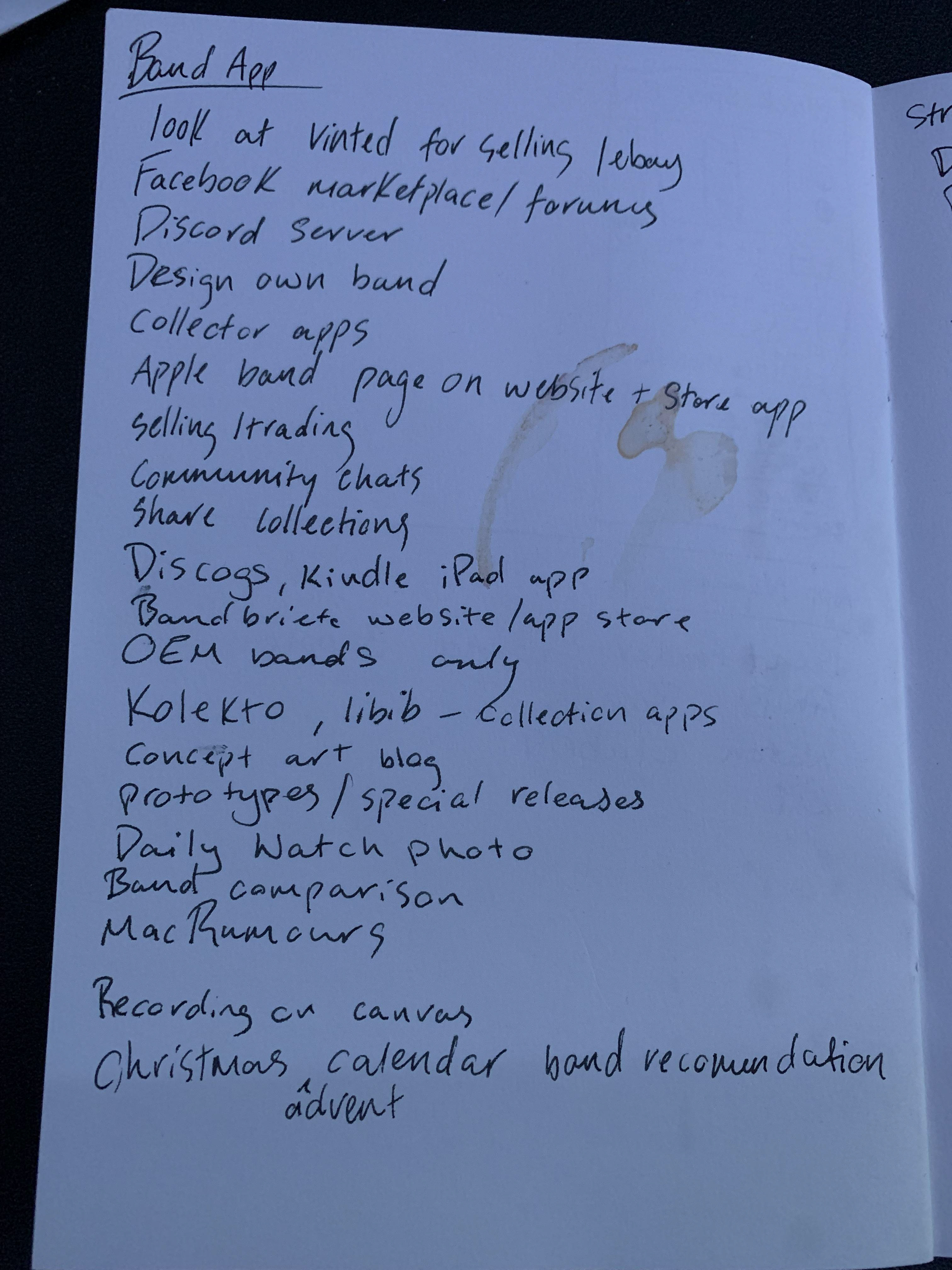
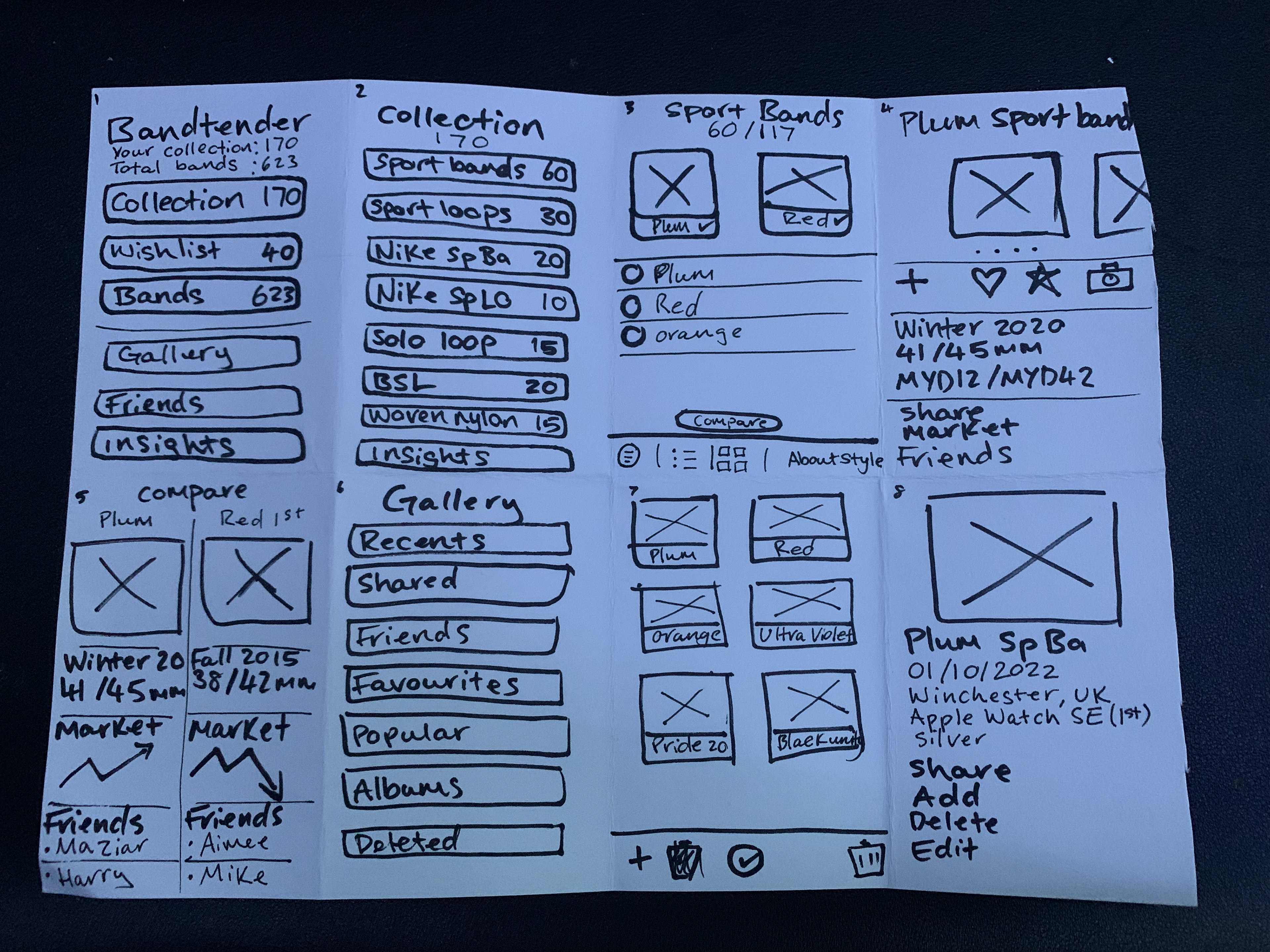
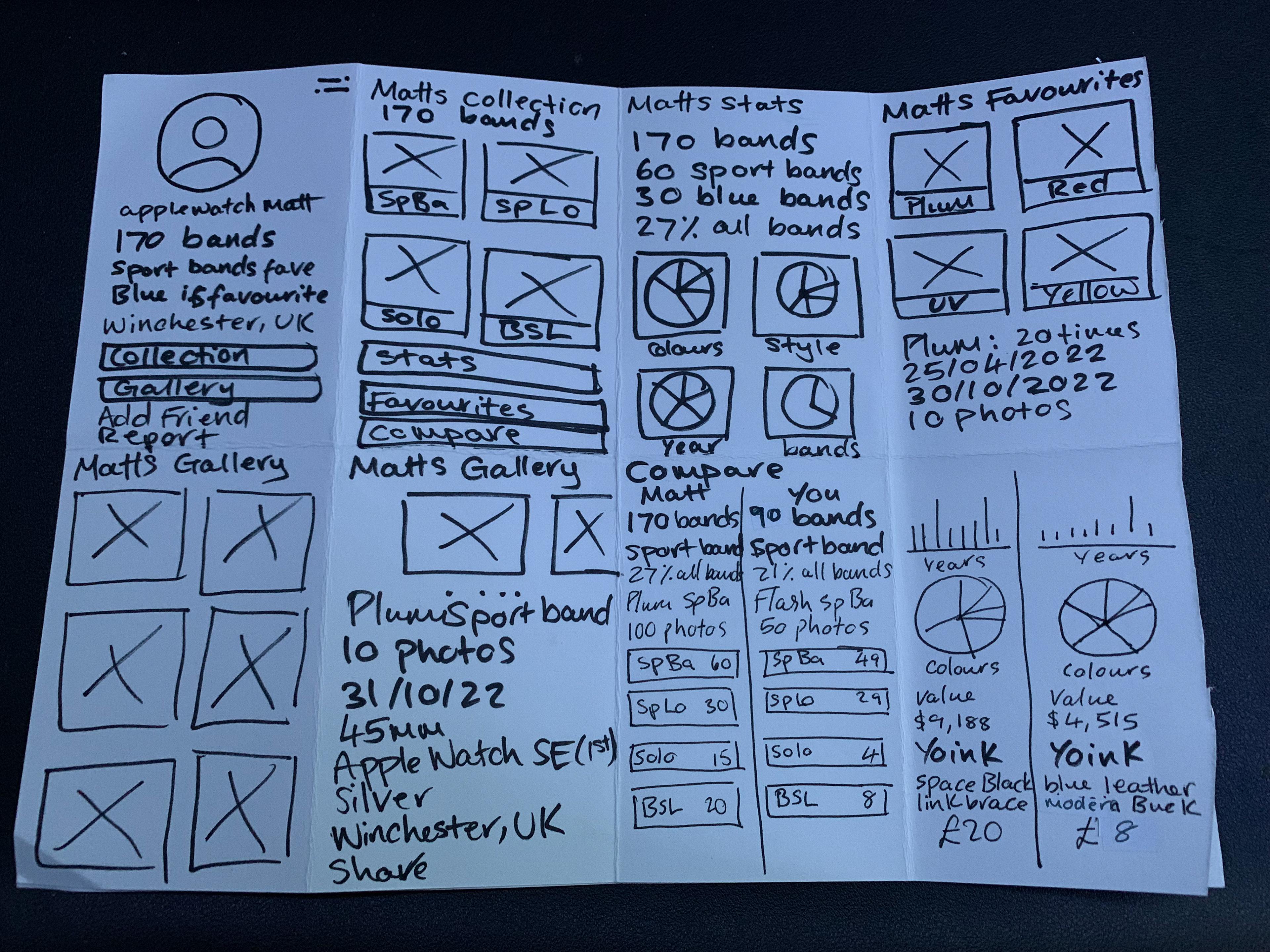
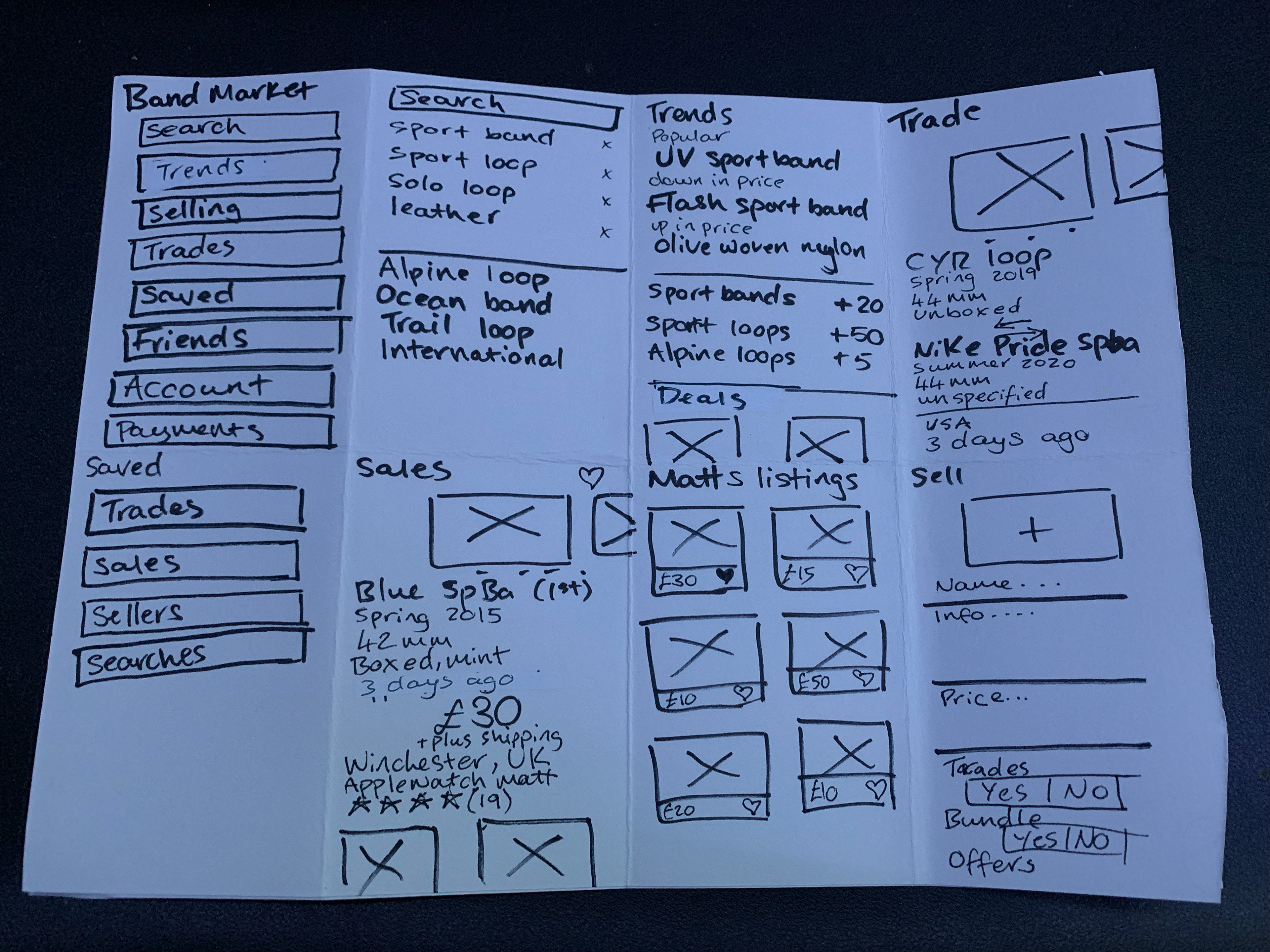
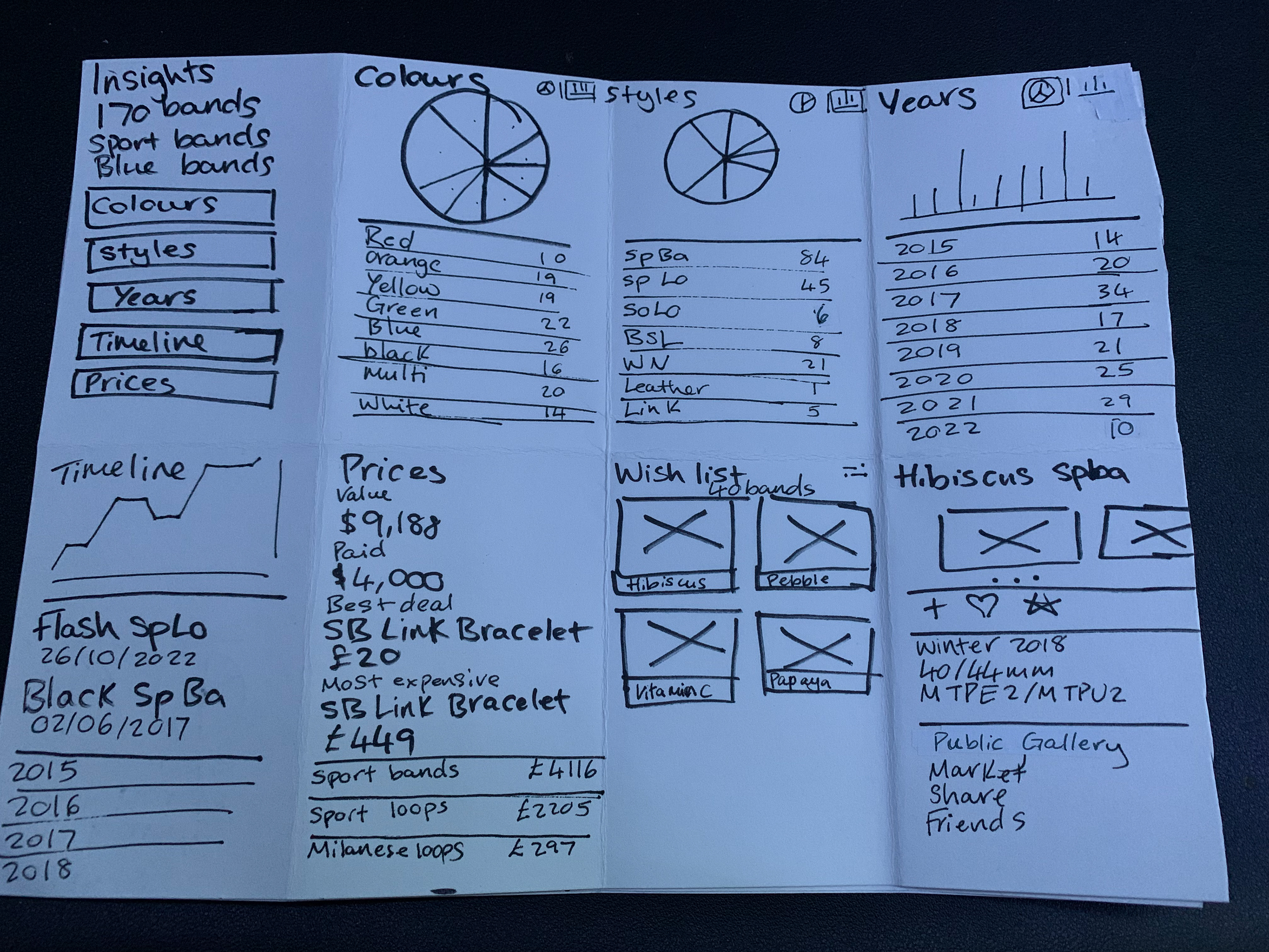
I first created a mind map for all the features that I would like to include within BandTender, however, due to limited time I will be focusing on the friend and photo aspect. If I had more time and skill, I would later create the marketplace designed within the sketched wireframes. I also asked my classmates for any feedback or features that I had not thought about, such as a design lab where the user could create their own band within the app and then a third party company would make and ship it to them. Although this is a good idea and adds another level of personalisation to the project. I solely want BandTender to focus on only original bands made and design by Apple and their partners, Nike and Hermes.
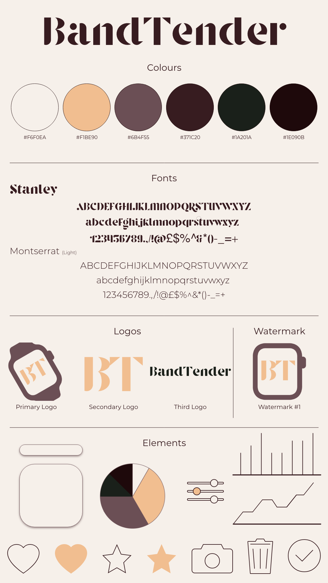
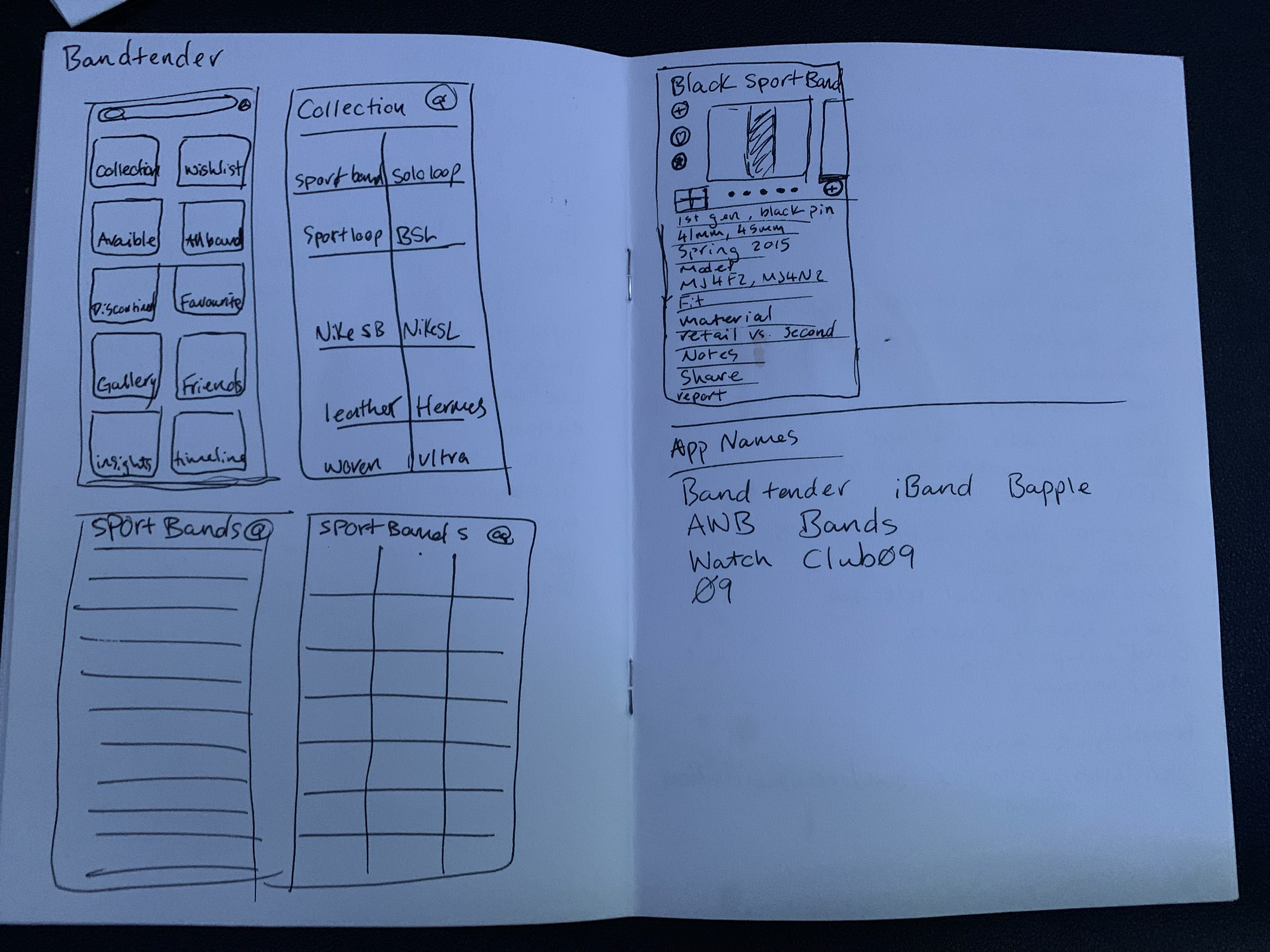
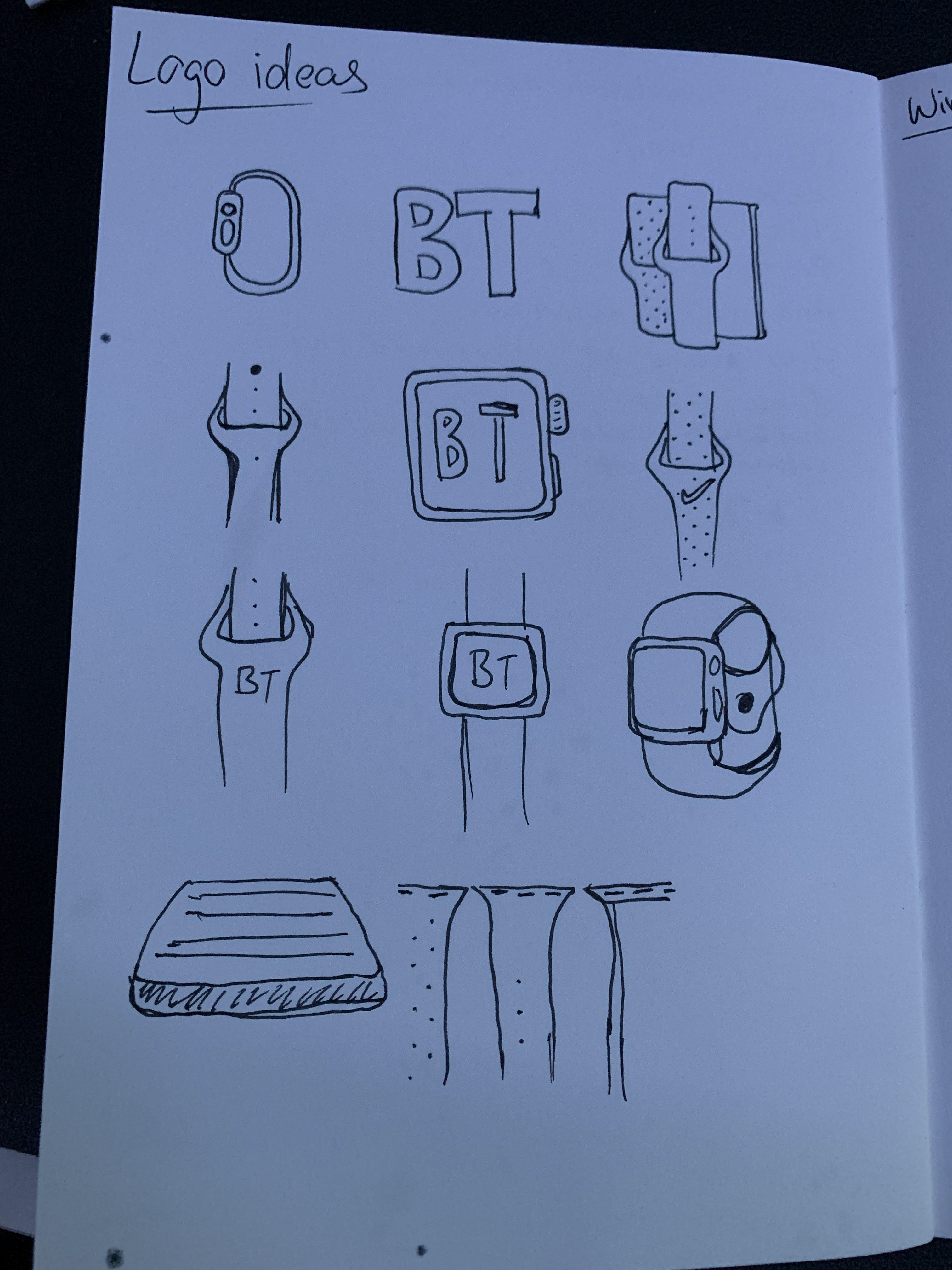
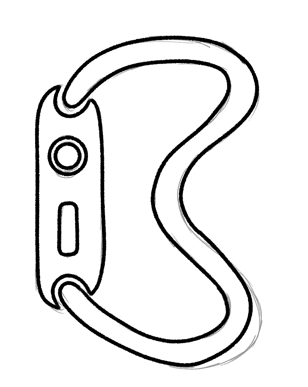
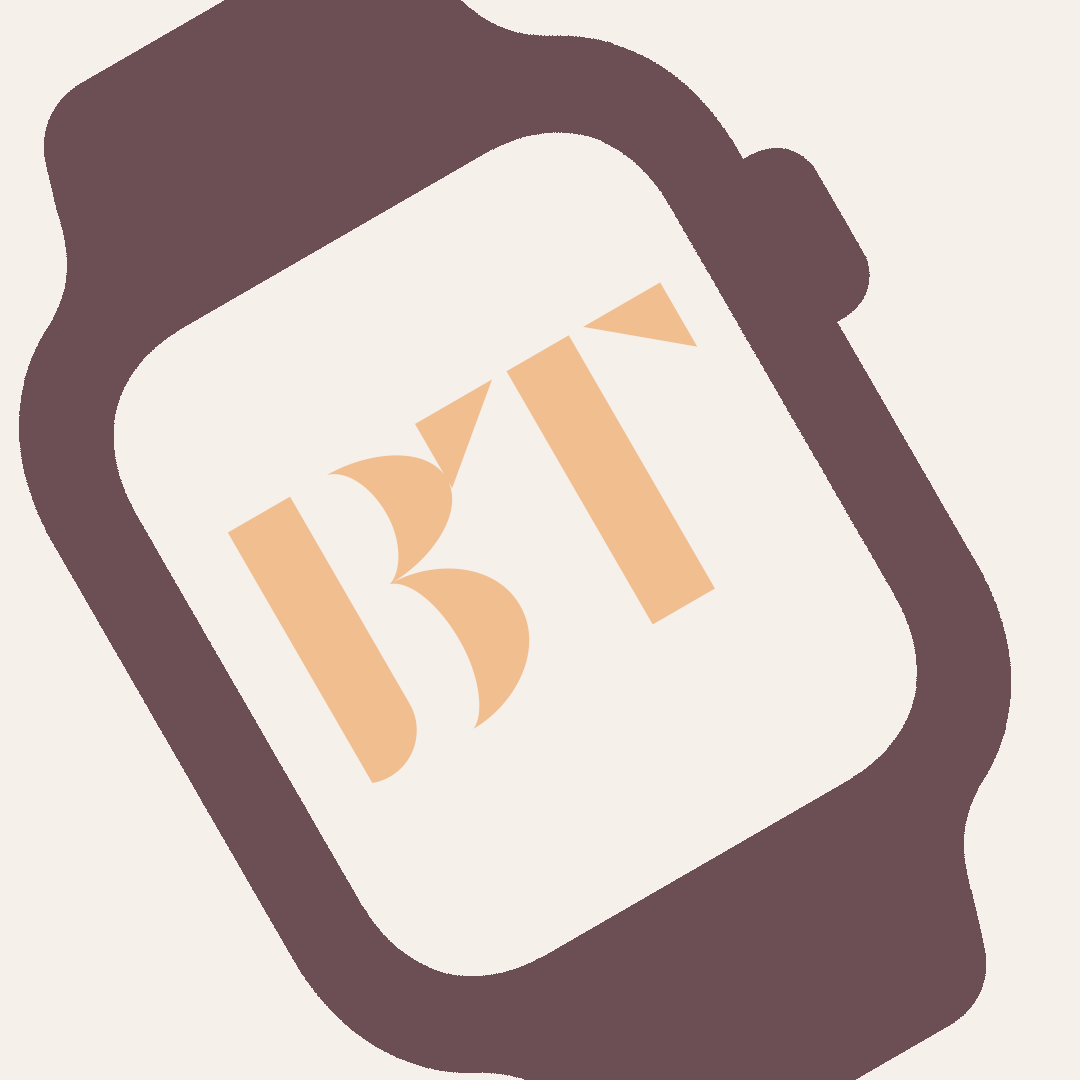
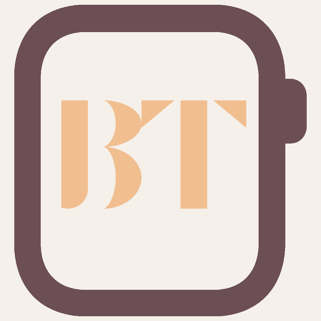
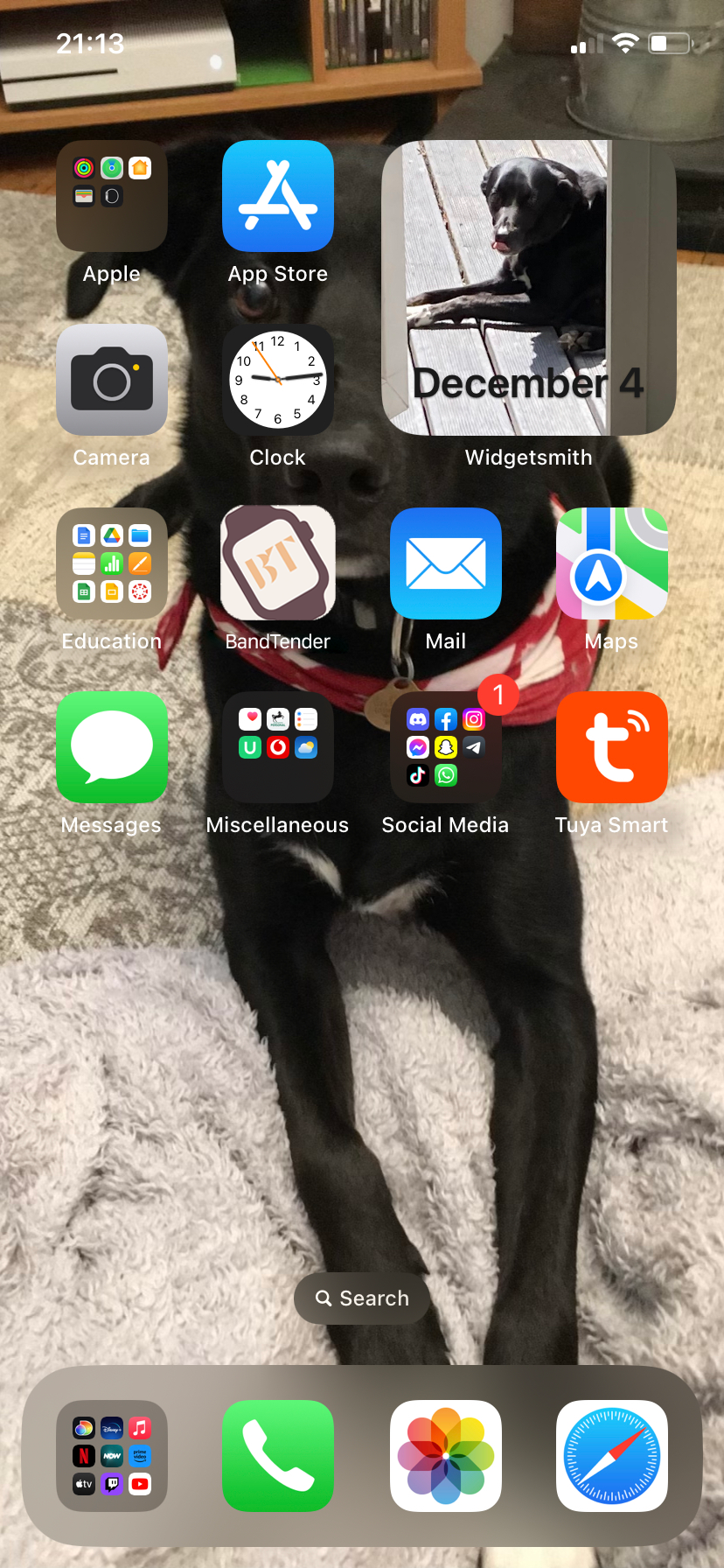
I then drew the basic wireframe of Bandbreite for inspiration and to gain an understanding of how the app works and the features that they already include. it is a very basic and simple layout that works well and is very clear. I wanted to follow suit with this, but to make my app more visually pleasing and have a luxury and expensive feel as the app focuses around Apple official Watch bands which can be very expensive. The most expensive band ever being sold worth $849 (£700) is the Apple Watch Hermès - 41mm Noir Swift Leather Gourmette Metal Double Tour available during the 2022 fall season (Link here). I then designed multiple different logos for the icon of my app. I again wanted it to focus around the bands and/or watch so it was clear what the app entails. After a class discussion and a talk with Paul. I tried to design a logo that uses the Solo Loop in the shape of a 'B'. However, I struggled to create a natural looking wave with the band while also looking like the letter. I then decided to use the watch face with BT on the screen, which I then tilted to make it stand out more on the Home Screen. On reflection, I like this idea much more as the first logo looks very similar to the 'Watch' application made by Apple to control the Watch device.

Watch Band Photos
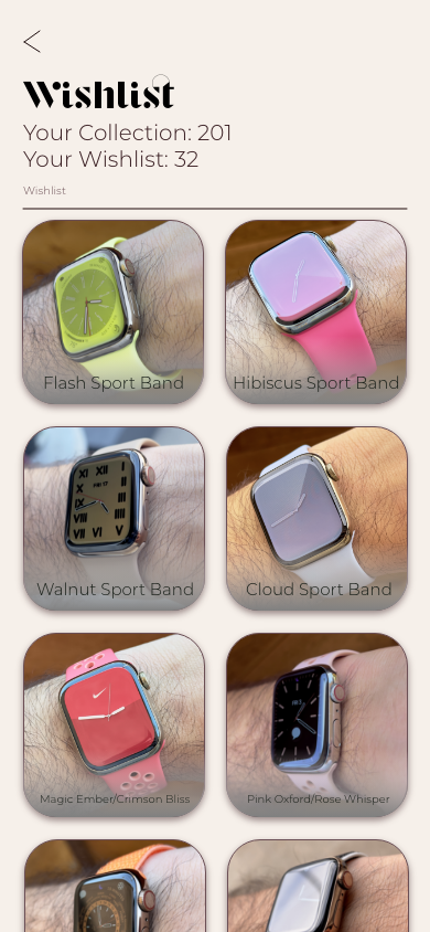
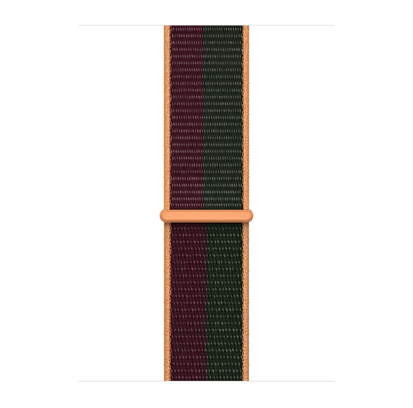
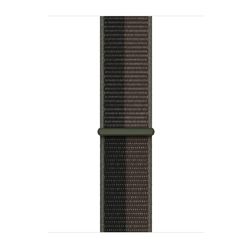
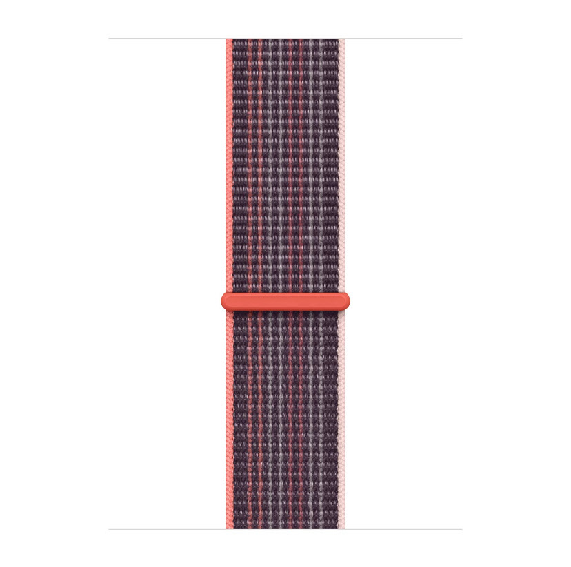
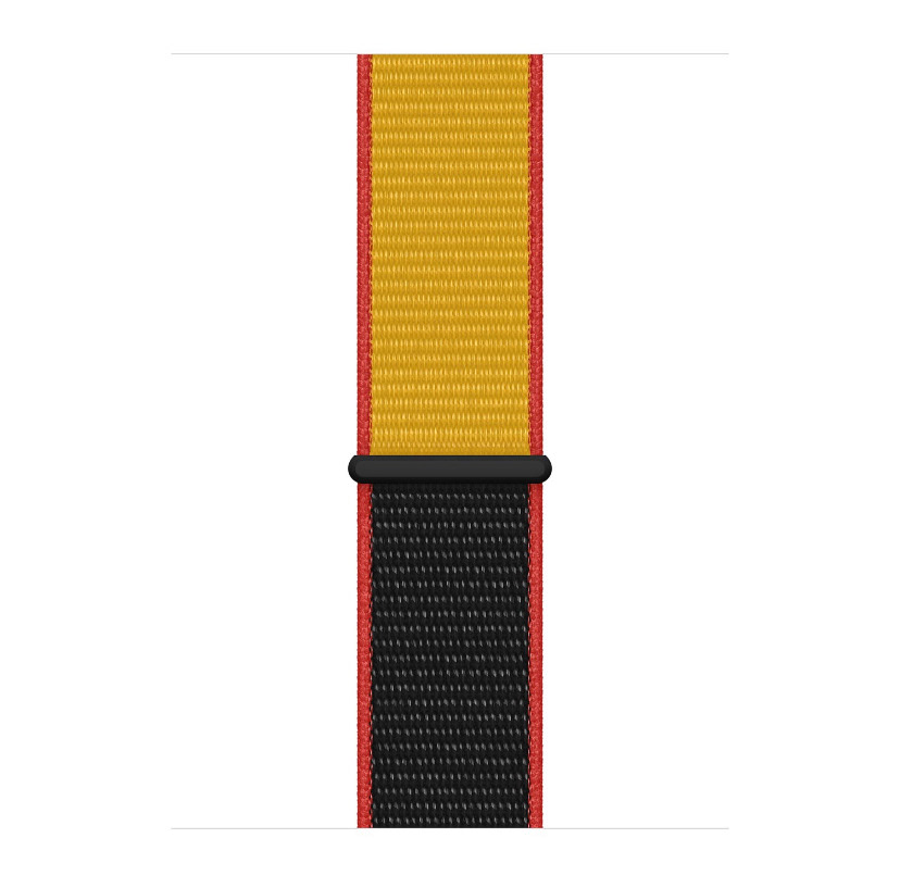
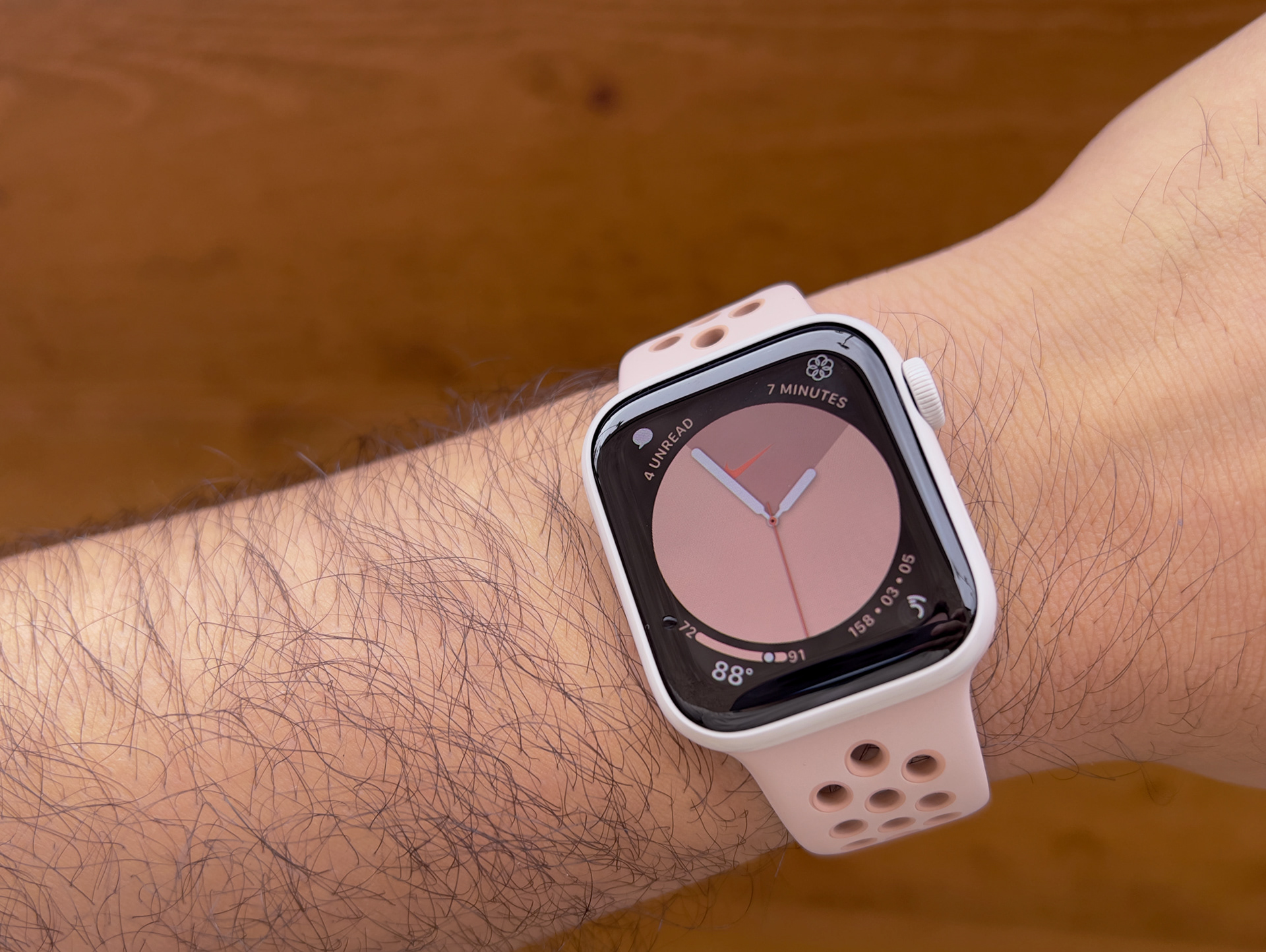
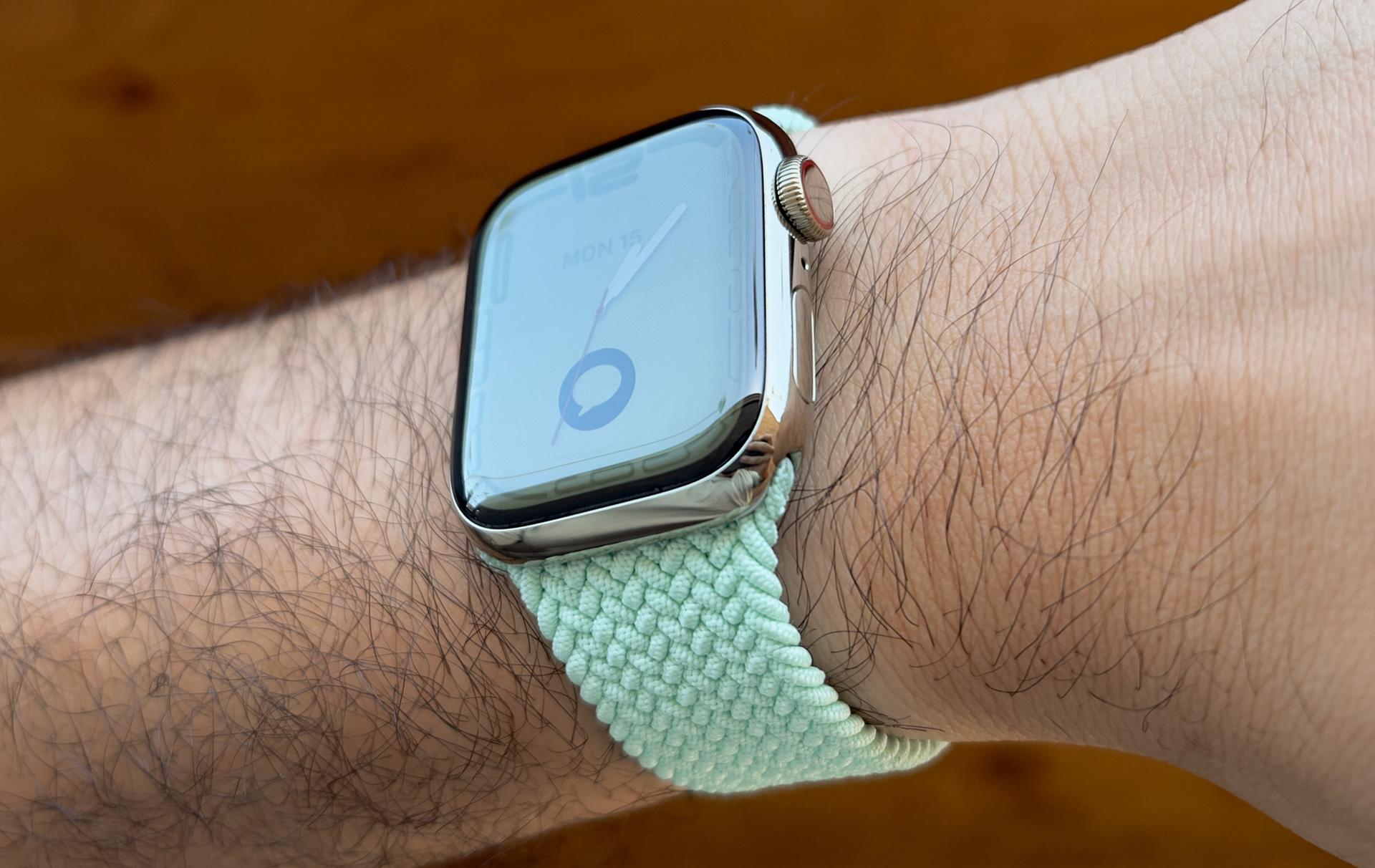
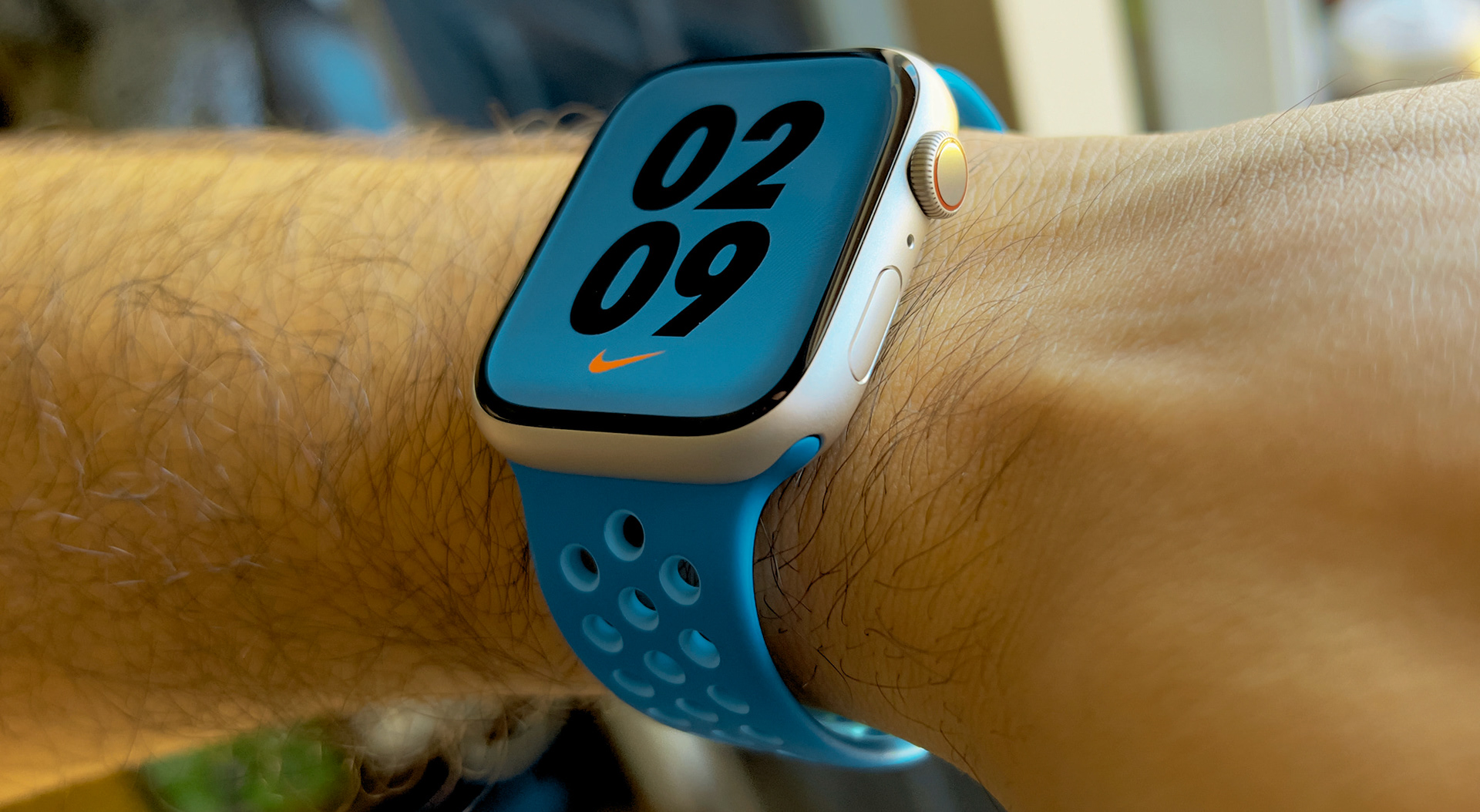
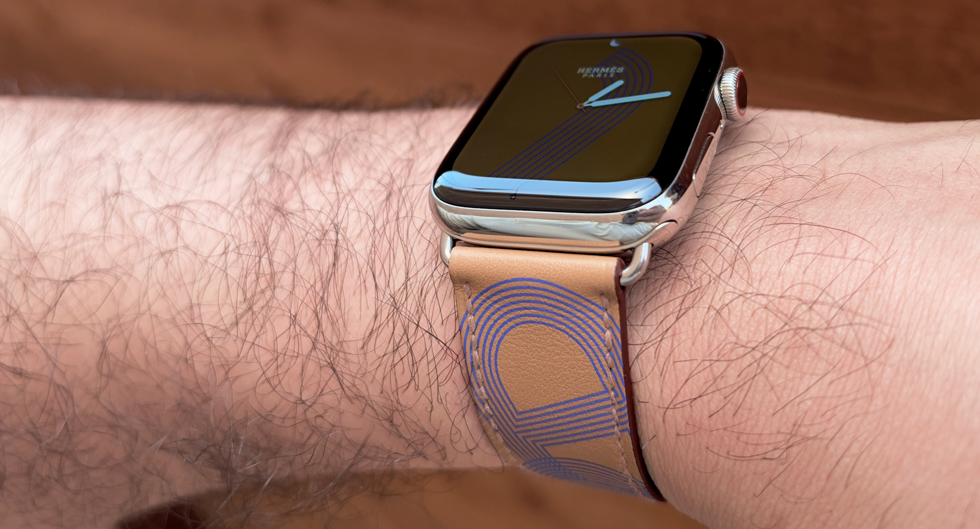
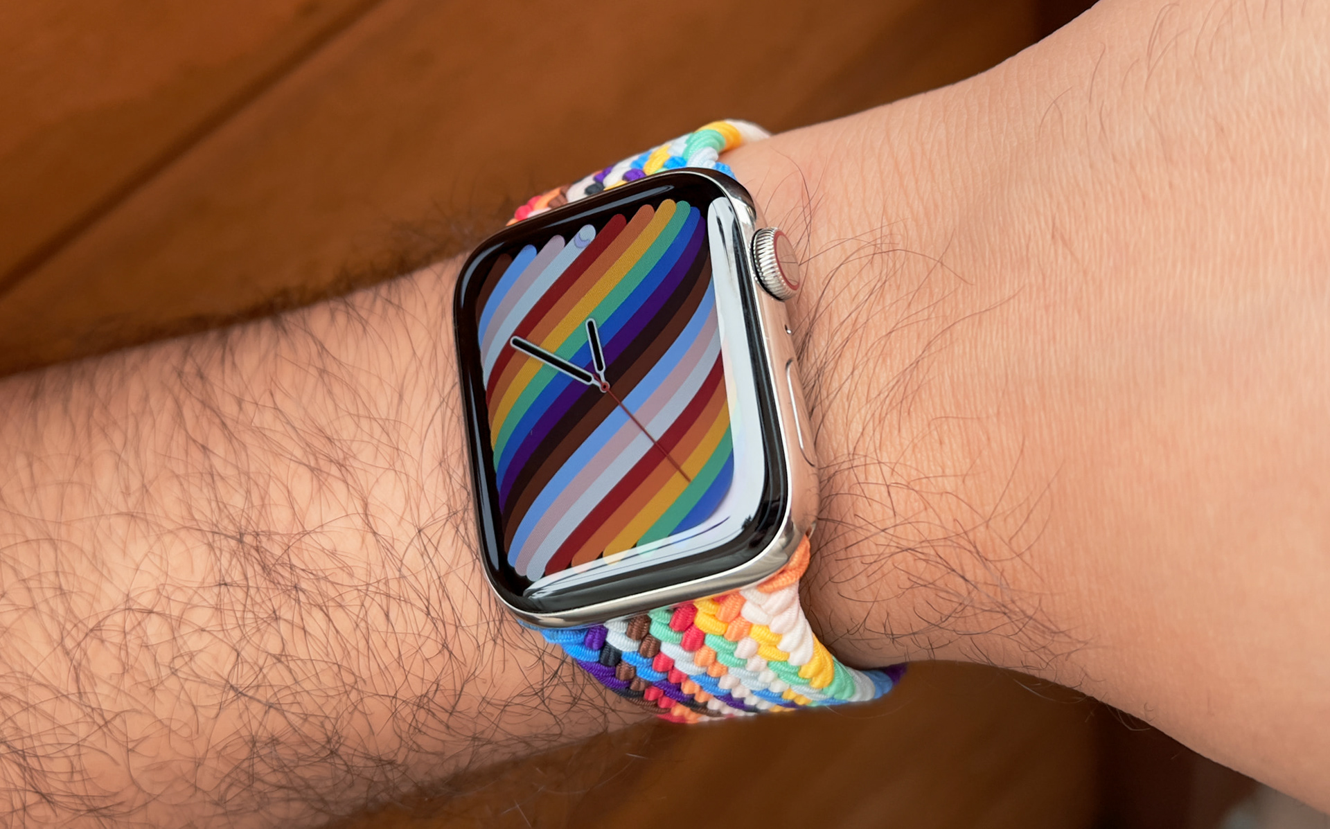
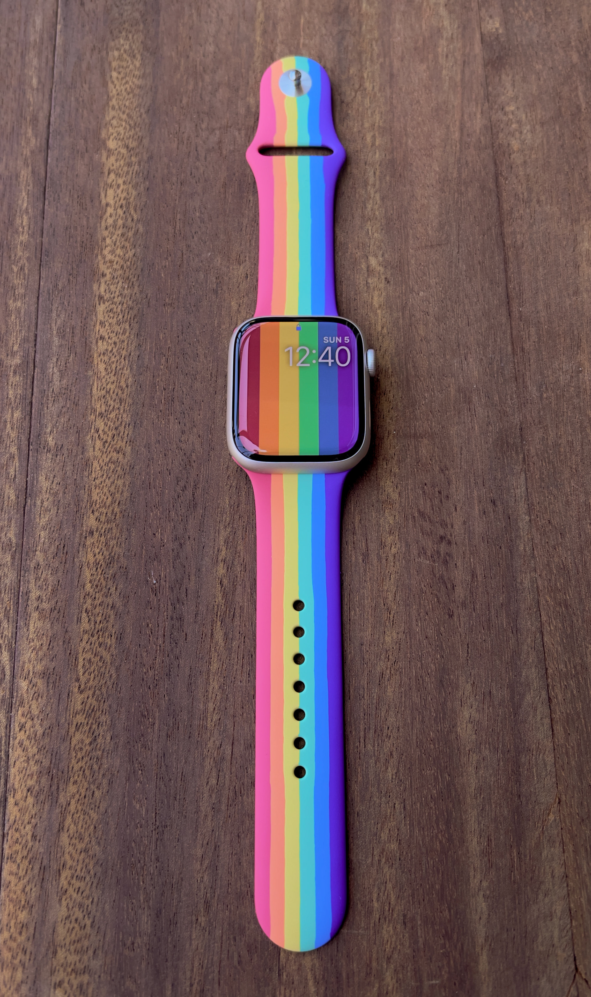
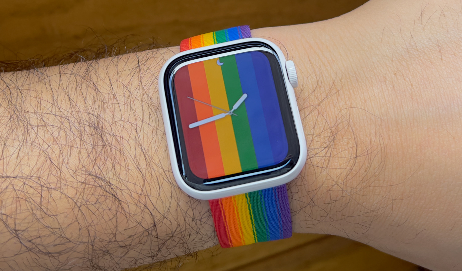
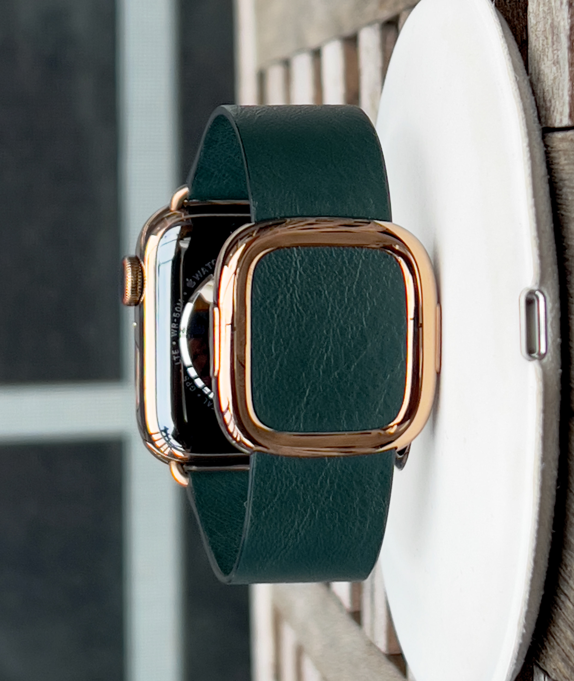
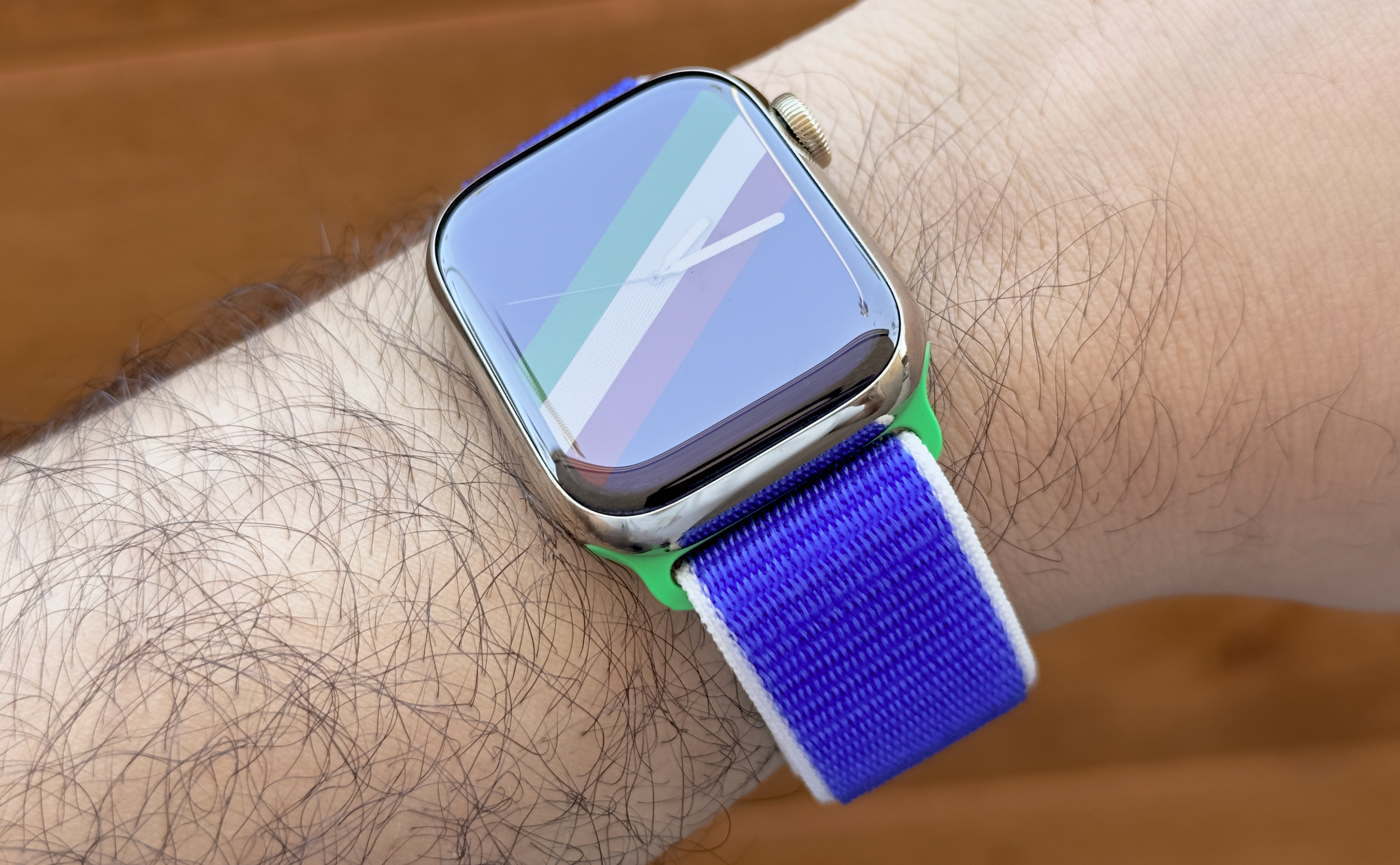
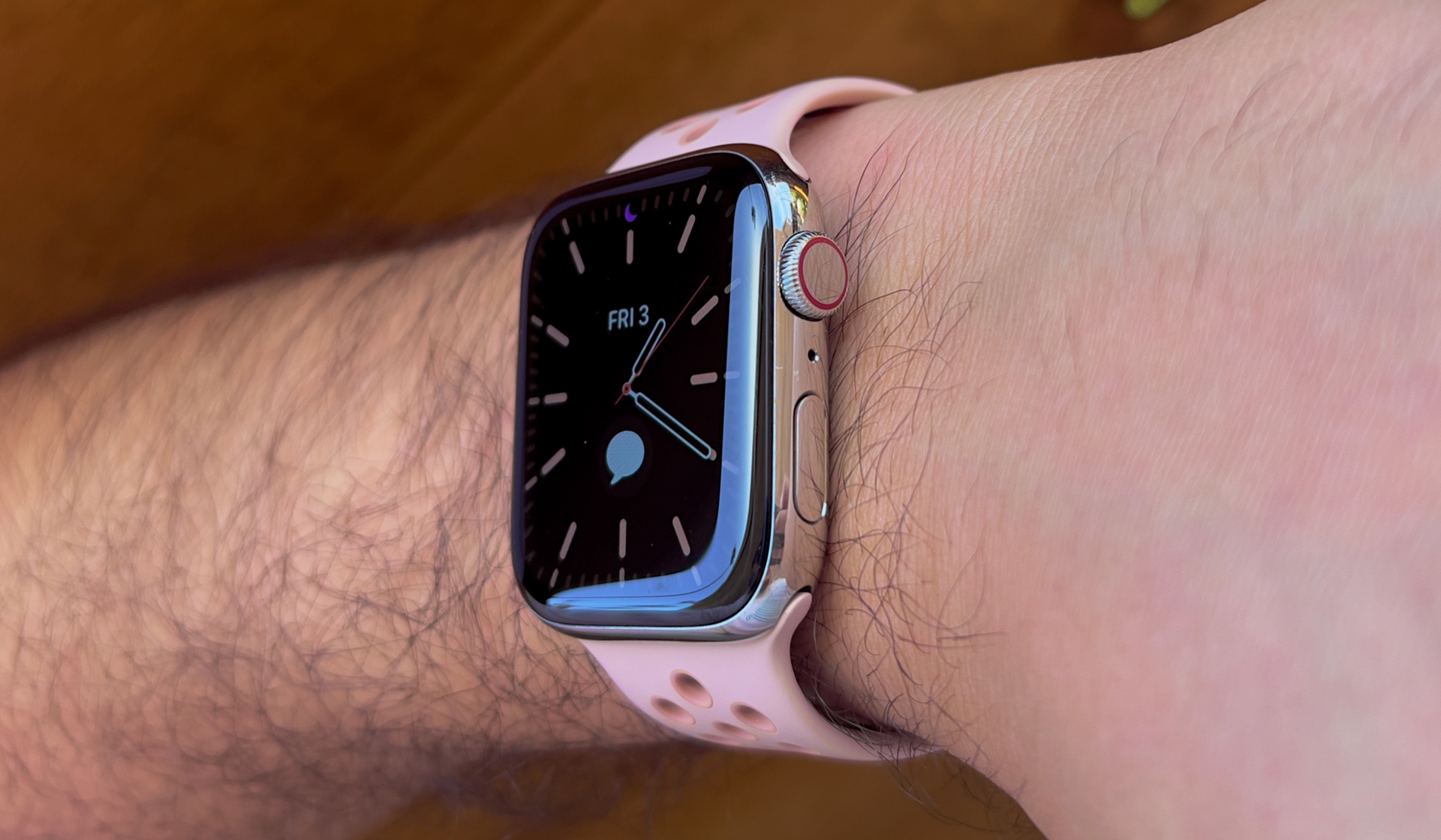
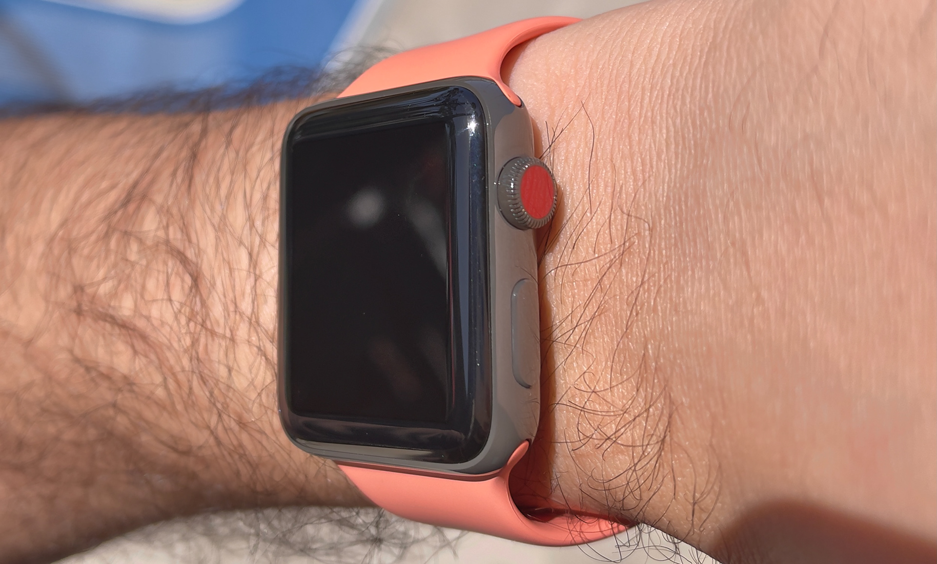
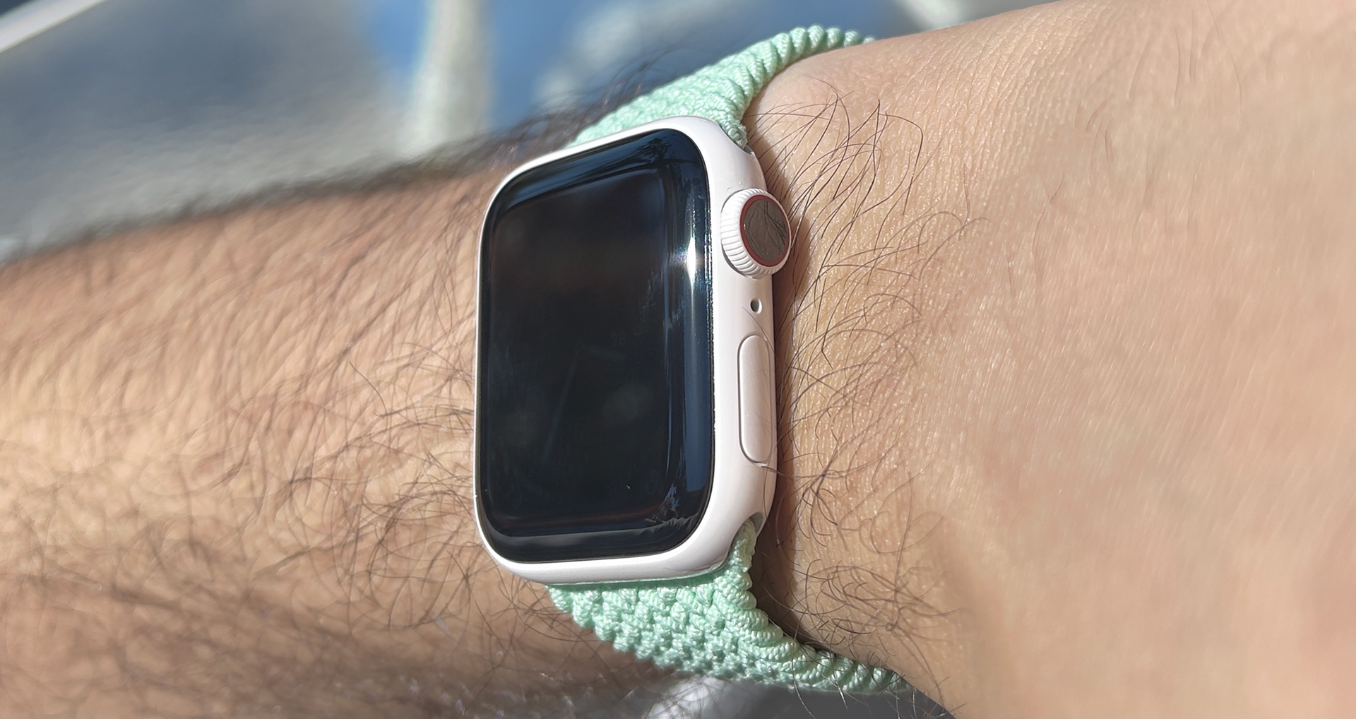
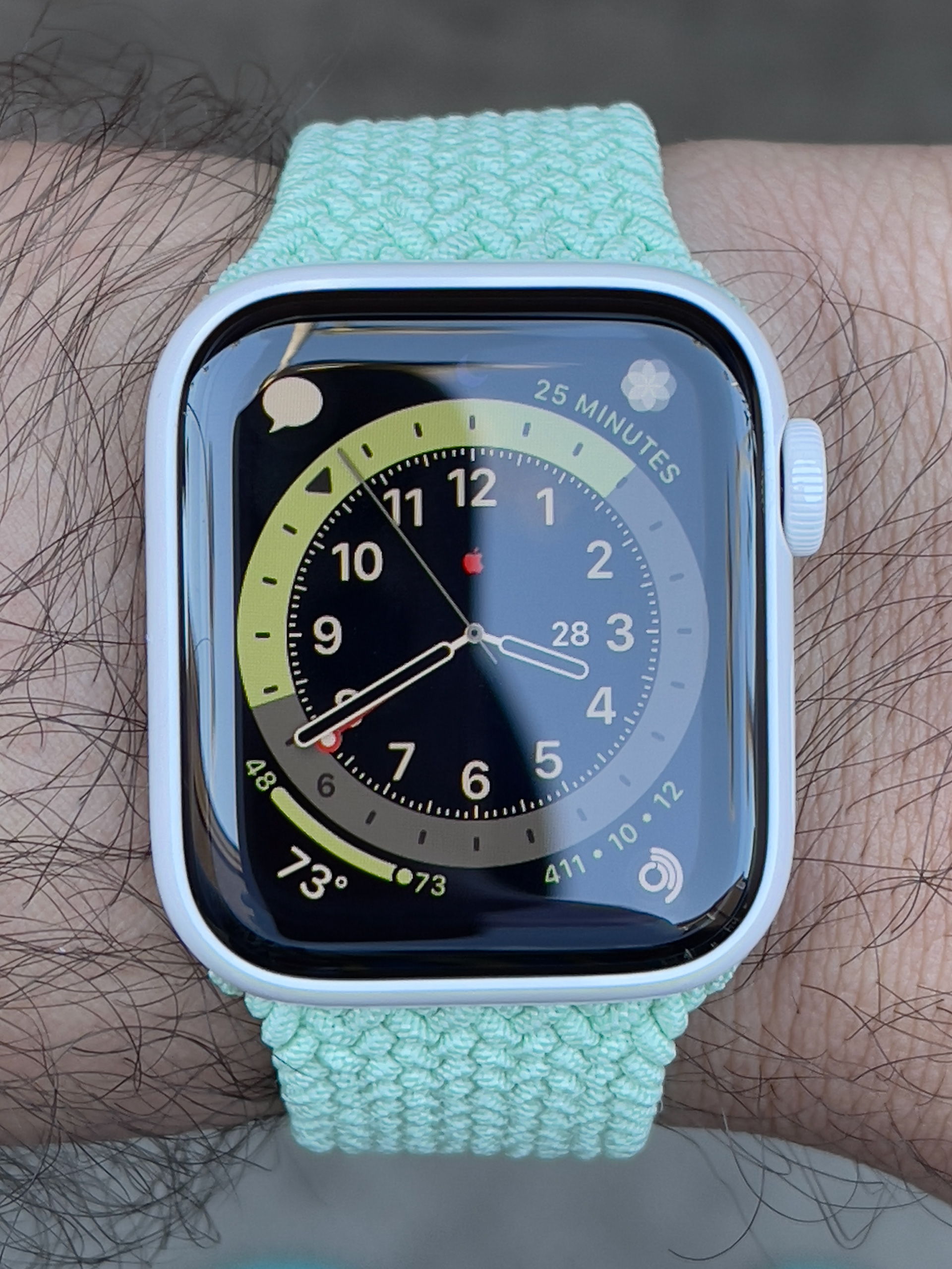
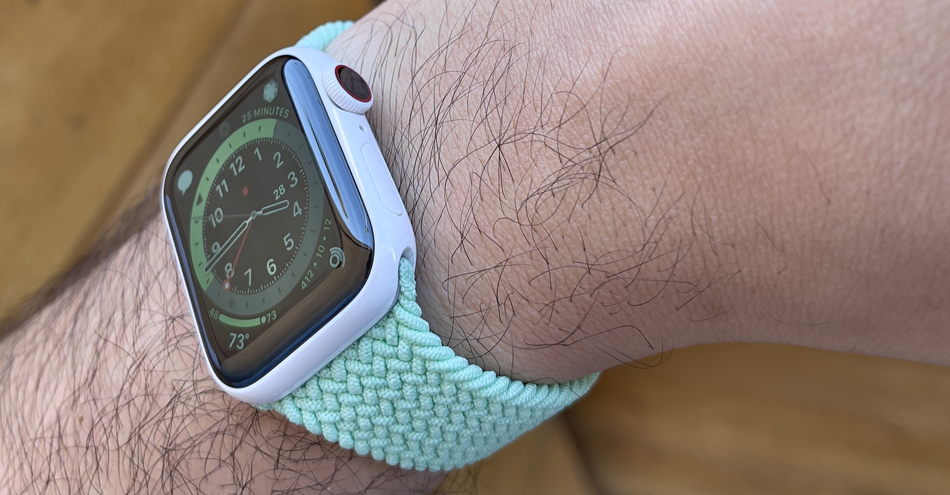
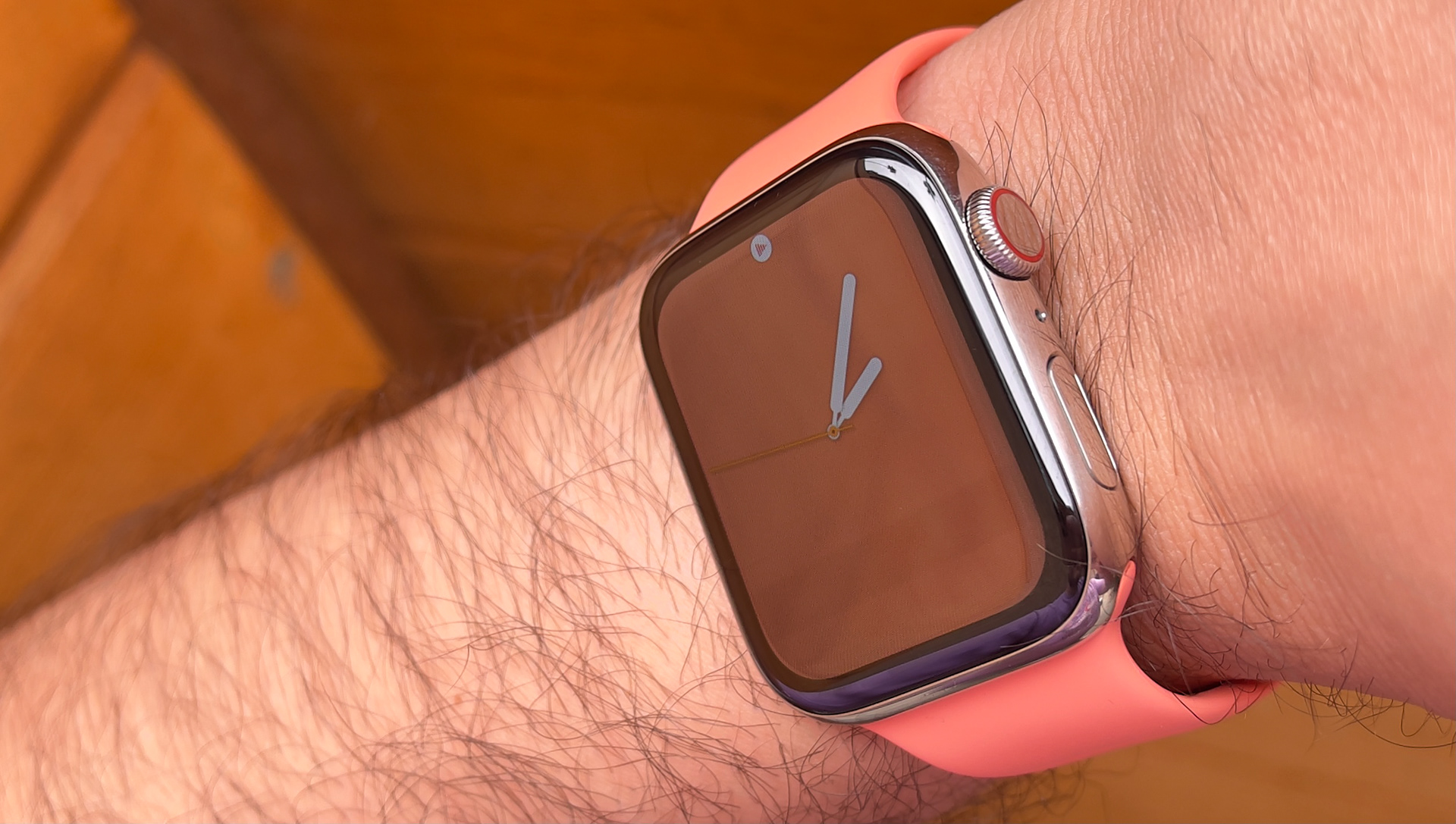
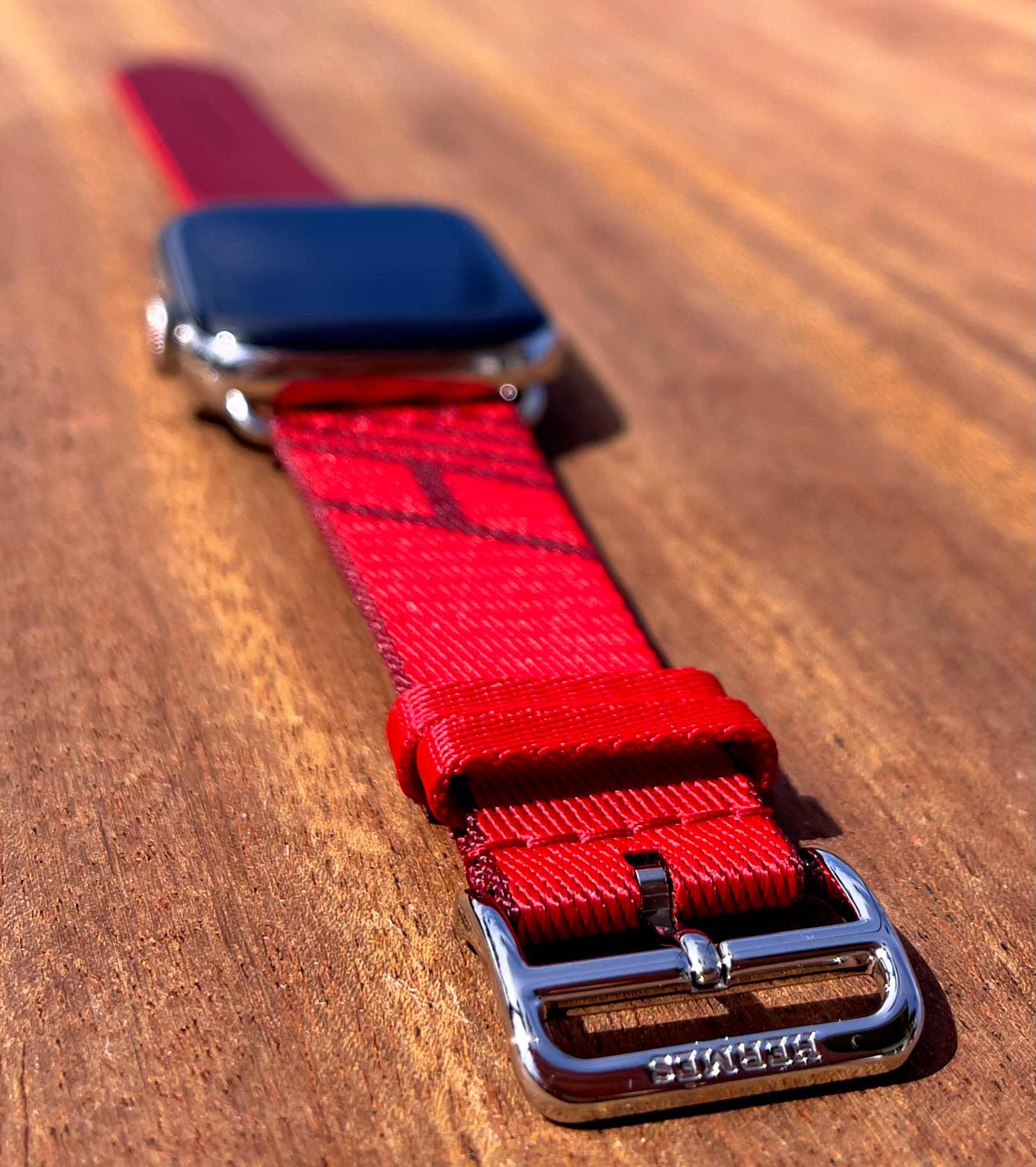
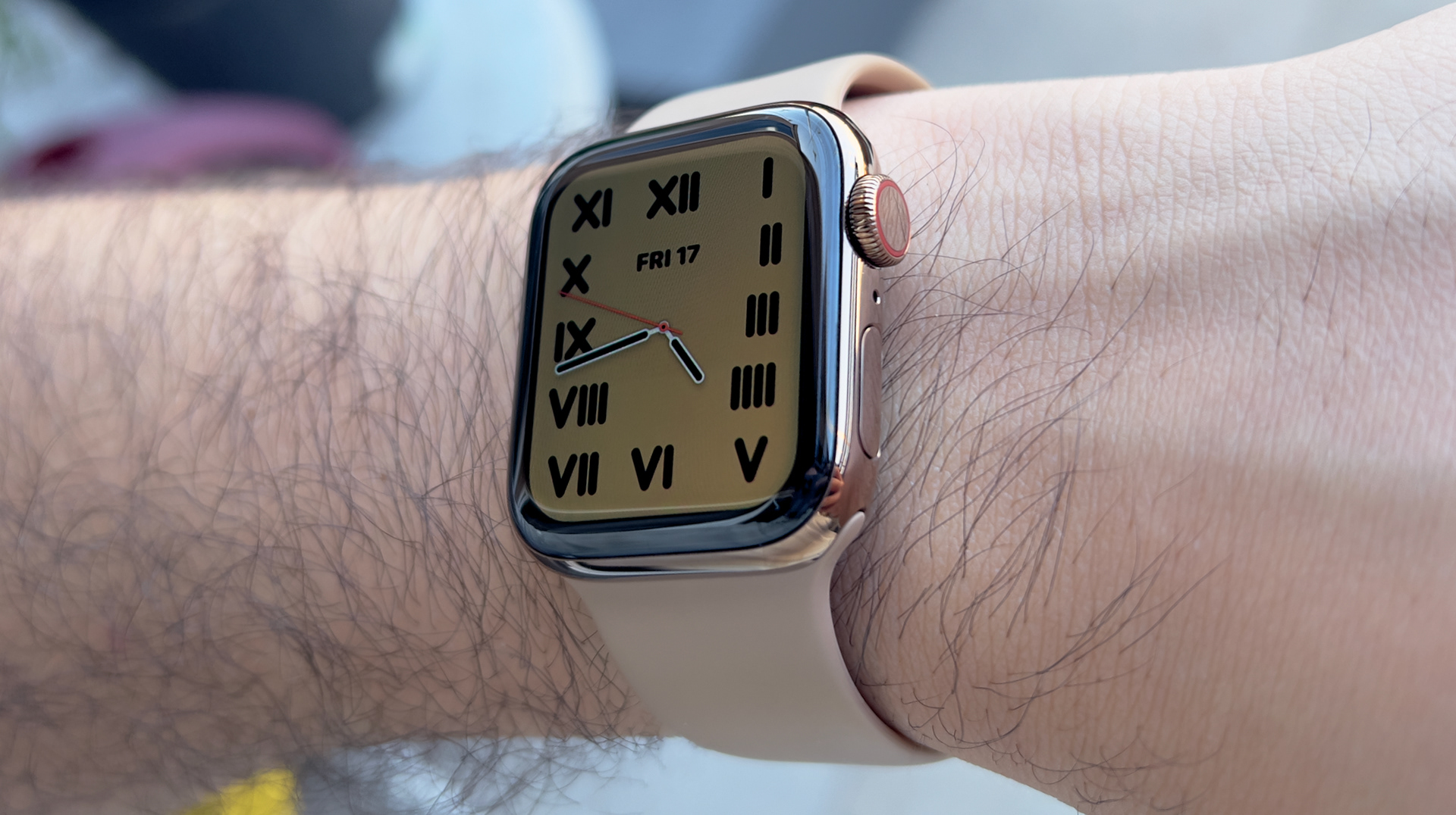
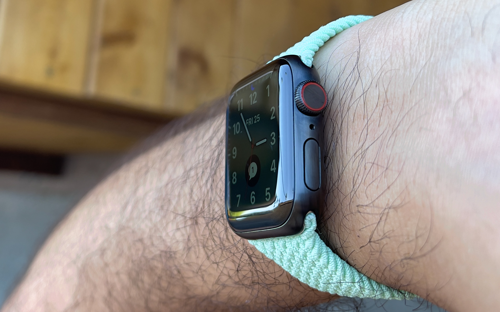
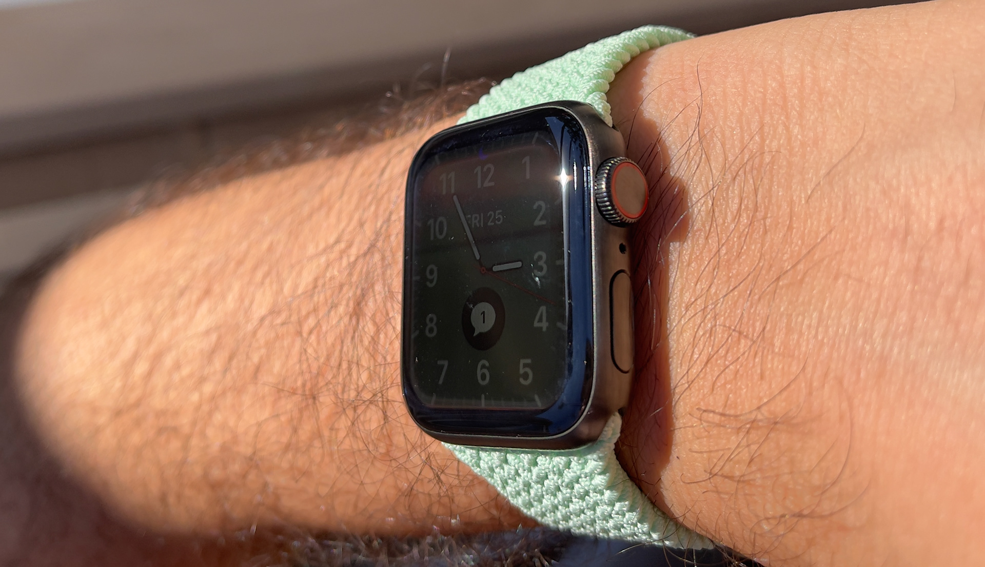
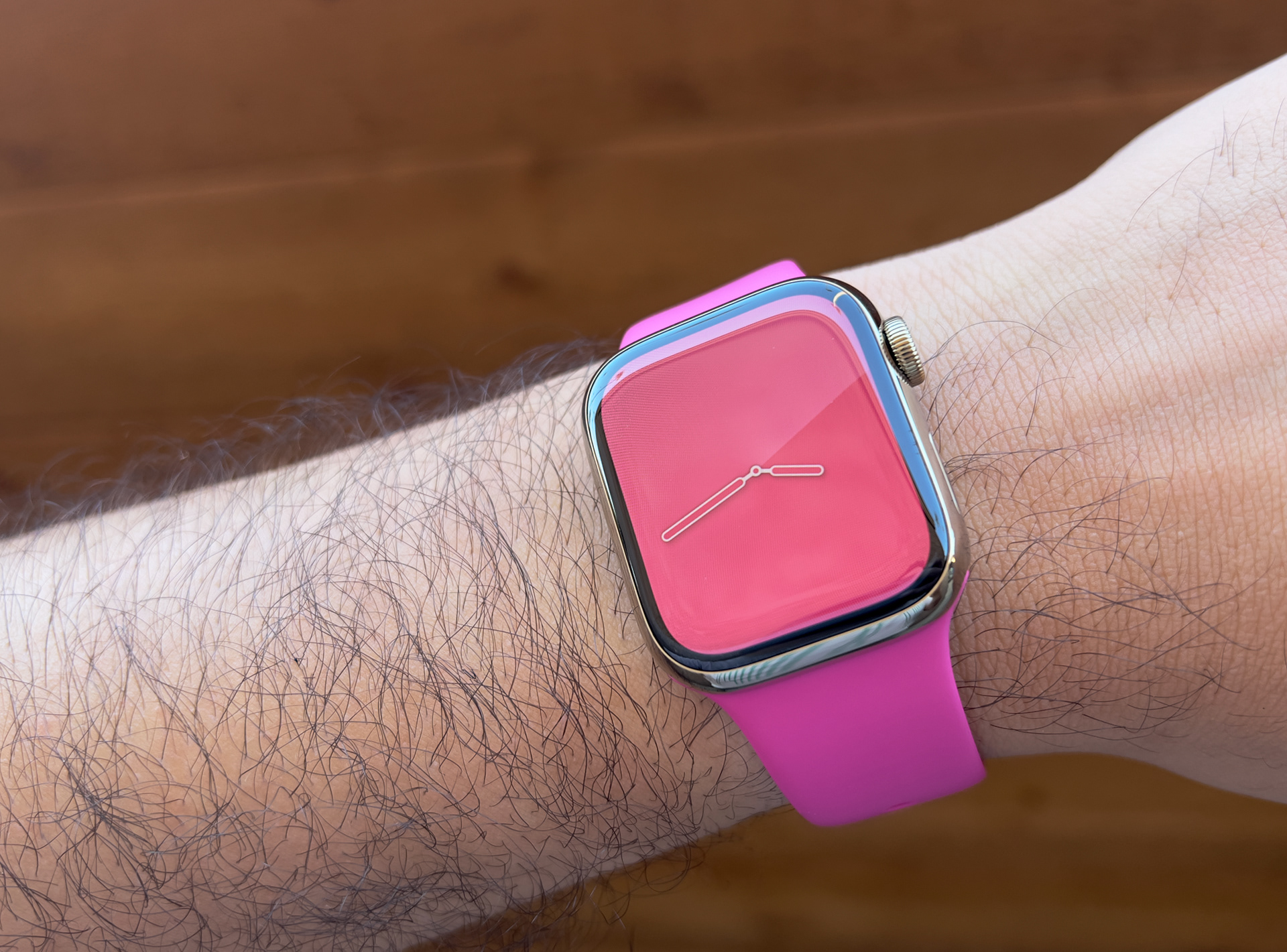
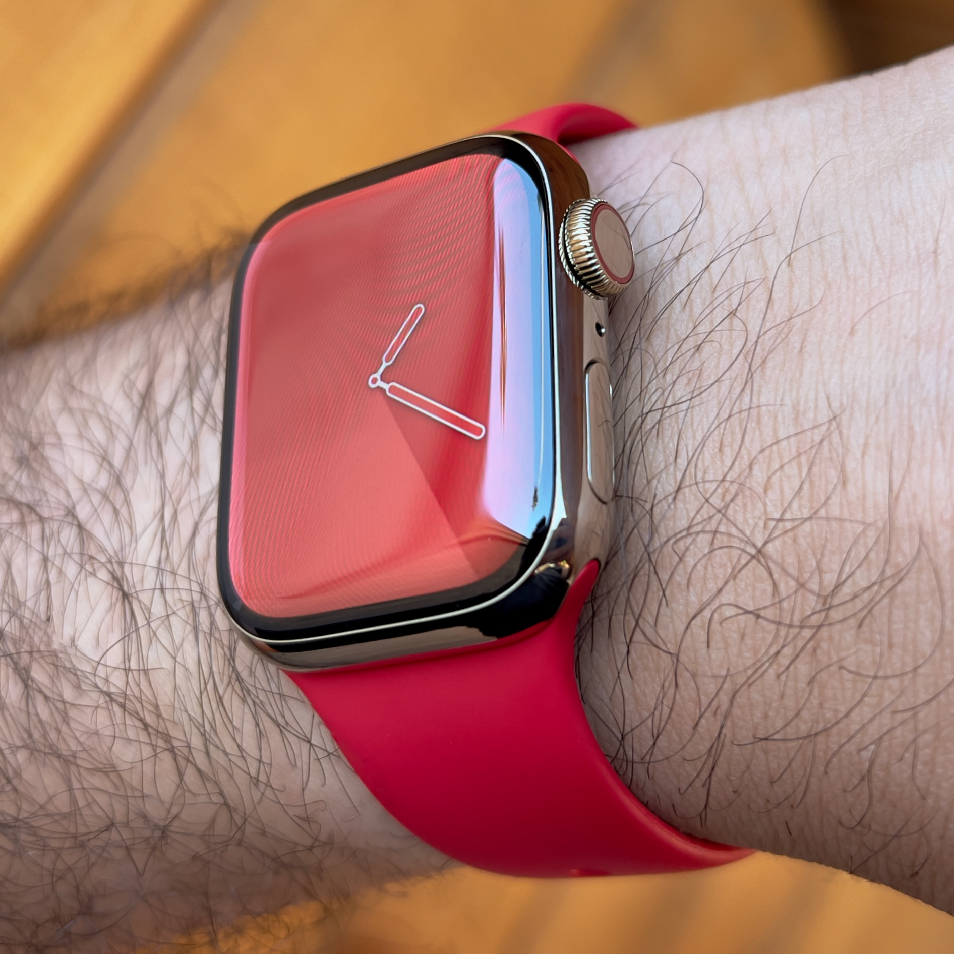
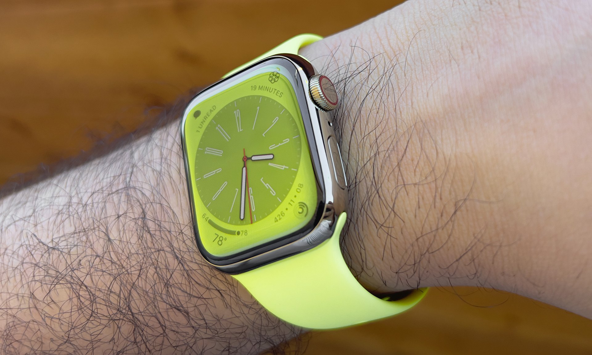
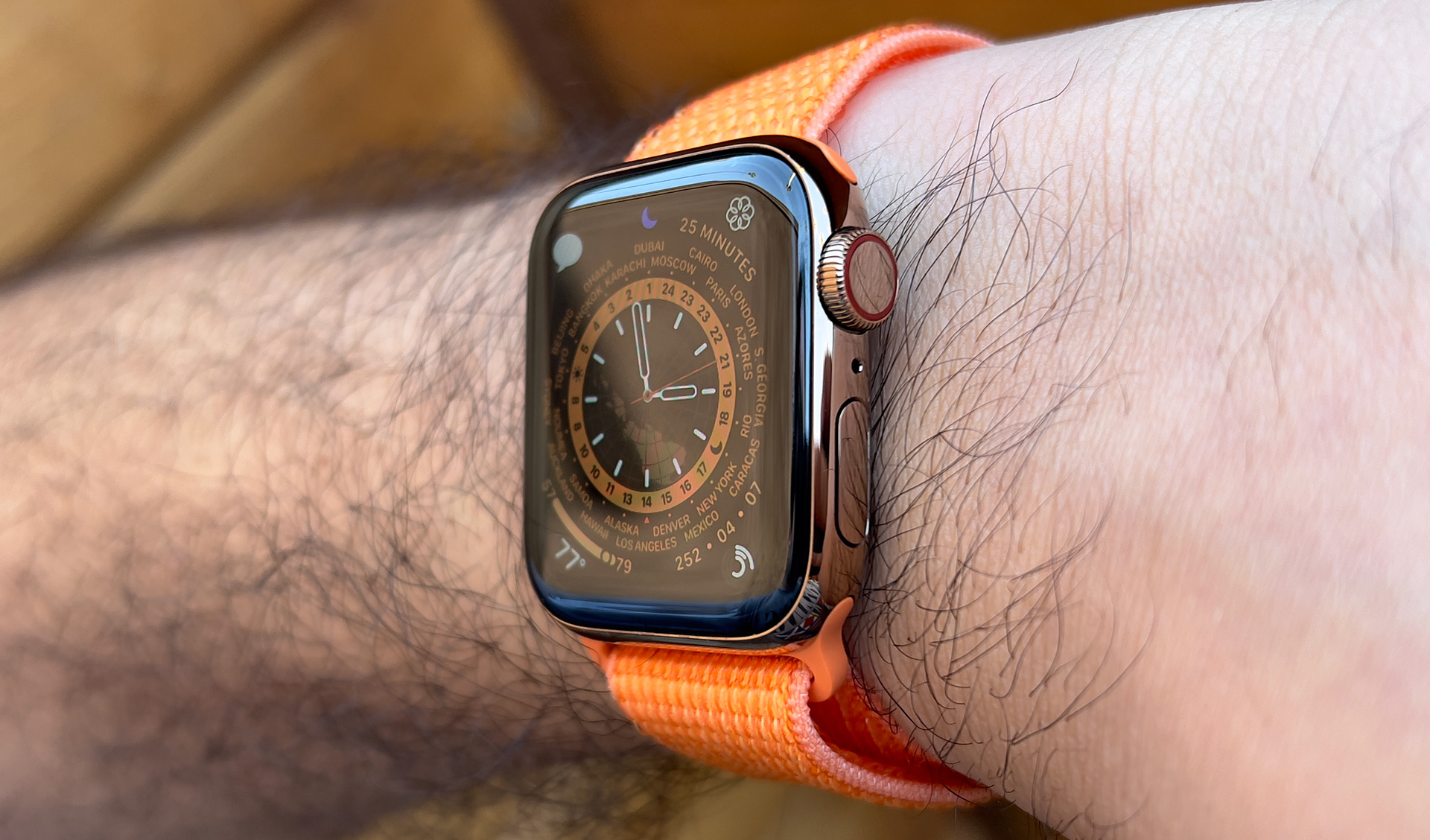
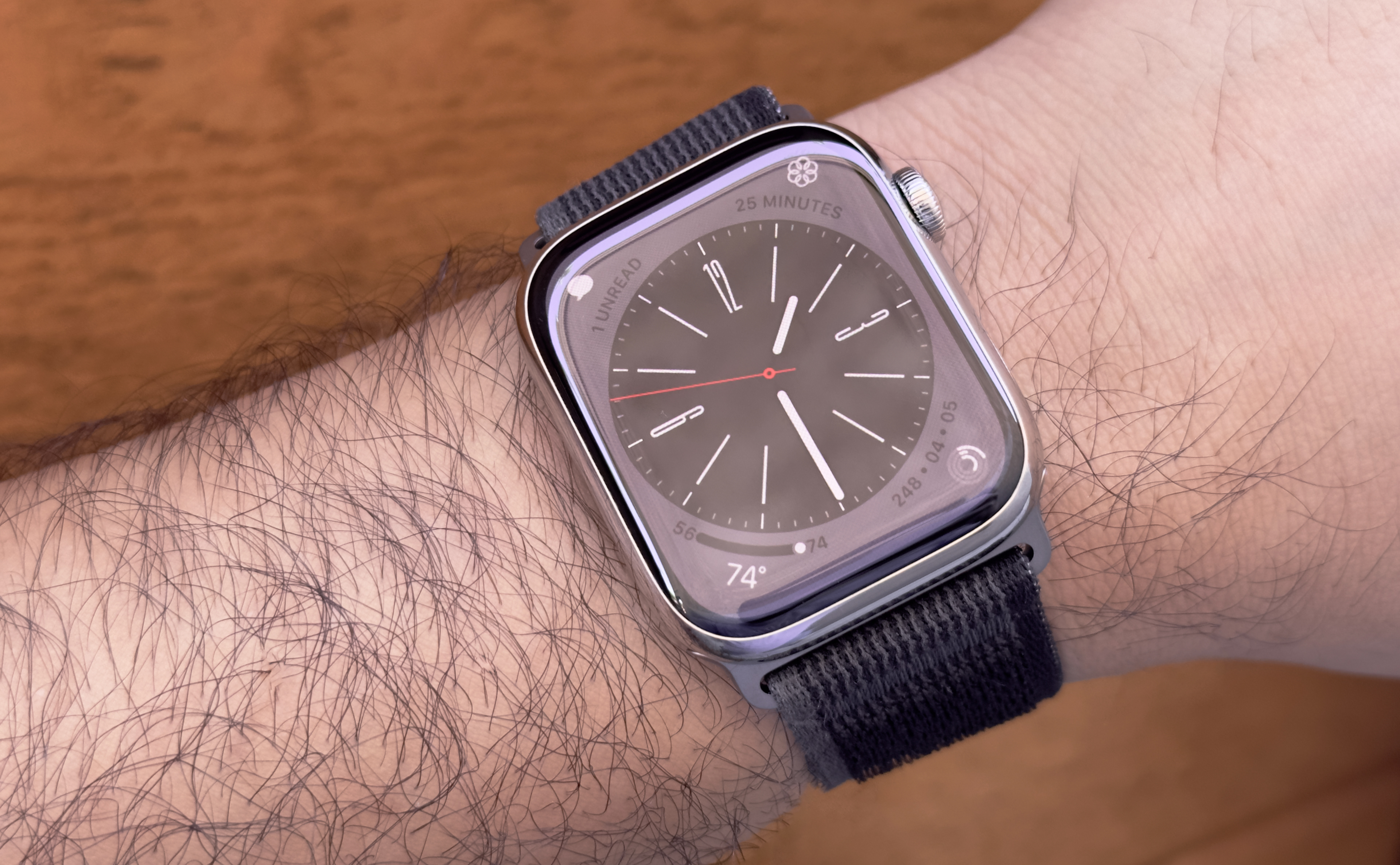
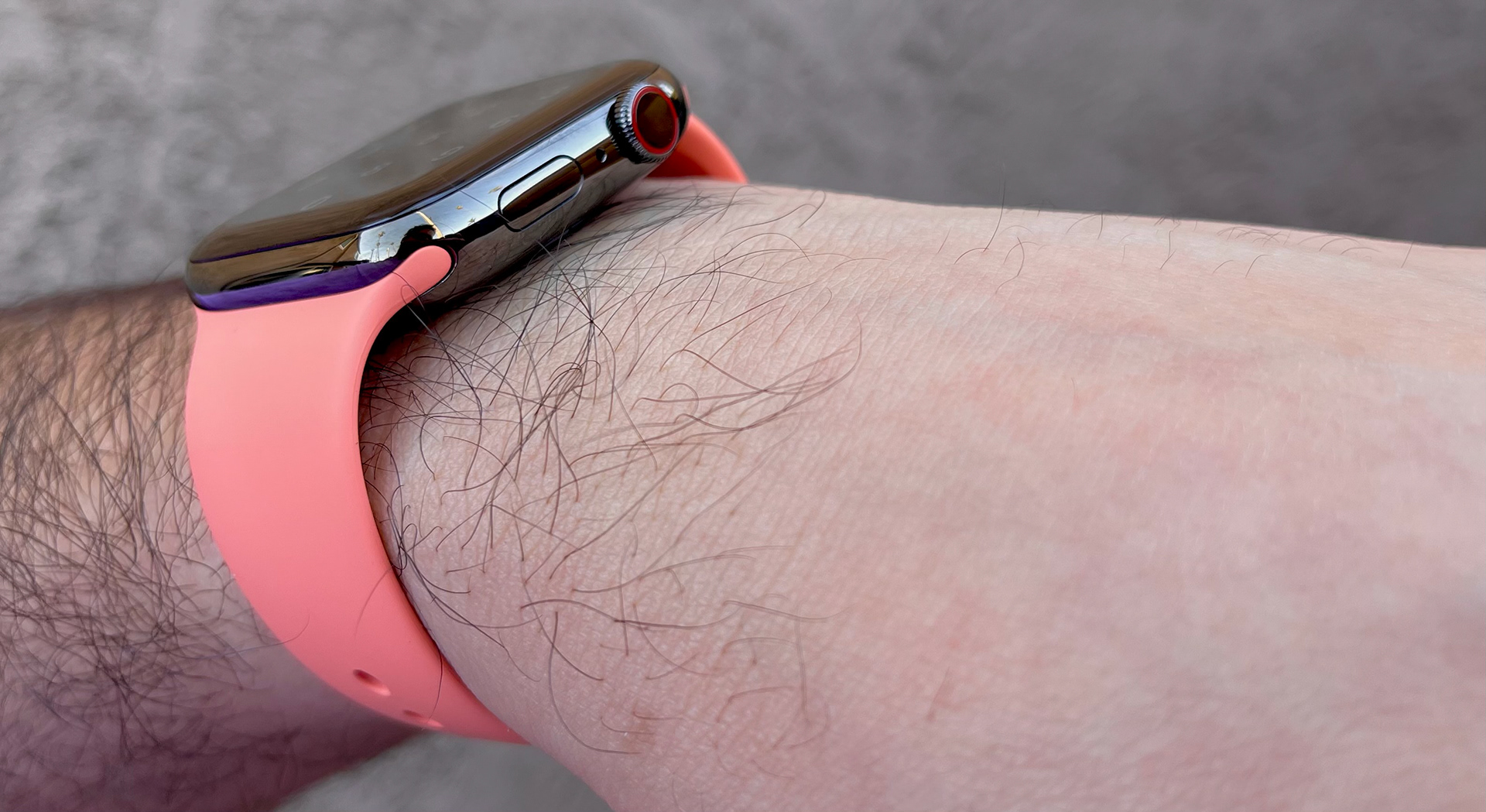
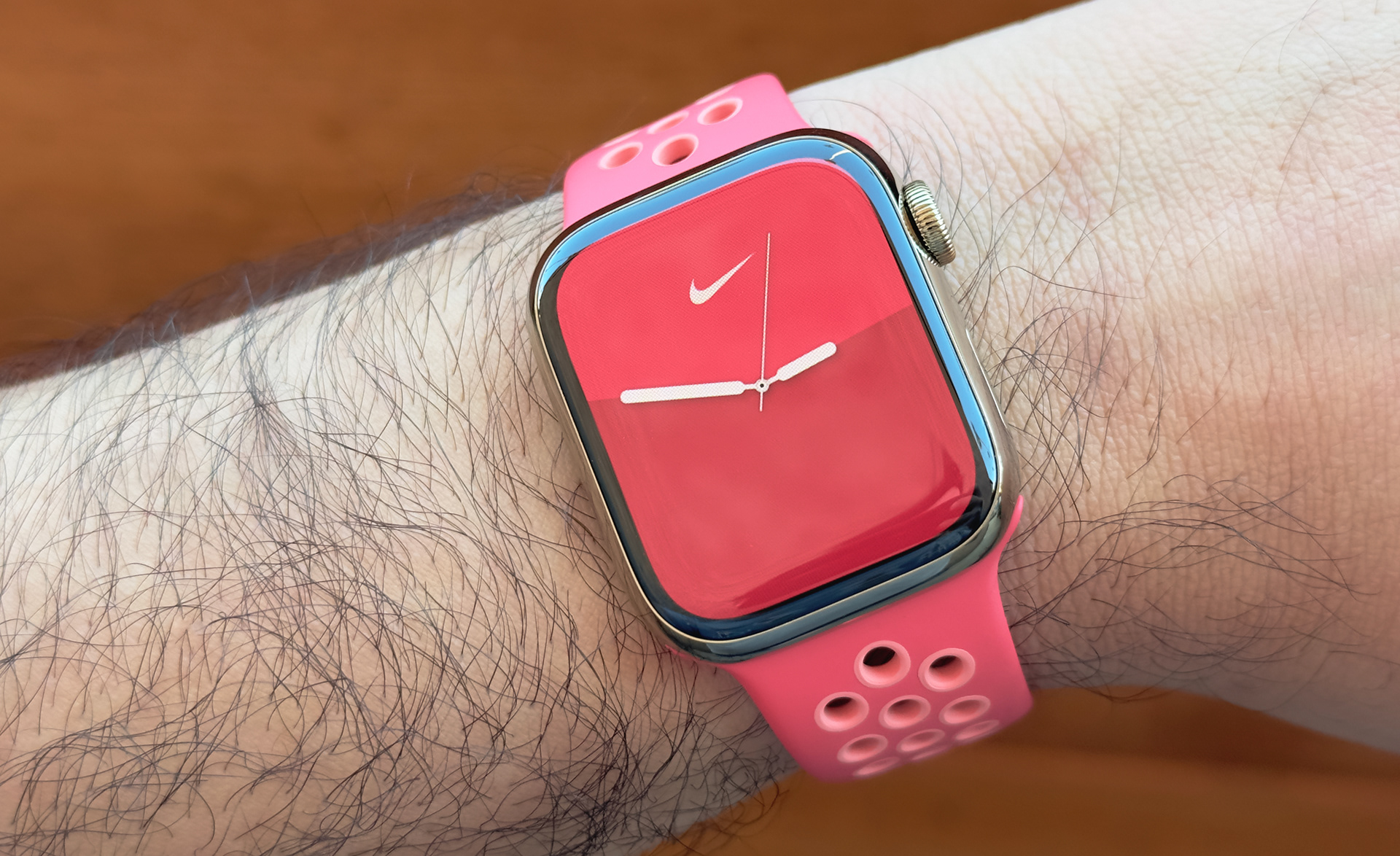
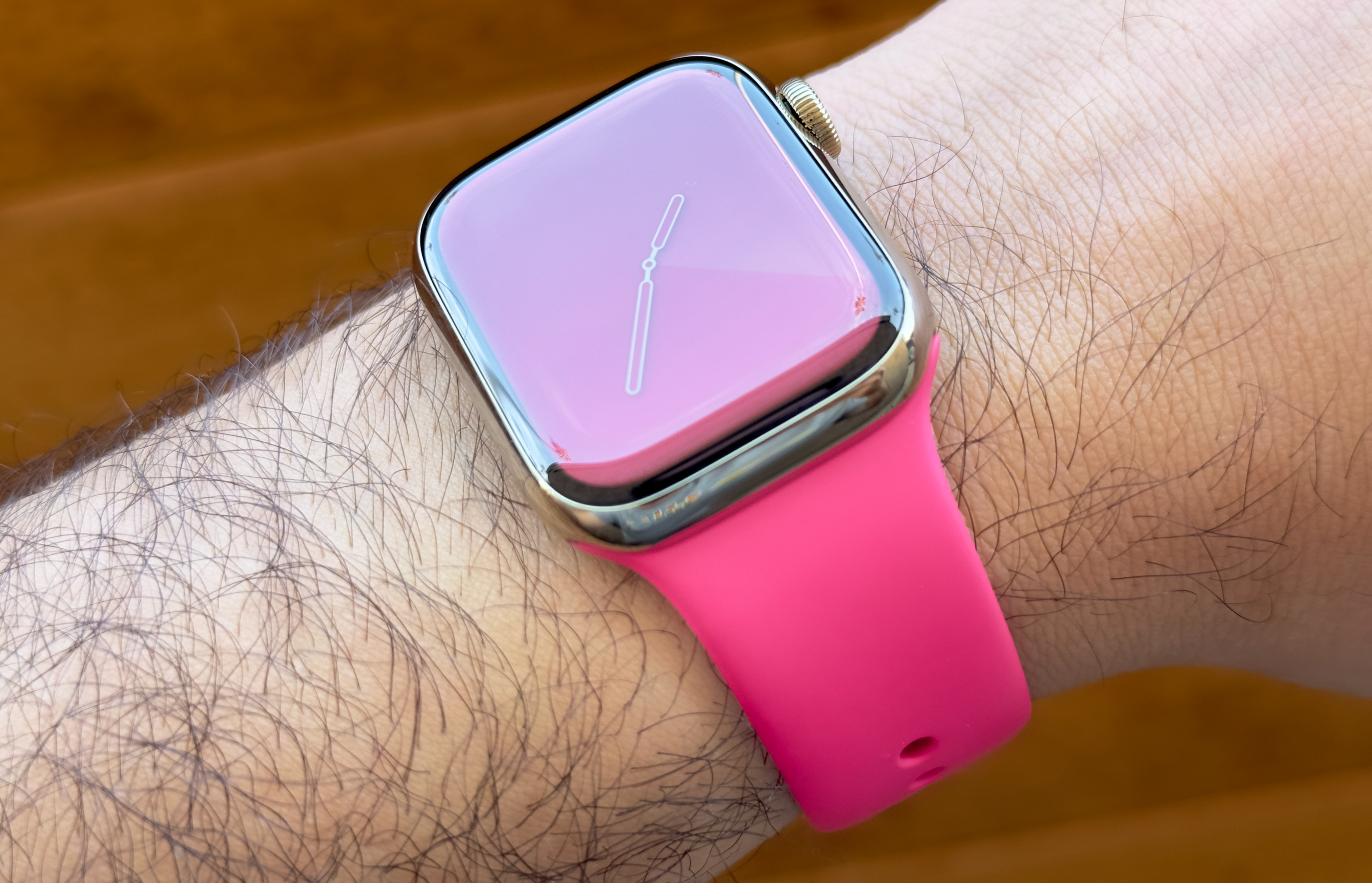
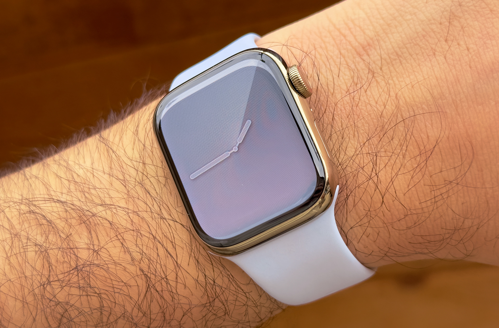
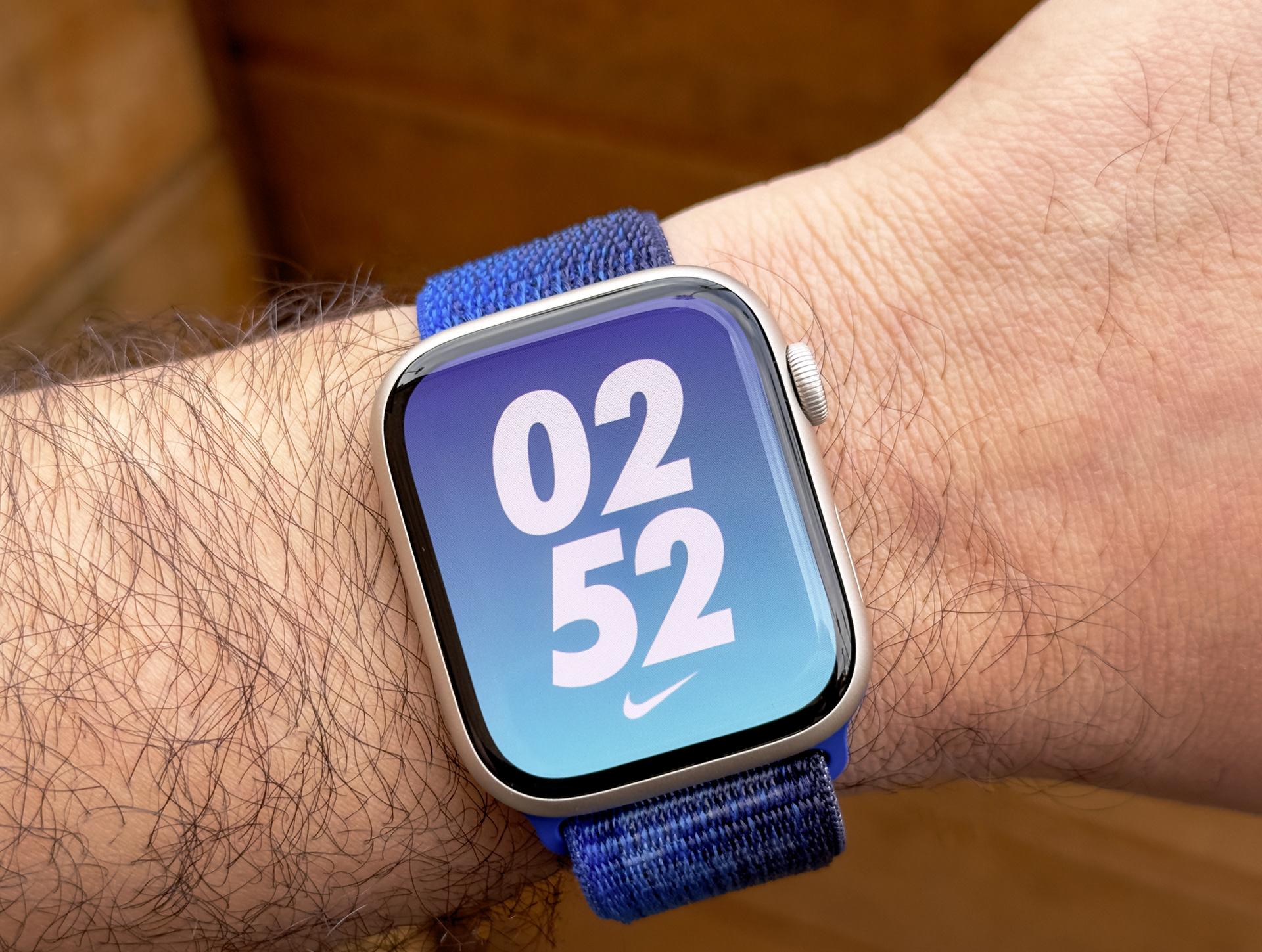
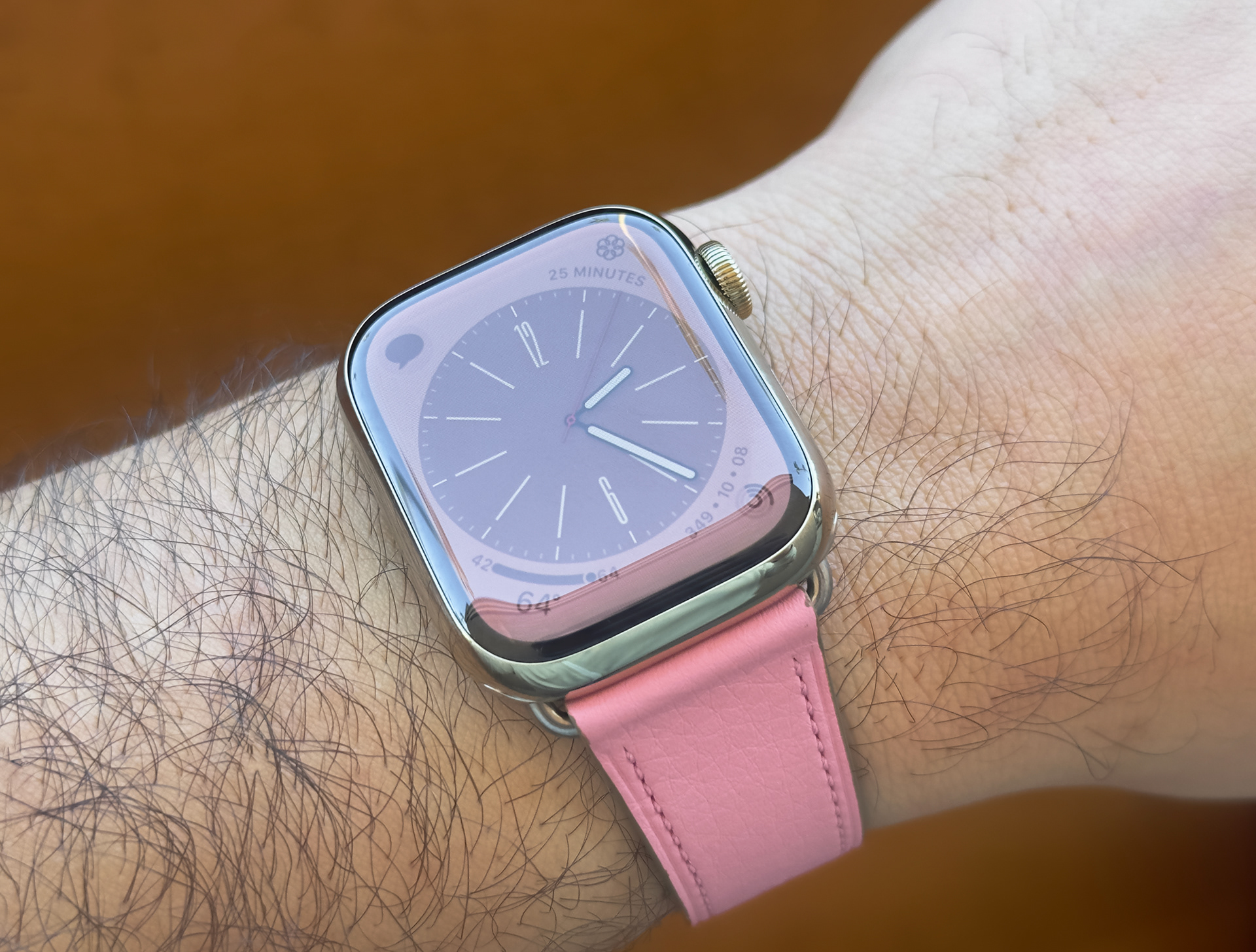
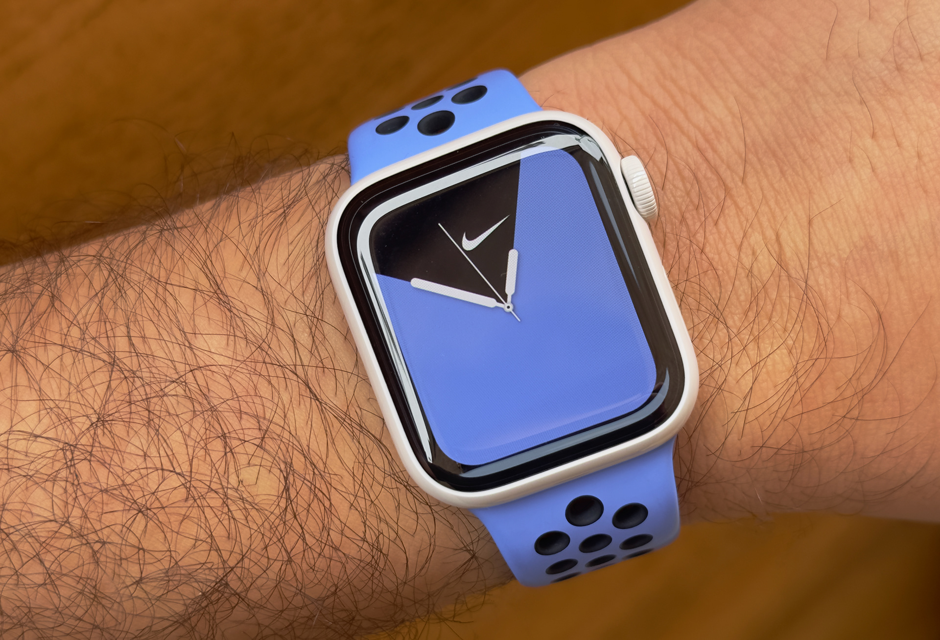
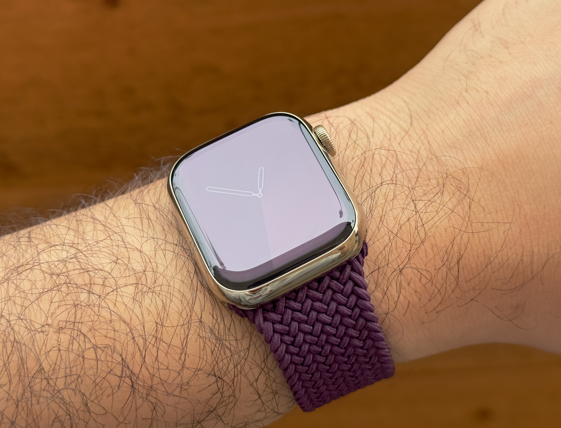
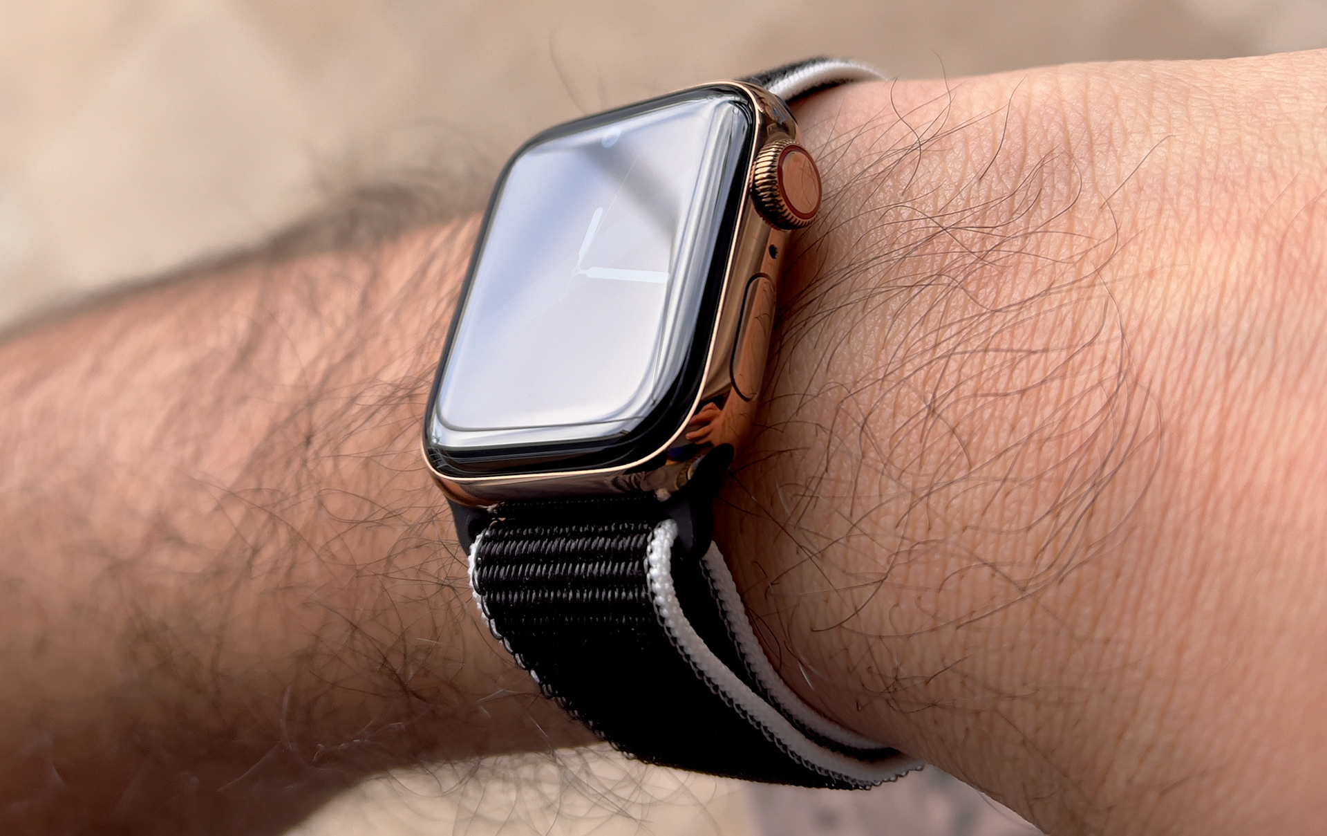
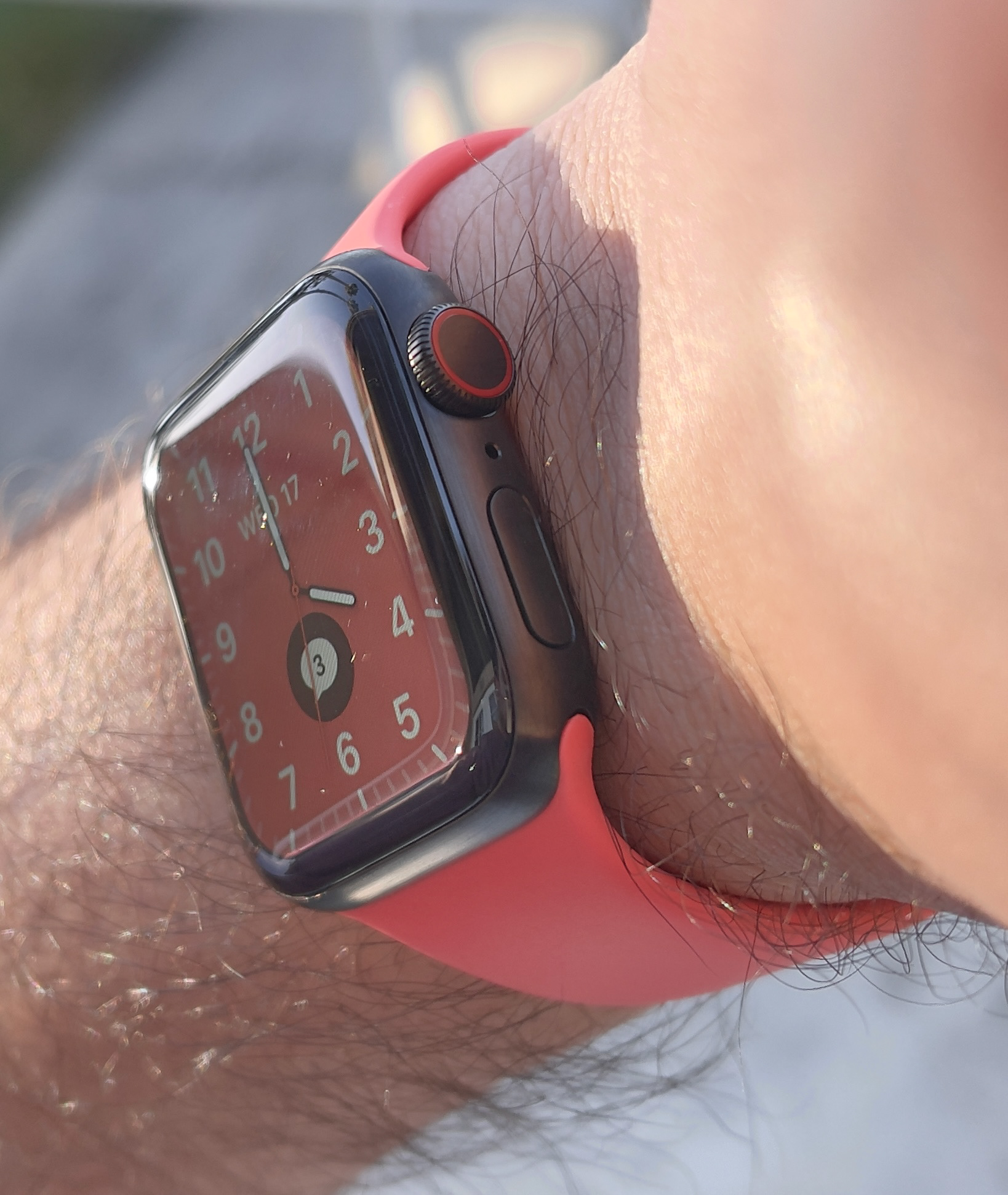
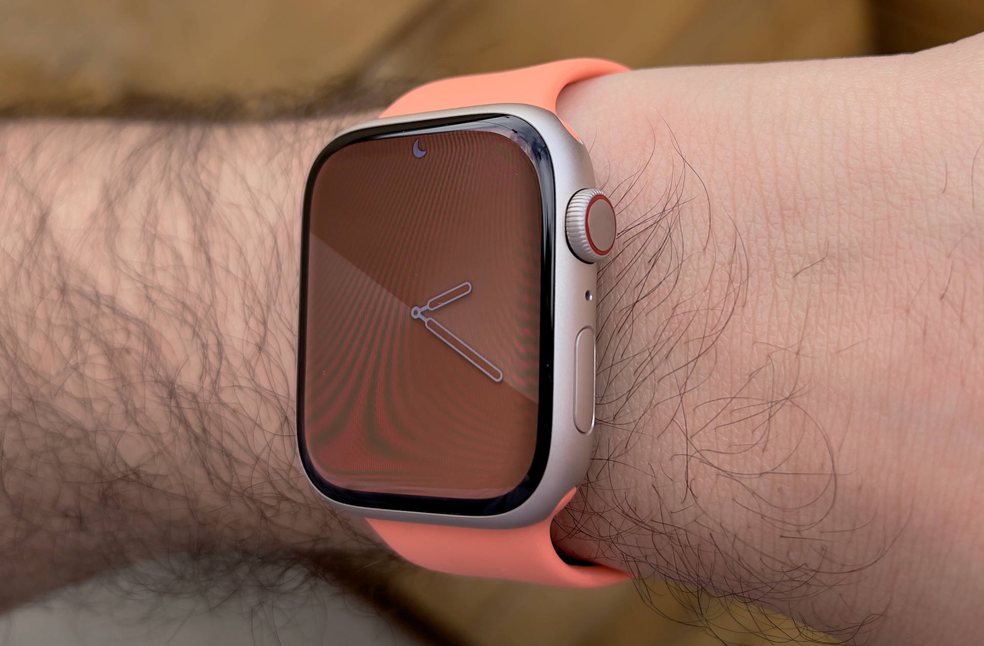
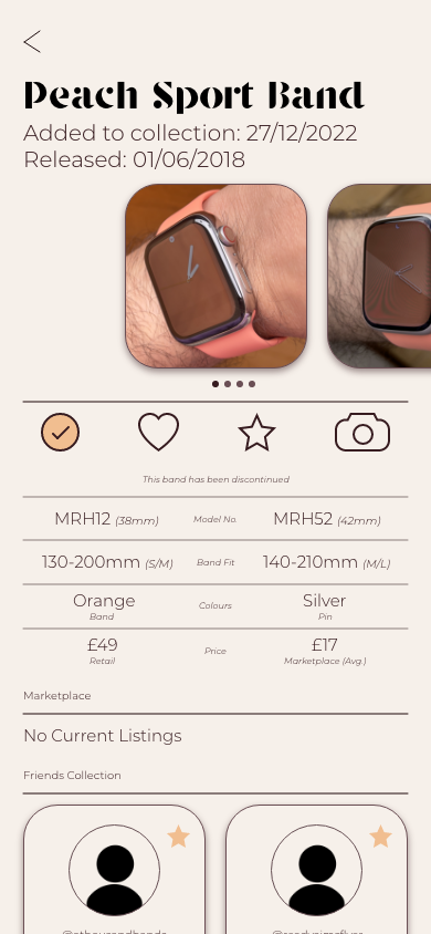
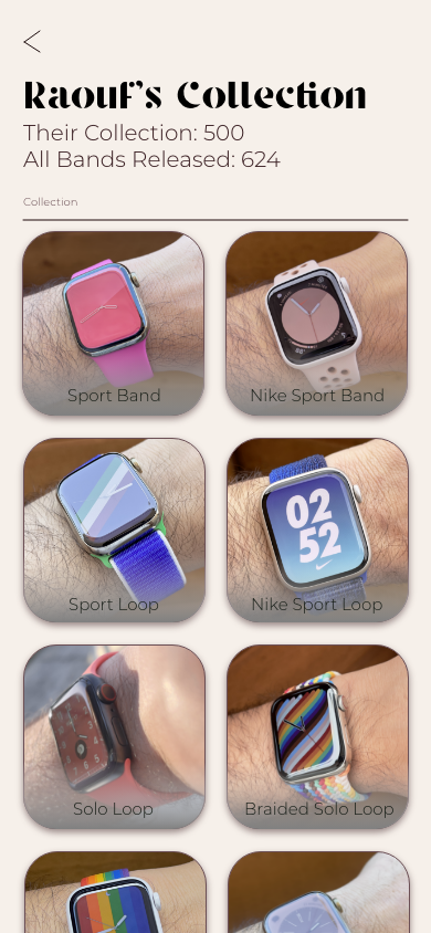
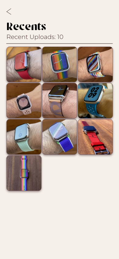
For the photos used within the app, I was given permission from a friend/discord user that has an extensive Apple Watch Band collection. Almost 500+. They have very clear composition and excellent colour correction to ensure that the correct shade is shown within the photo. These photos are often more reliable than the stock photos used by Apple on their website. Also, using photos from one person meant that there is consistency throughout the photos used and gives BandTender a more refined, professional look.

Prototype
Figma
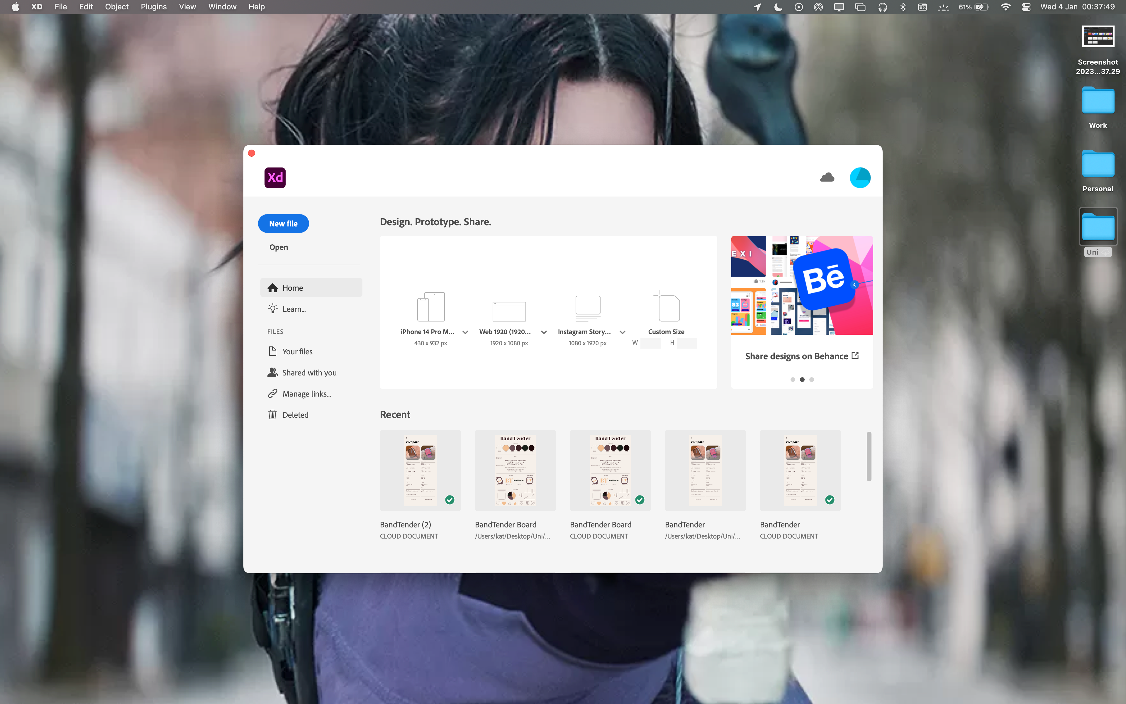
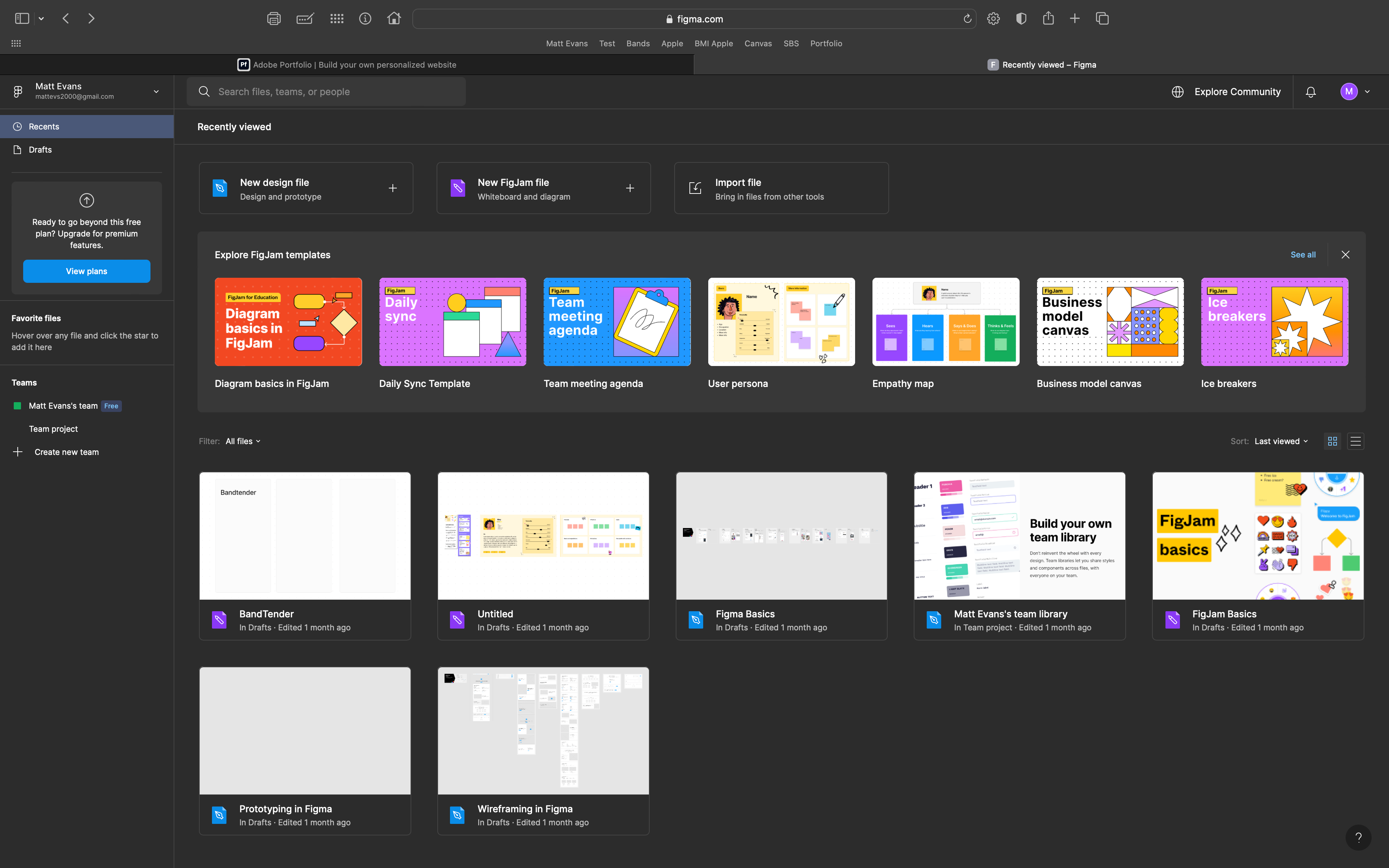
At the begging of the semester, I tried to learn figma for this project and to have another software in my skillset. I first tried figma on my iPad using an Apple Pencil and then moved on to using my MacBook to gain a good understanding of how the two operations systems worked together. However, due to time management and workload, I felt I didn't have sufficient time to learn figma enough to create a working prototype of BandTender. I therefore moved back to Adobe Xd, where I have more experience and more confidence in the work that I can produce. In my free time, I intend to spend more time learning figma and gaining confidence switching between Mac and iPad. this will be beneficial to me in the future for employment as I can use multiple softwares.
Adobe Xd
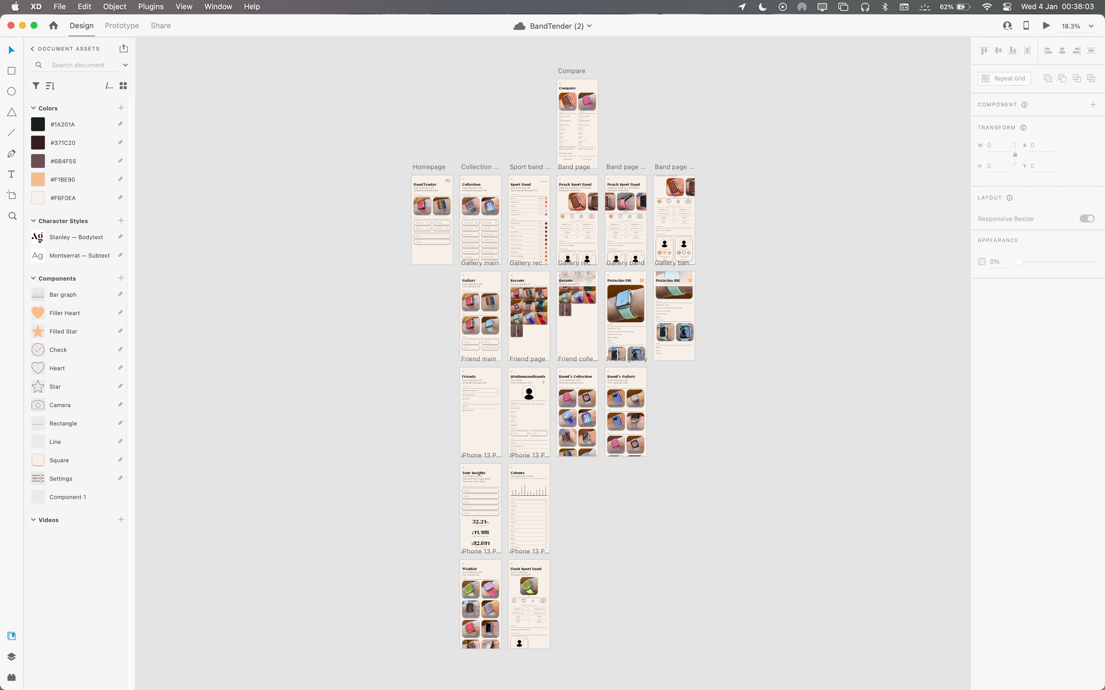
Having used Adobe Xd throughout my college education and my University undergraduate degree, I felt confident creating a working prototype of BandTender. I first started by sketching out a lo-fi wireframe in a sketchbook and then moving on to digital work creating hi-fi wireframes and the final project within Adobe Xd. Completing the sketches early allowed me to work at and edit my designs throughout the project and refer back to them when designing assets and the UI. I also referred to Bandtender's competition, BandBreite, to see how they had laid out similar features and making sure that they were different to each other, while still remaining clear.
Development
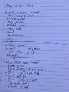
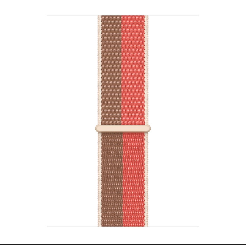
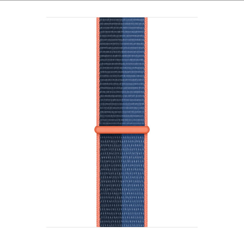
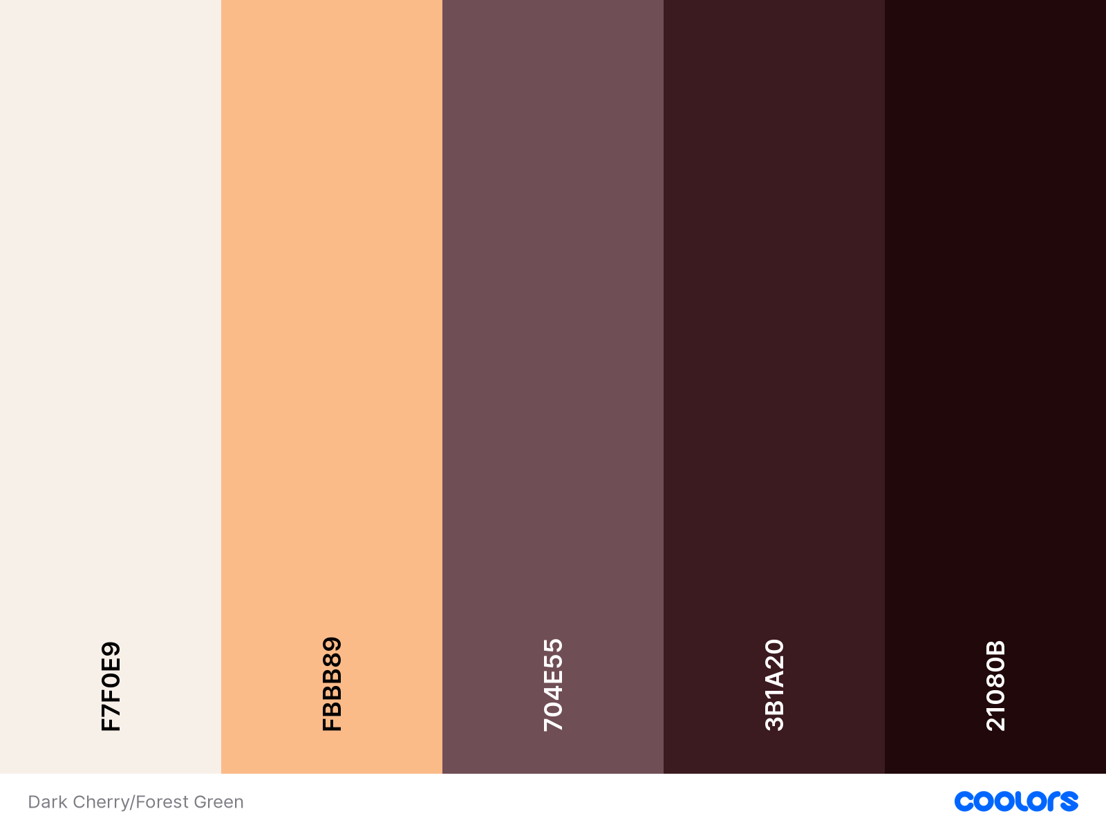
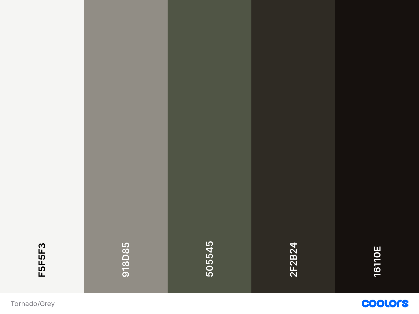
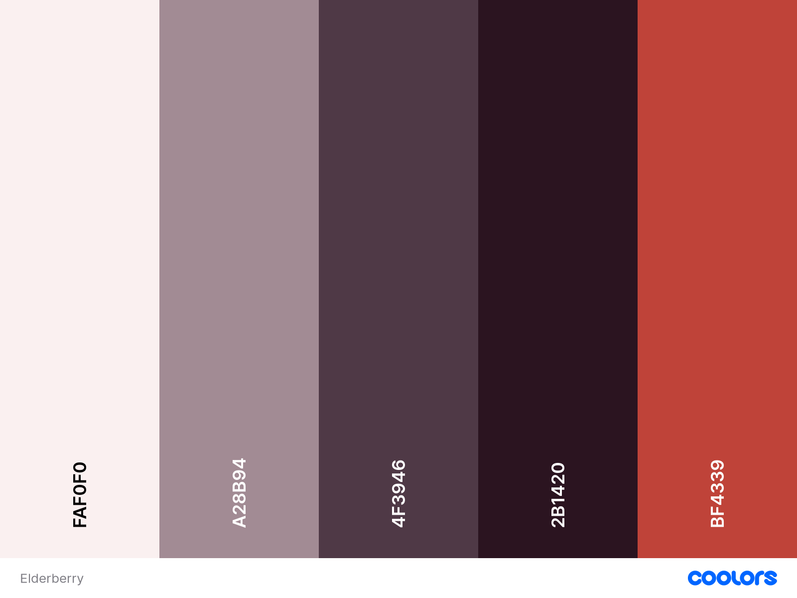
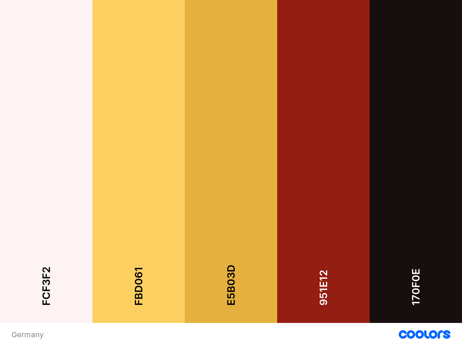
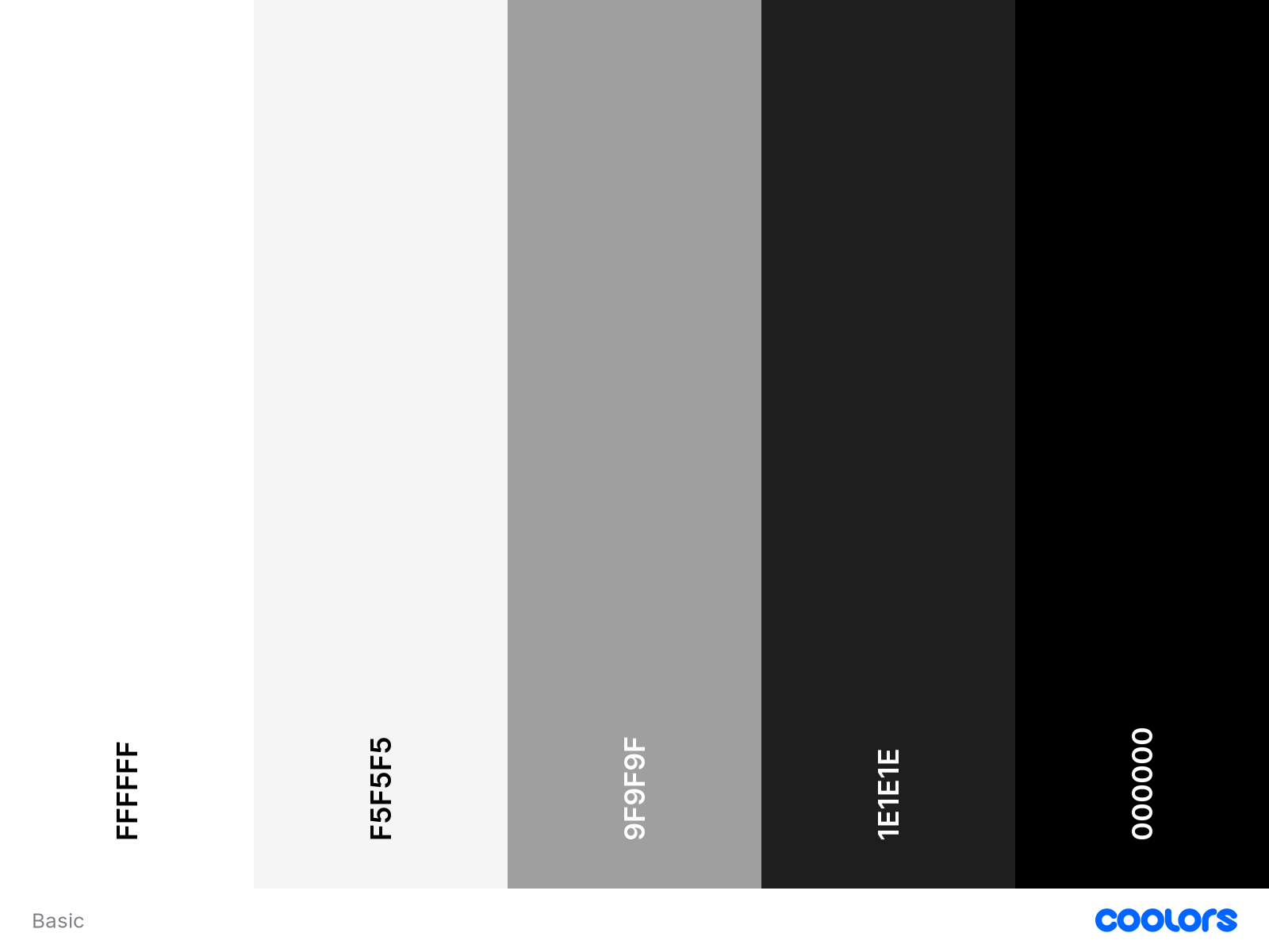
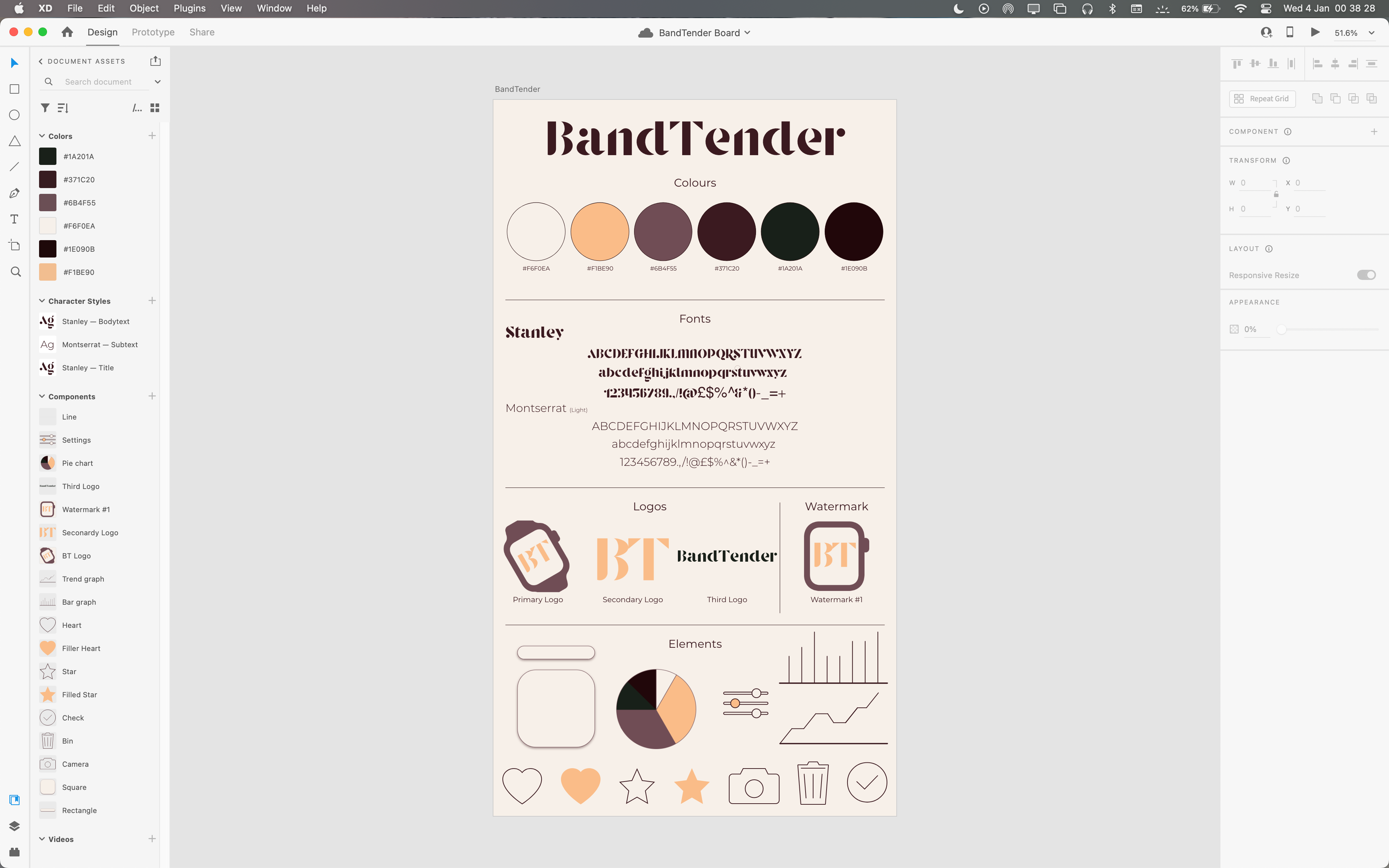
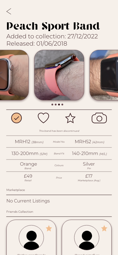
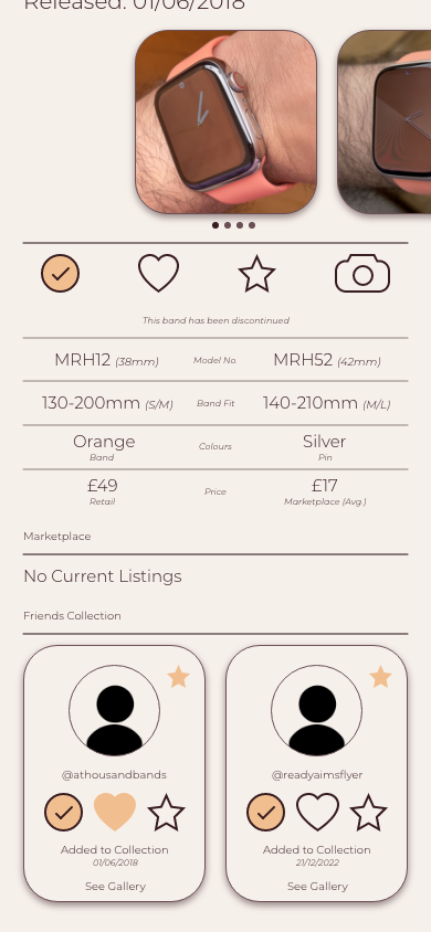
When I first started designing, I was using a monotone colour scheme of black, grey and white. However, this looked visually similar to bandbreite, and very bland or boring. I then started to use a different colour scheme based off the Apple Watch Band, Dark Cherry/Forest Green. This gave BandTender great warmth and a welcoming feeling while also looking professional and complimentary. The fonts used within the app are Stanley - which is used for titles and facts - and Montserrat Light for the body of the text. These two fonts are easy to read, even on small phones, while also looking elegant and refined. I was keen to use Sans Serif and Serif fonts to differentiate between pages and aspects of the design.
I also designed a Home Screen icon to show how BandTender would look on a users phone, while also being able to see how the logo stood out amongst others and if it needed any adjustments.
Prototyping
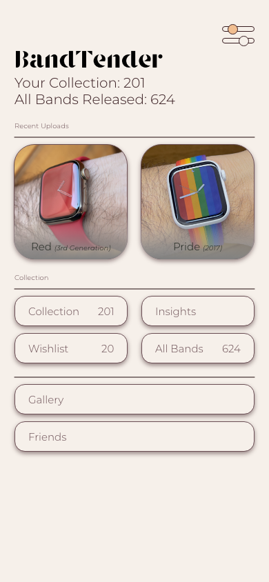
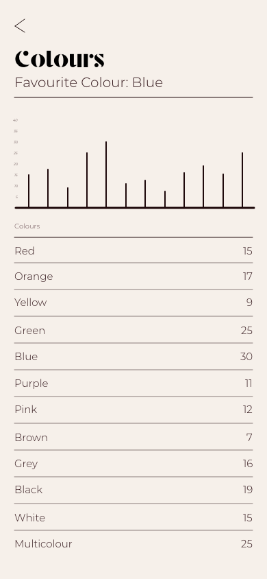
Once the UI design was complete, I was able to start prototyping within Adobe Xd to see how BandTender would function and if the usability was easy. This also allowed me to spot any mistakes or adjustments needs to be more user friendly. Most adjustments being font size being too small, but once viewed on a mobile phone, it was much clearer to see how BandTender would look to a user. One great and useful feature of Adobe Xd is being able to see live updates on a mobile phone plugged in, meaning that I could see how the design was visually looking to a user and able to make tweaks quickly and accordingly. Once the prototyping had been configured and edited, I recorded myself using BandTender as a user for a proof of concept and to understand how the app functions. I also sent BandTender to a friend for feedback to make any last minute adjustments and to get their opinion on how the app functions. They thought that the app looked great and functioned well for a prototype and are excited to see where BandTender will go in the future - being an Apple Watch Band collector themselves.





Analyse
Conclusion
Overall, I thoroughly enjoyed this project and creating BandTnder as I have a deep connection to the idea. As it an alternative to an app that I use every day with features that I wish were incorporated. If I were to carry on creating and working at BandTender, I would like to add more aspects to it such as a Marketplace for users to sell and buy bands from authorised users at a fair price. This means that bands are shared between like minded collectors and can help each other build collections however they desire - either collecting all bands ever sold by Apple, or to complete a colour scheme of personal preference. I would also like to add a chat function within BandTender, both a forum server, similar to Discord, where users can talk all about bands with other collectors. And also private direct messages between users, either to sell and buy bands or to make friends with people of similar interests. Another aspect I would like to add is similar to BeReal, where wearers would have a certain amount of time to show off their Watch and their band, wherever they are. Another notification I would like to implement is 'Band of the Day' where all users receive the same notification generated by BandTender making a suggestion on which band to wear that day and to show it off with everyone else in the public server. This would create a sense of community as users are able to join in and participate in a group aspect. One final aspect I would like to design, but due to time constraints I have been unable to do so, is to create a timeline of the users bands. To show when they added bands to their collection to watch their collection grow but to also know how long they have owned a band.

