Brief
The Brand Design and Strategy brief was to create a set of brand guidelines and an accompanying advertising strategy. I decided to focus my project around building a motorcycle community called Torque, that has a dedicated app, targeting new riders in the Hampshire area, later expanding throughout the UK.
Elevator Pitch
Torque is the best place to find and connect with other motorcycle riders. If you’re just starting out or an experienced rider, you can find out about group rides, get new gear or find specialised motorcycle events.
So if you’re riding around the UK, the Torque community is easy to join just by downloading the app and joining the Discord server.
So join us and get Tourqing!
Aims
Torque aims to;
- Create a community for new motorcycles riders.
- Spread tips for new riders when riding a motorcycle or taking care of one.
- To meet people with the same hobby and to reduce isolation by organising events or group rides.
Insights
While developing an idea for this project, I focused on a gap in the market that I noticed in my area as I am an inspiring new motorcycle rider. I thought that creating an app and community centred around this would be great to promote within training centres that riders are encouraged to join once they have their CBT or licence.
Features
The Torque app will have many features that the user will be able to use while wearing full gear (gloves, helmet etc.) It will also be accompanied by a Discord server with the same name and later have an Instagram page (which hasn’t been completed during this project) the Target audience is younger new motorcycle riders, but all are welcome to use the app.
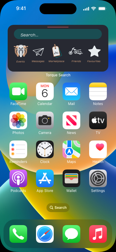
The main features are a marketplace where rides will be able to get gear from other rides (other than helmets as they should alway be bought new due to safety) a chat feature with private direct messaging or group chats. Other main features include creating and sharing routes, learning about and attending events and sharing your location with friends. All of these features will be quickly and easily accessible via the hot bar on the landing page of the app.
Hot bar showing different features, screenshot from XD file.
Time Management
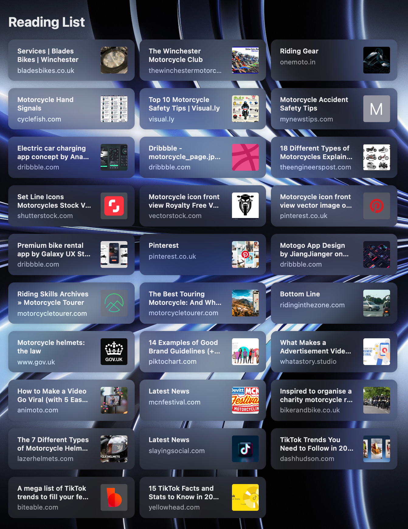
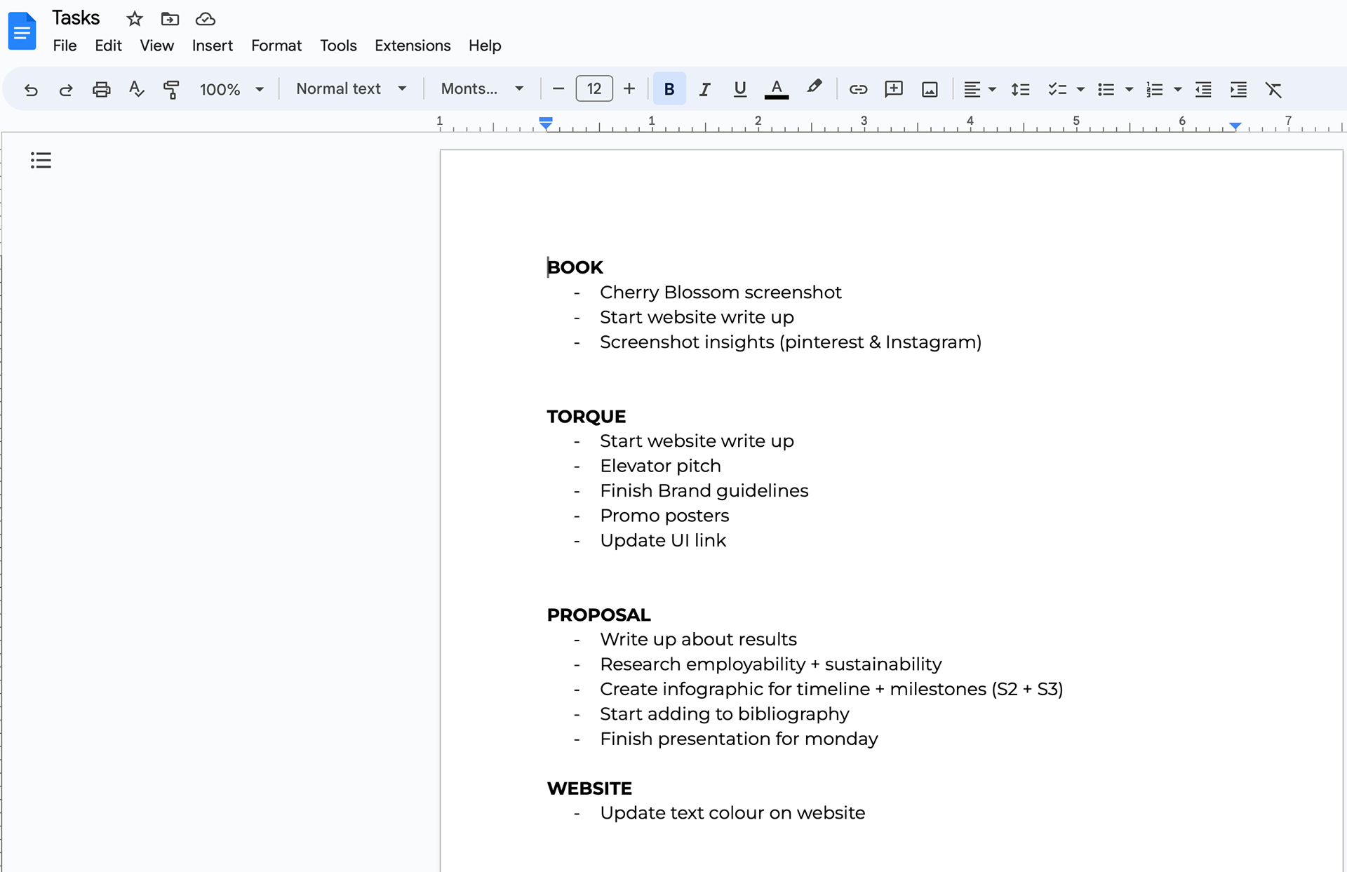
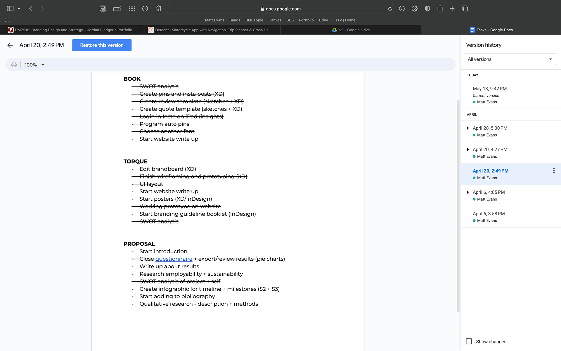
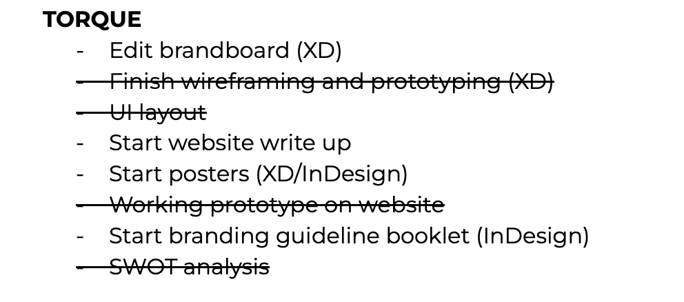
At the beginning of this project, I created a Gantt chart to follow throughout. I also kept a reading list of all the links I visited that aided me in my research and kept to do lists that I would update and print out regularly to make sure I was completing each task. I followed the Gantt chart and moved tasks around if there were other tasks taking priority, that needed to be added or due to poor time management on my own behalf.



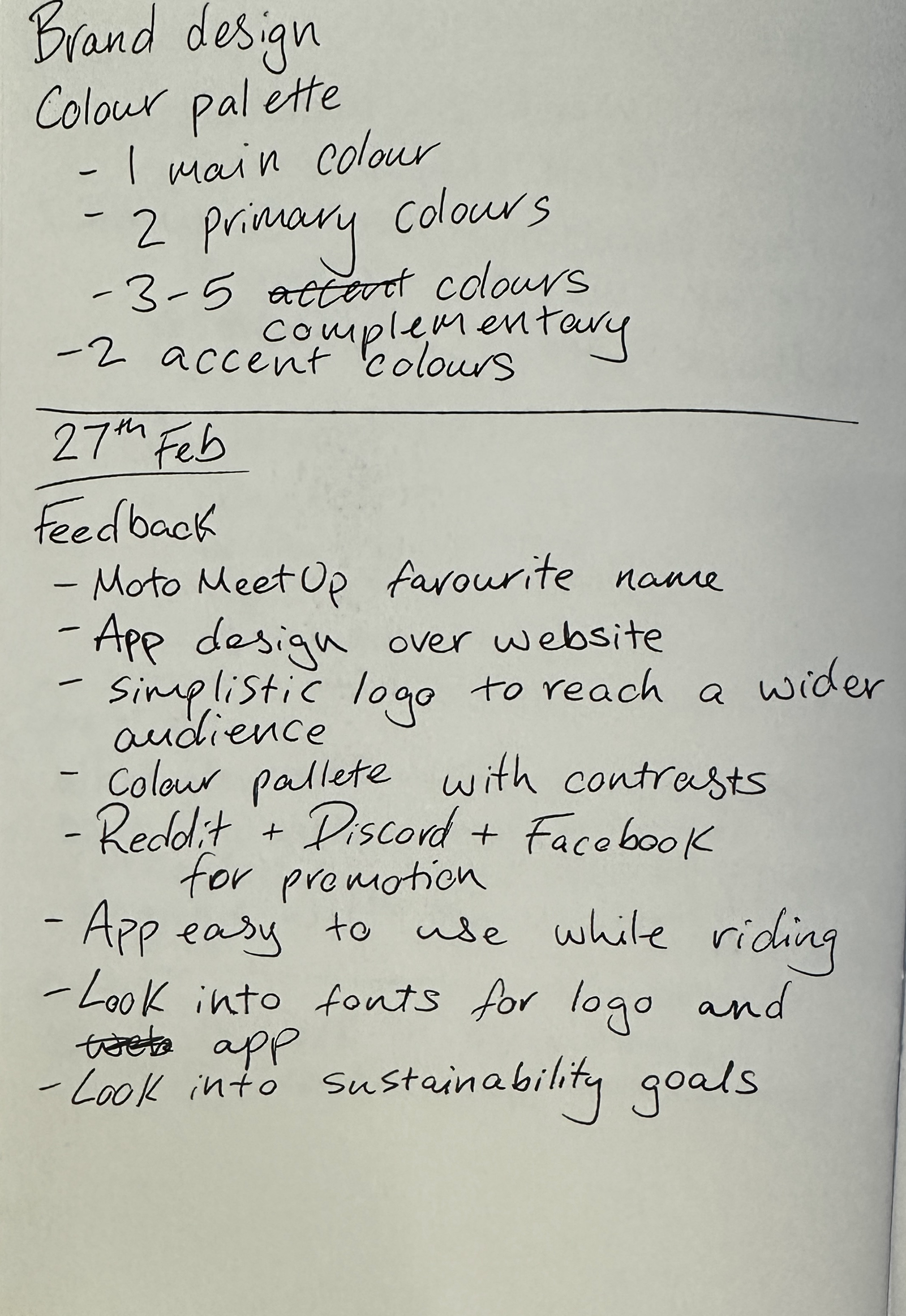
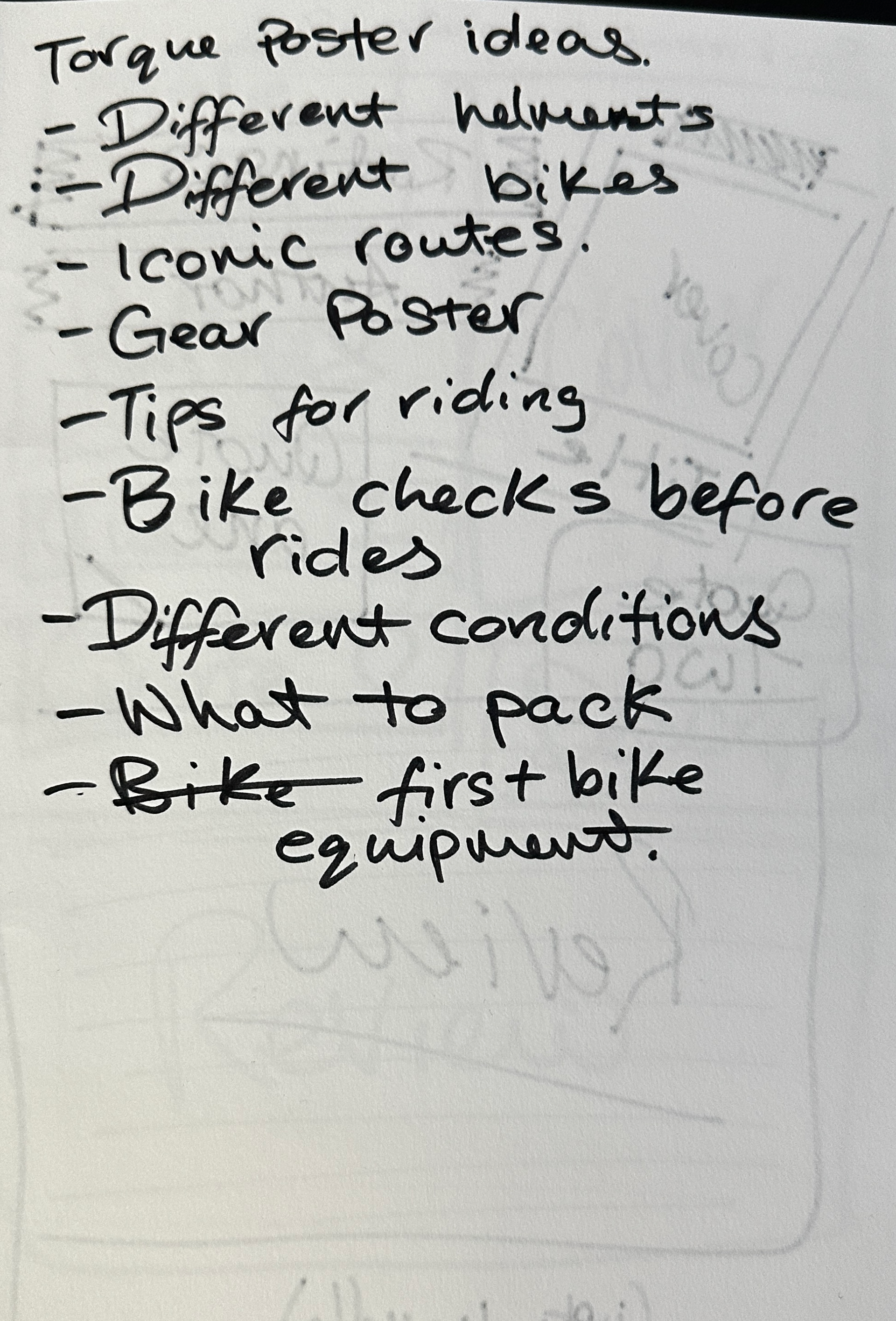
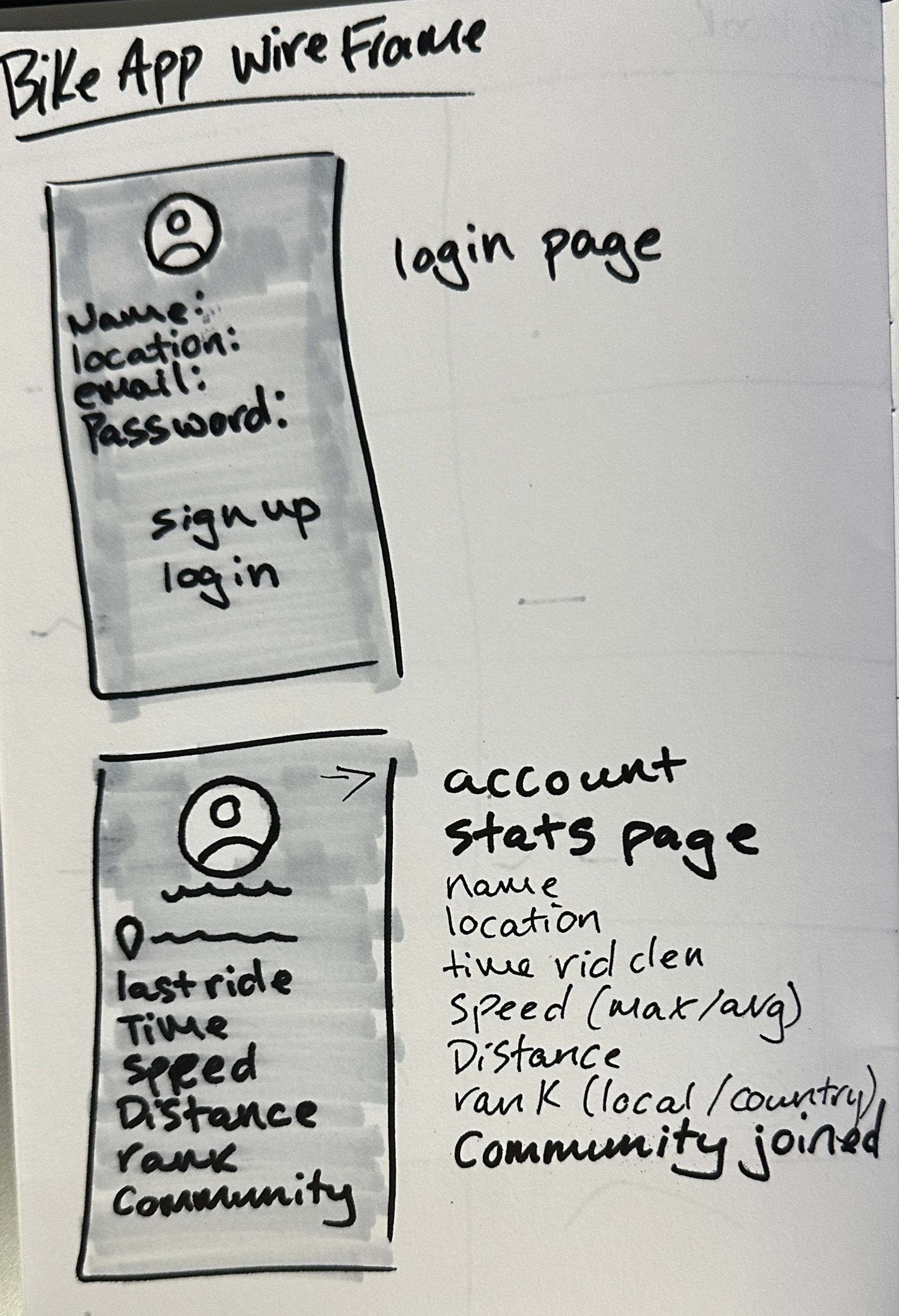

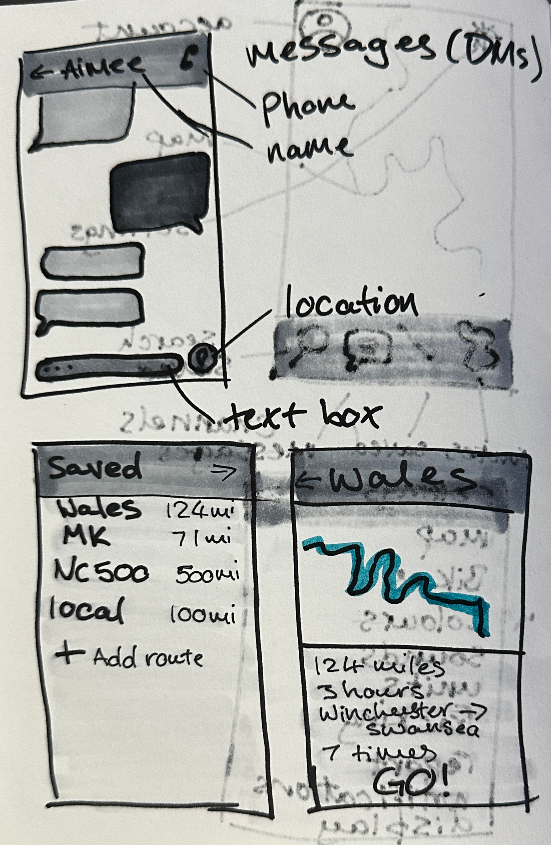




Sketchbook and iPad
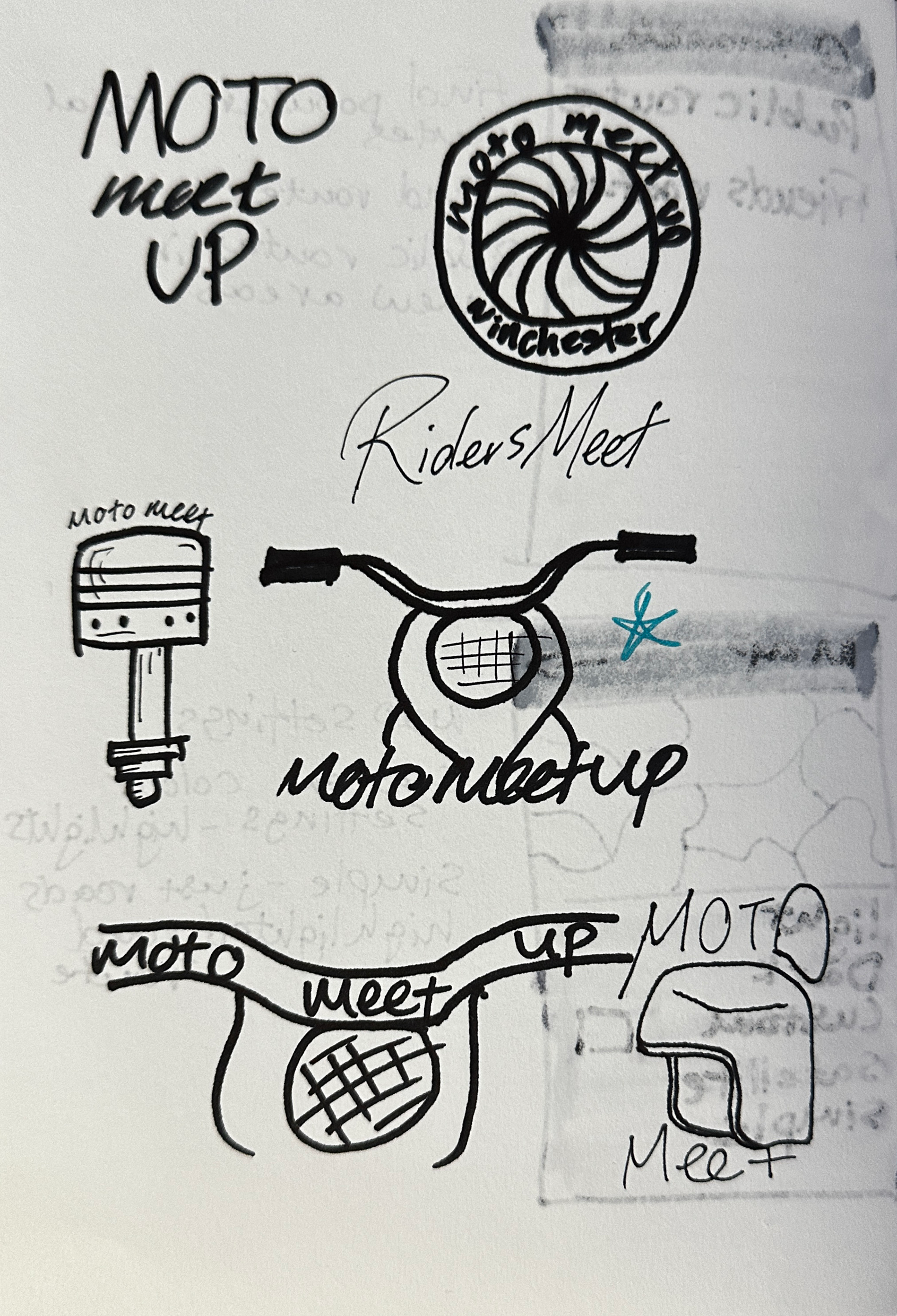
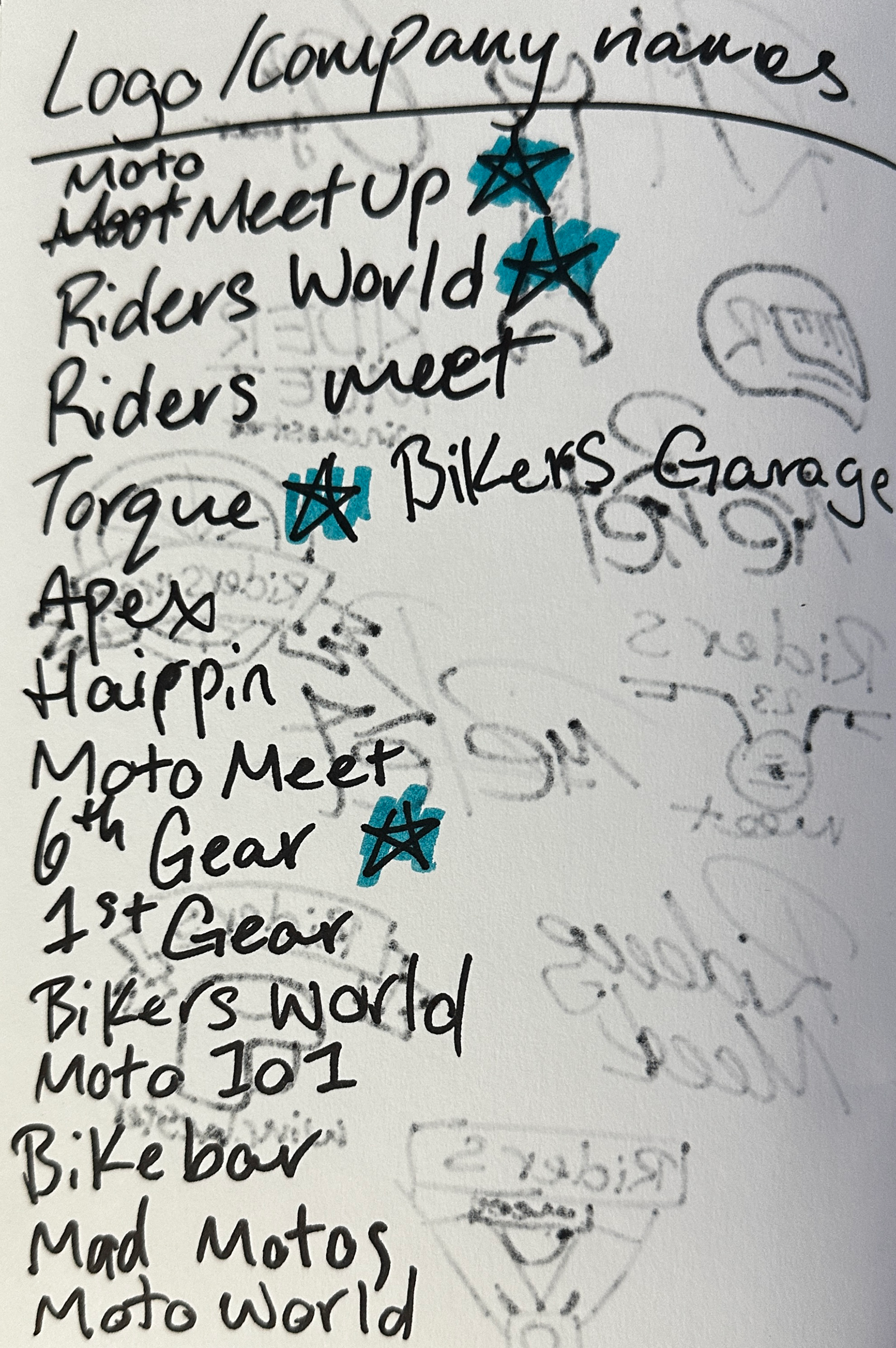
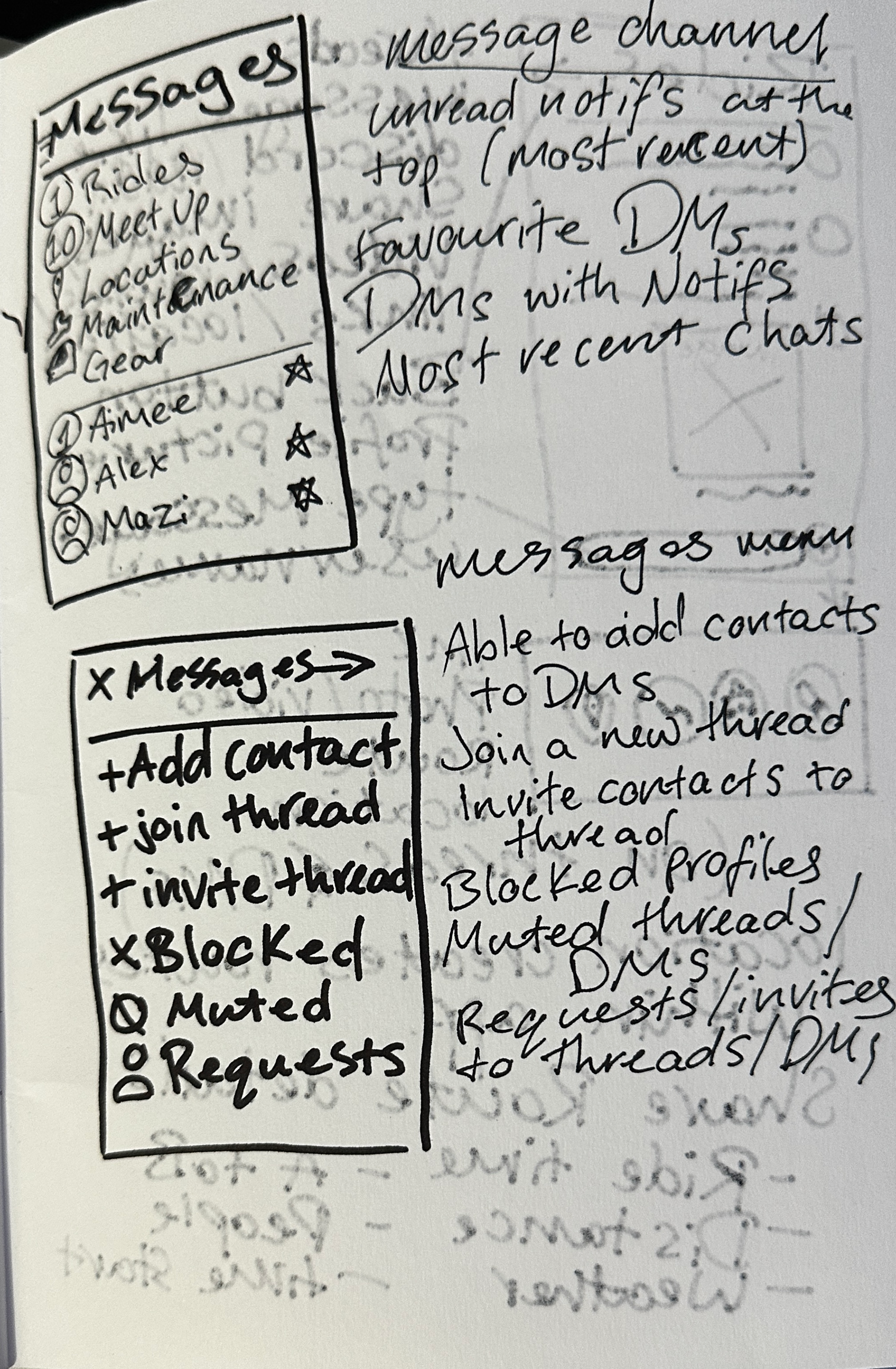
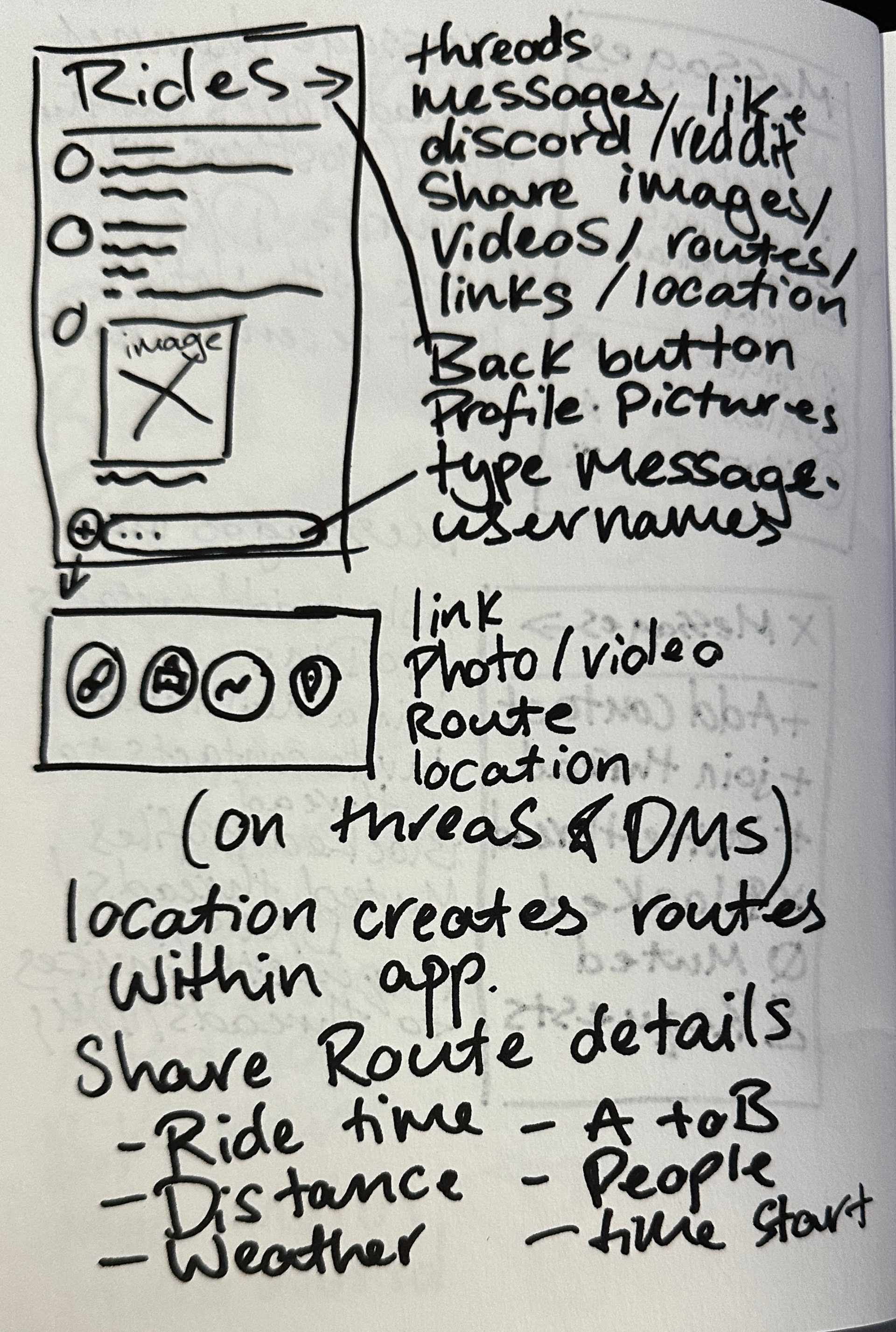
I kept a sketchbook with me during this project to develop my idea and to sketch out wireframes and logos while being able to edit them easily and get feedback from classmates. I was then able to import these through scanning my sketchbook and uploading them into Procreate to create digital versions, then importing them into Illustrator or Xd to finalise into prototypes and vectors. I decided to not keep a blog this semester to dedicate my time into my project developments fully.
Initial Ideas
My initial idea was to create a community with a social media campaign using social media and print media towards motorcycle riders in general. However, as the project progressed and I completed more research, I decided to create an app to promote within learning centres for new riders after speaking with my lecturer and classmates, who reminded me “If you target everyone, you target no one”.
The USP of Torque is that it is dedicated to new riders in the Hampshire area looking to find friends who are also just starting out and to gain confidence and connections. Creating an app also meant that it was easier for users to plan and join events and group rides in their areas and remain in contact with them in a dedicated app with little distraction.
Inspirations
Having grown up around motorcycles with my father, grandmother and grandfather riding motorcycles or scooters when they were younger, and my grandfather rediscovering his passion for motorcycles in his retirement years before he passed away. I have always wanted to learn how to ride one but have come to notice a gap in a market for new riders to easily meet each other outside of learning centres.
Having completed my own research for learning centres before this project, none of the companies I researched offered anything once the riders had gained their CBT or licence. Personally I would like to join a group in my area to plan group rides and to learn from each other to gain knowledge about motorcycle safety and maintenance to also to build friendships and most importantly confidence in riding a motorcycle.
Family photo of me on my dads scooter.
Research
Location
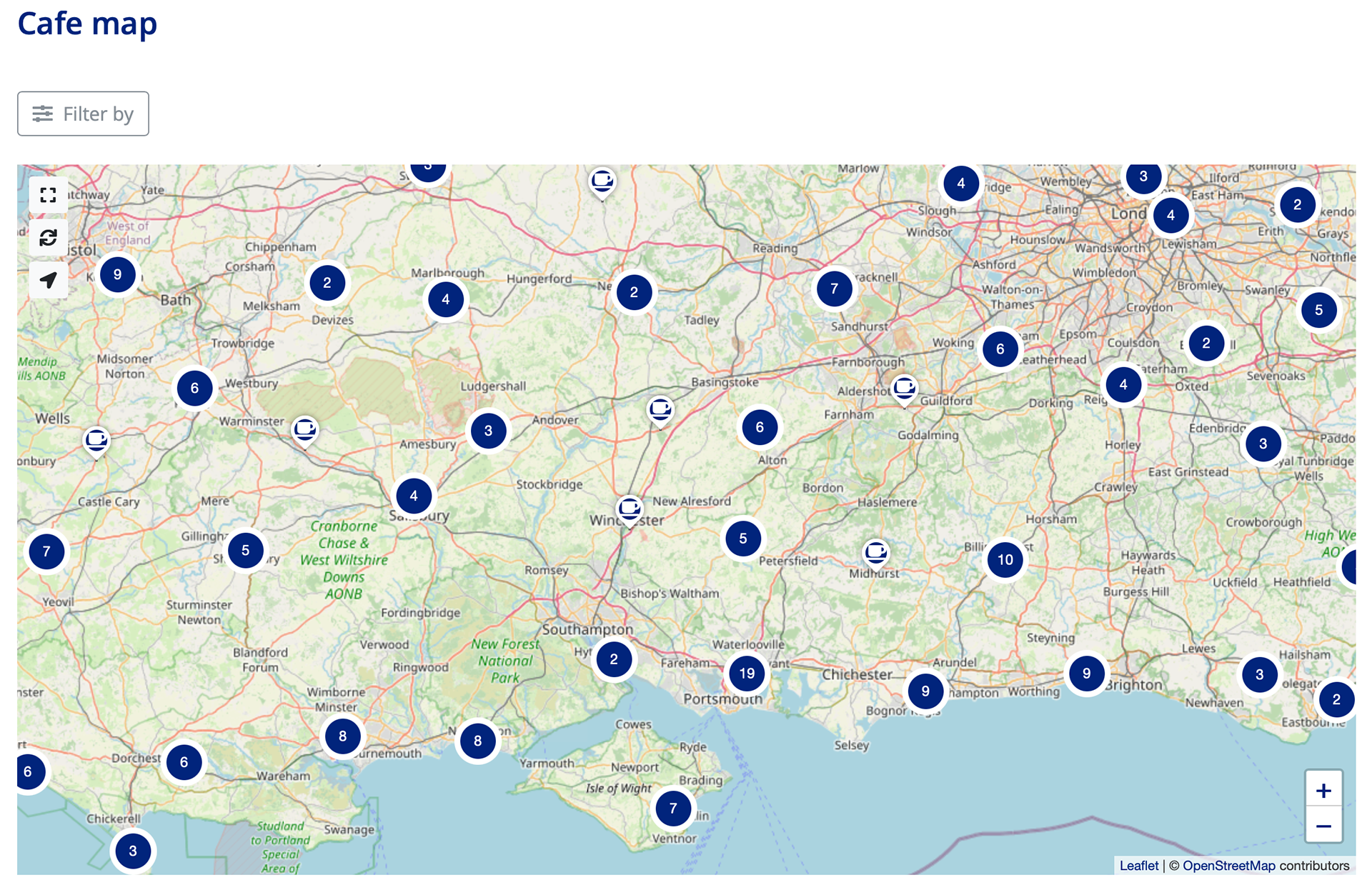
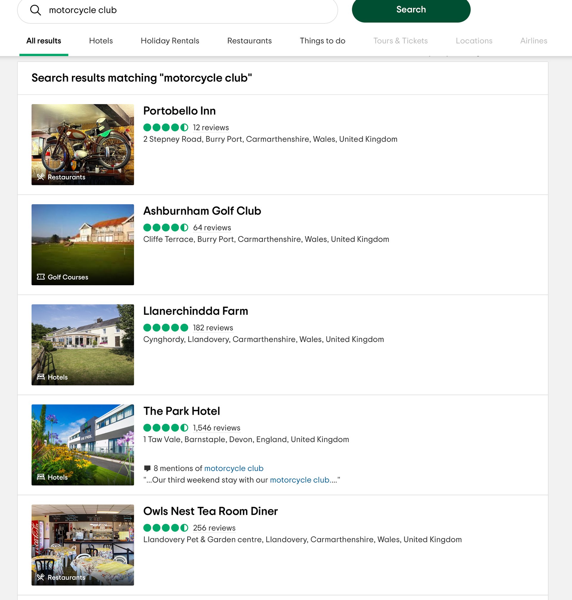
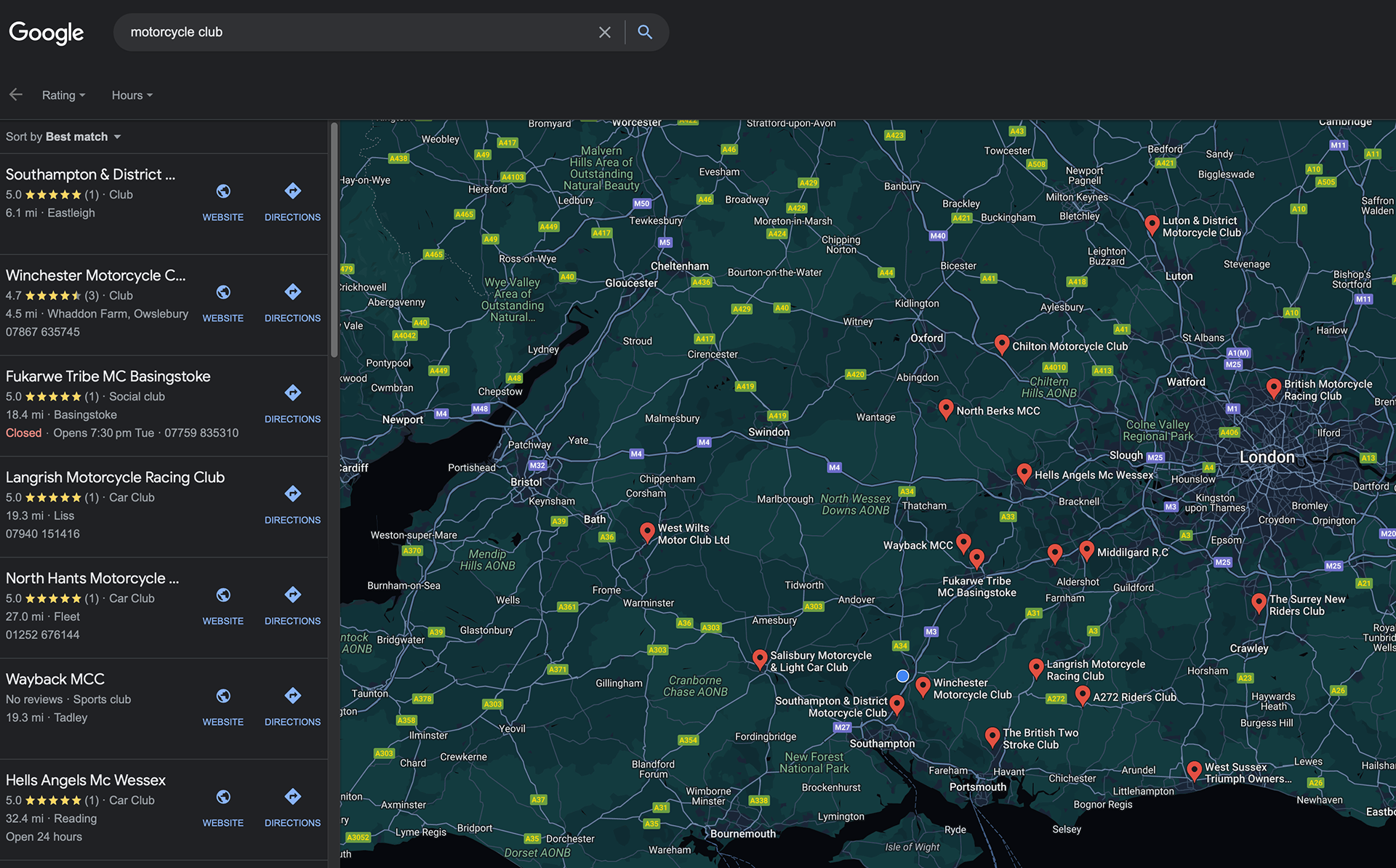
In and around the Winchester and Hampshire area, there are many motorcycle clubs, cafes, servicing and training centres that cater to experienced riders, motorcycle maintenance, marketplace of bikes and learning. However, riding in a large group of experienced riders can be daunting of those just starting out or who have less powerful bikes, or don’t have a licence meaning they are unable to ride on motorways.
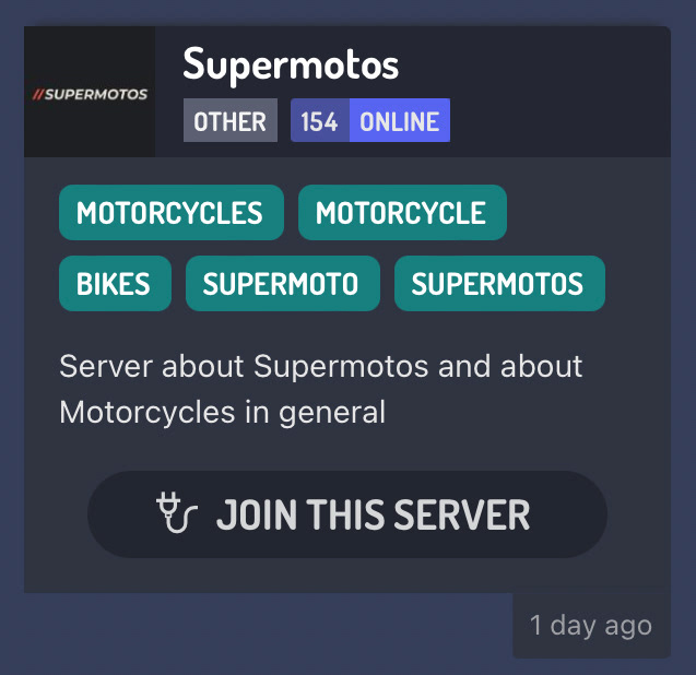


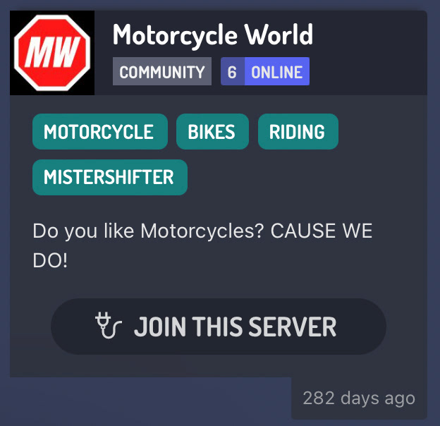
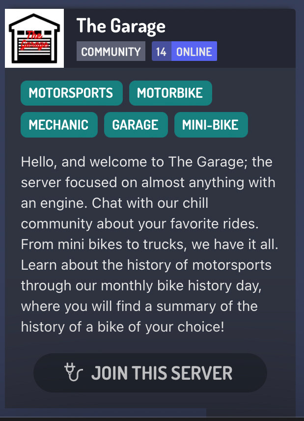

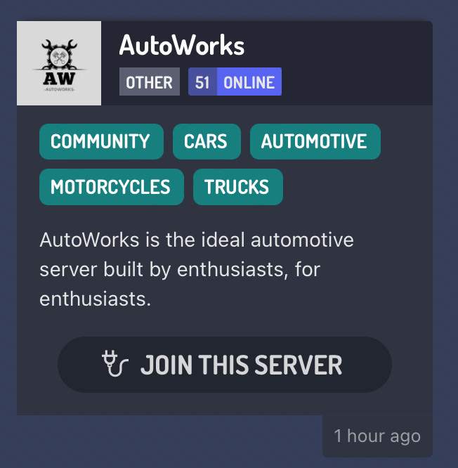

Market
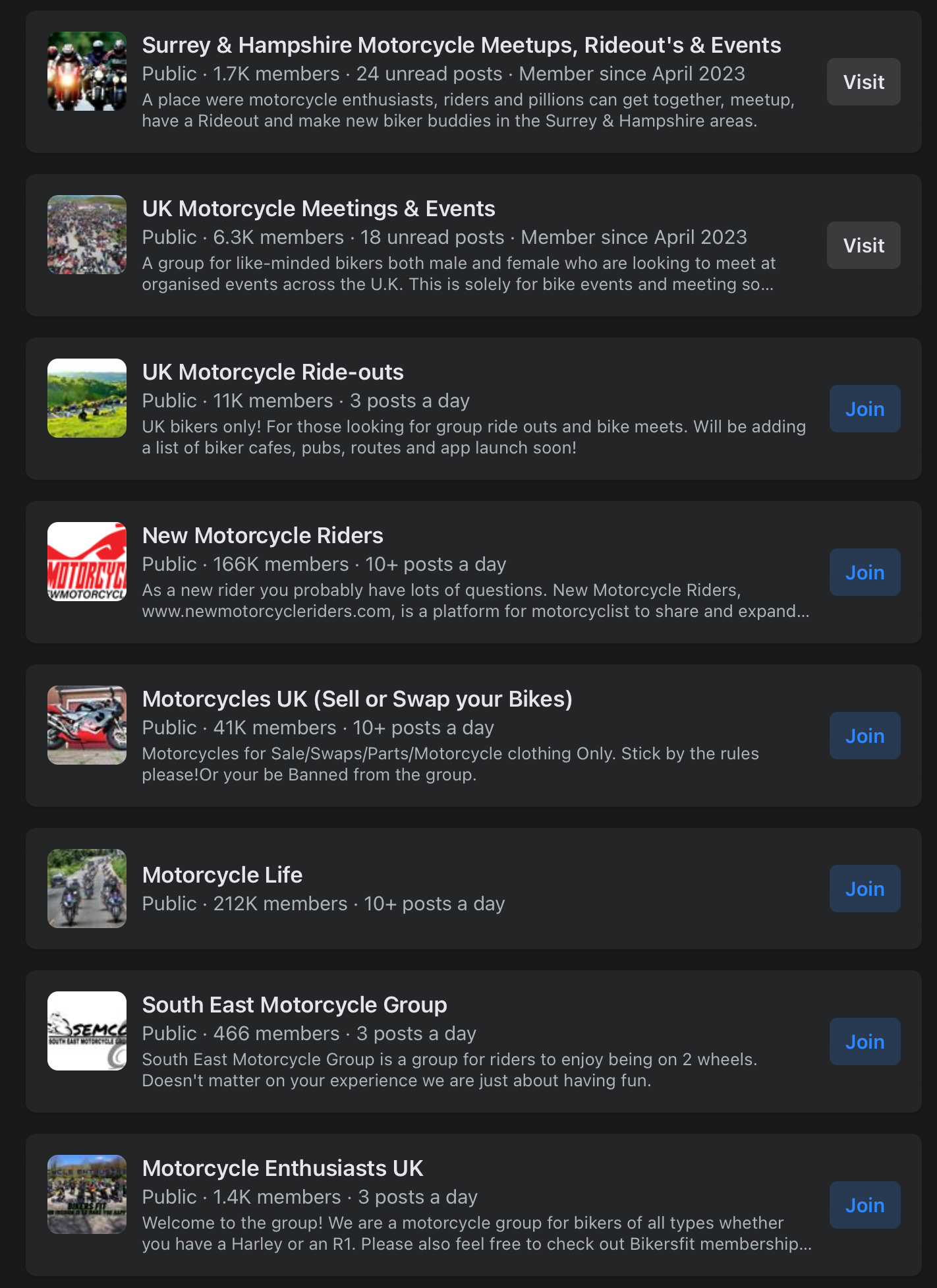
The majority of the motorcycle community is male in the UK however there have been movements to encourage more female riders from different companies. The main age bracket for motorcycle riders are 16 - 24 as motorcycles are considered exciting and affordable. Torque will be targeting the younger riders of the motorcycle community as they are the majority of new riders. Torque will also stand out within the market as it is the only company within the Hampshire area that offers the USPs with being able to find a dedicated new riders group that has a companion app. There are groups on facebook that are related to Torque, however, Facebook is decreasing in active users in younger generations and Facebook isn’t dedicated to motorcyclists. There are also Discord pages dedicated to beginner motorcyclists. However, Discord servers also don’t have the USPs of Torque such as map views, marketplace and you’re able to add your favourite routes/places/friends.
Mental Health
A study was completed in 2021 by Asda Money with 1000 British motorcyclists, asking how riding a motorcycle helped with their mental health, especially during COVID-19. The top results found that the riders enjoyed the sense of freedom (59%) and the thrill of riding a bike (40%) helped with their mental health during difficult times. Riding a motorcycle can also release dopamine and endorphins hormones, helping to lift your mood and makes you happier. It can also help as the rider is able to get some fresh air and reduce stress by focusing on the road and not other subjects that may be troubling. Riding a bike will also introduce you to new communities and social environments, so the rider is not so isolated, helping their mental health and social life. Motorcycle riding can also improve your physical health as its a very physical activity/sport especially when riding on winding roads and reaching high speeds.
17th sustainability goal infographic created by the UN.
Sustainability
The sustainability goal for this project was the UNs 17th sustainable development goal, ‘Strengthen the means of implementation and revitalise the Global Partnership for Sustainable Development’. This made me consider how my brand would be able to fit in sustainability goals through development and if it were to become a real company. The target goal highlights the struggles and issues the world is facing at the moment such as COVID-19 and how internet usage has increased throughout the years, meaning the population is becoming more isolated and having less social interactions.
Torque plans to tackle this by encouraging their users to meet up in groups and socialise with others. Torque also plans to create partnerships with training centres and bikers cafes to promote the app. Creating these partnerships will also lead to more socialisation by the users and encourage more partnerships with all those involved, with the aim of creating a positive impact on social issues faced in the community.
Competition
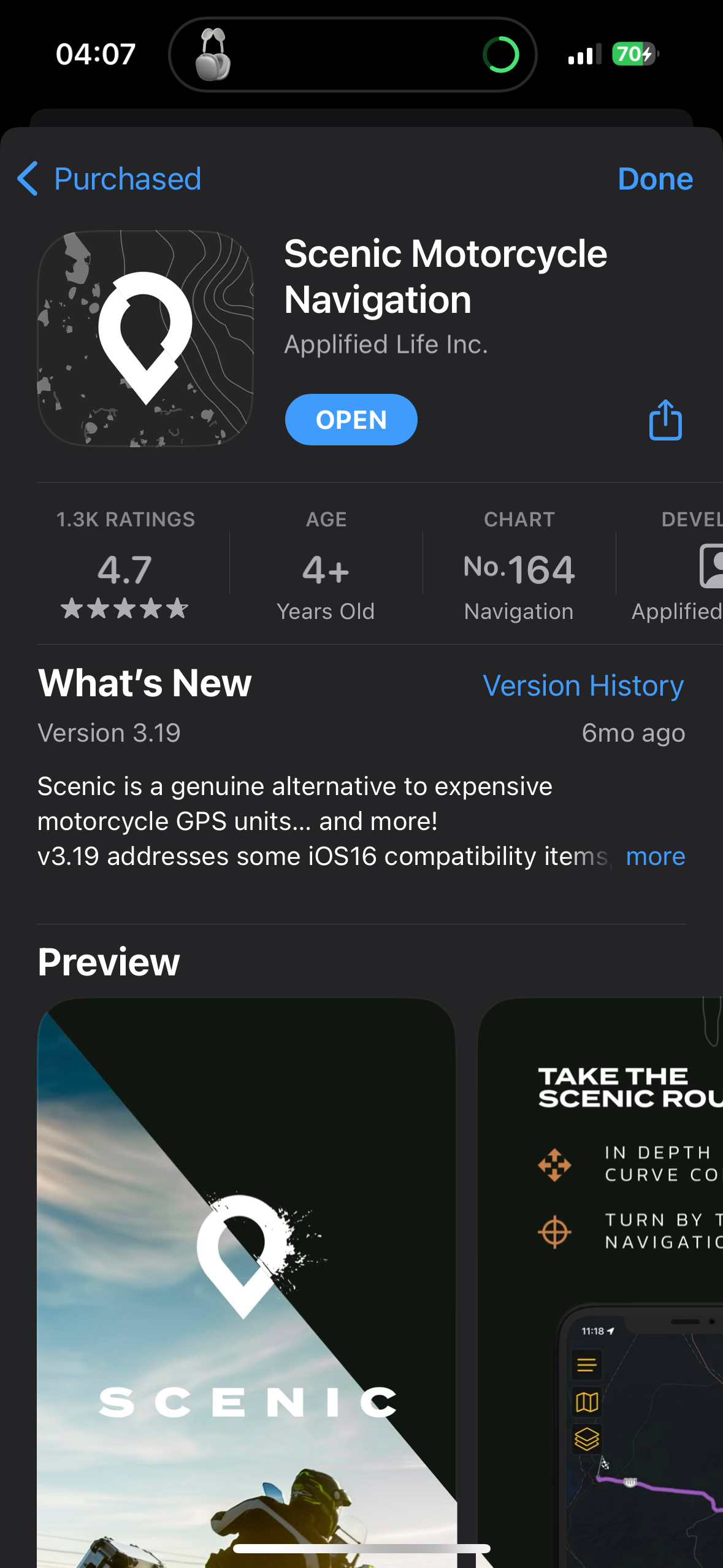
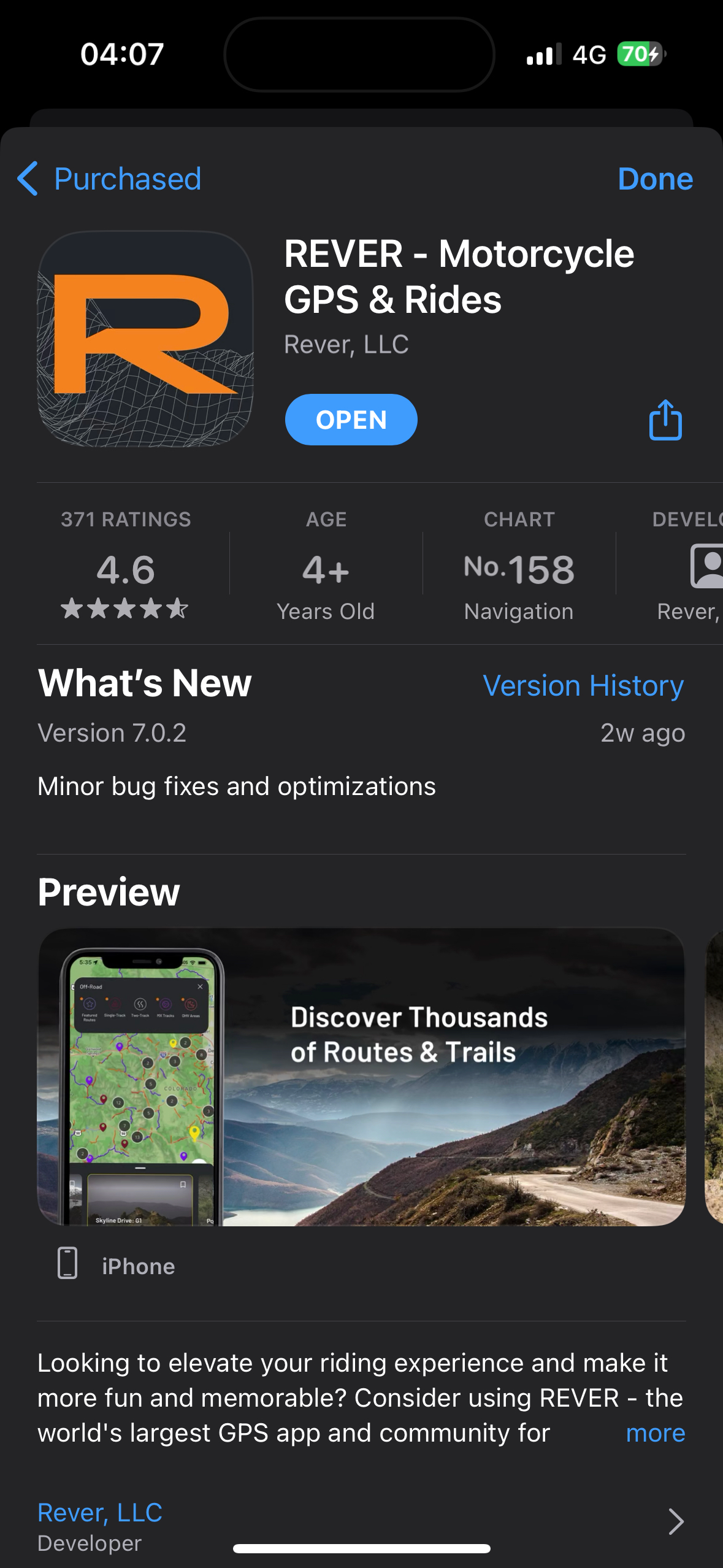
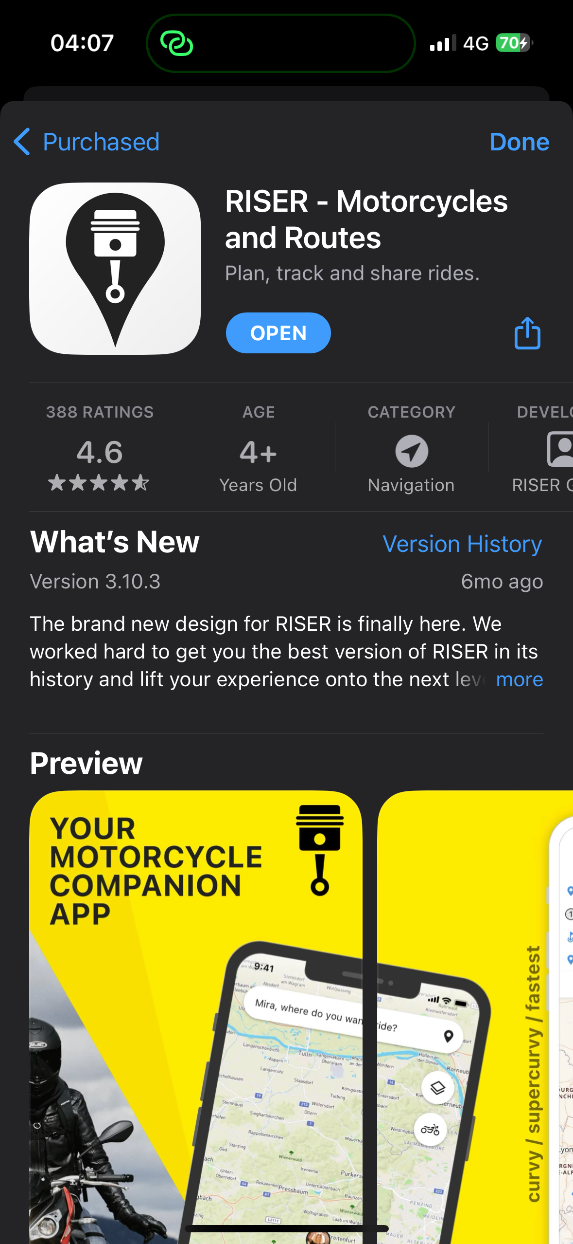
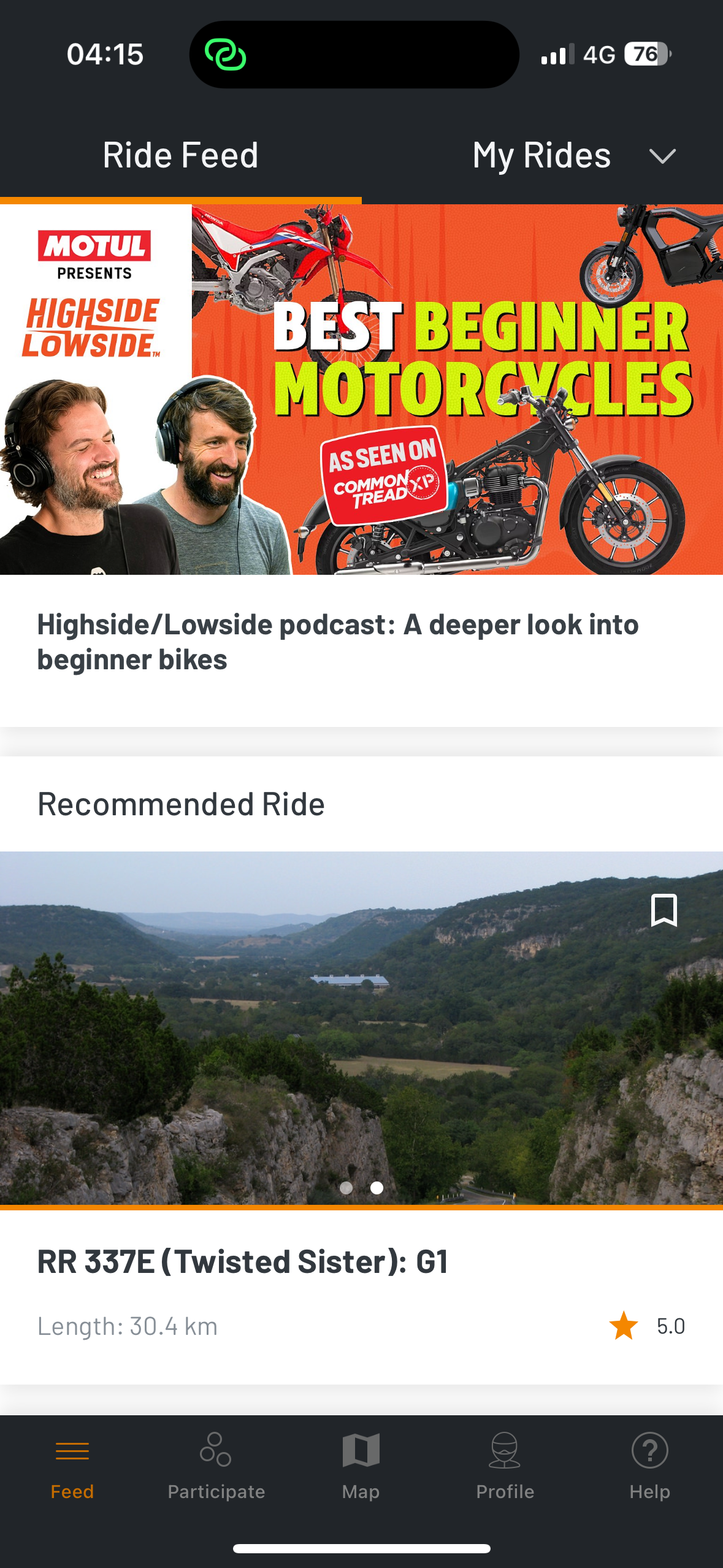
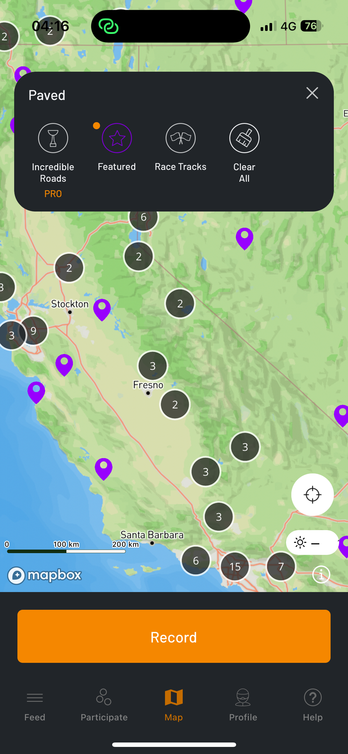
After completing research, I was unable to find any companies in the UK that offer similar services, especially in the Hampshire area. However, some competitors for a comparison offer apps for riders to attend events and to create routes. These are mostly in the USA but there are a few in the UK.
Direct
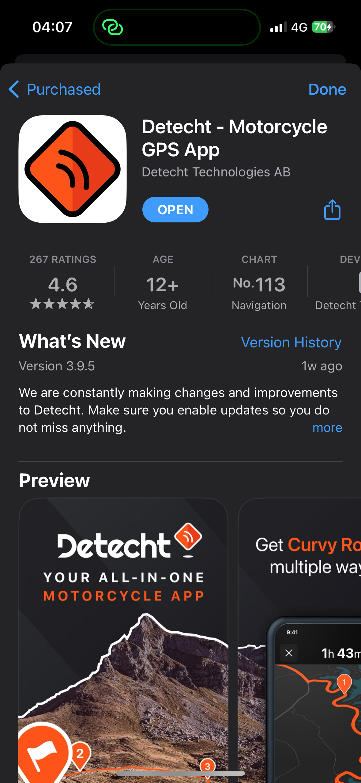
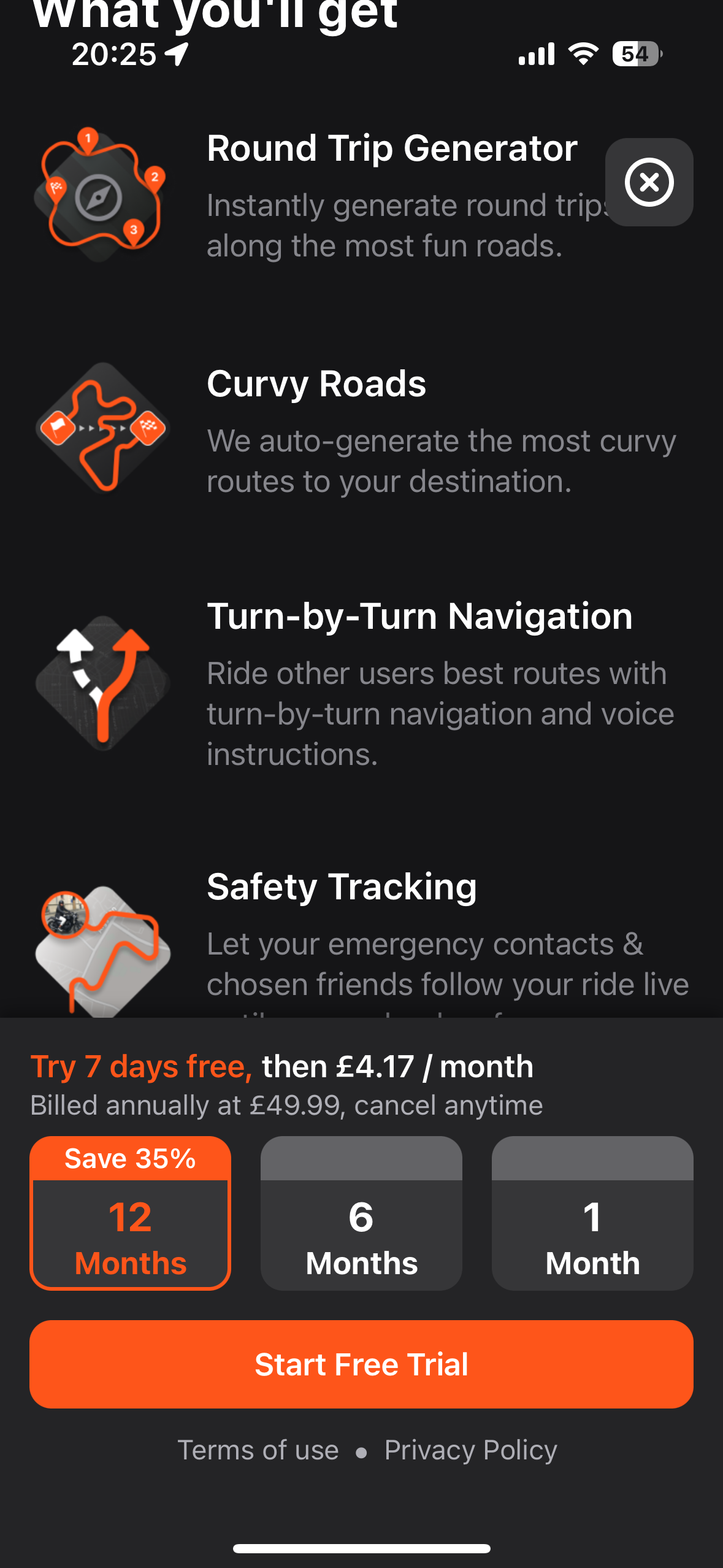
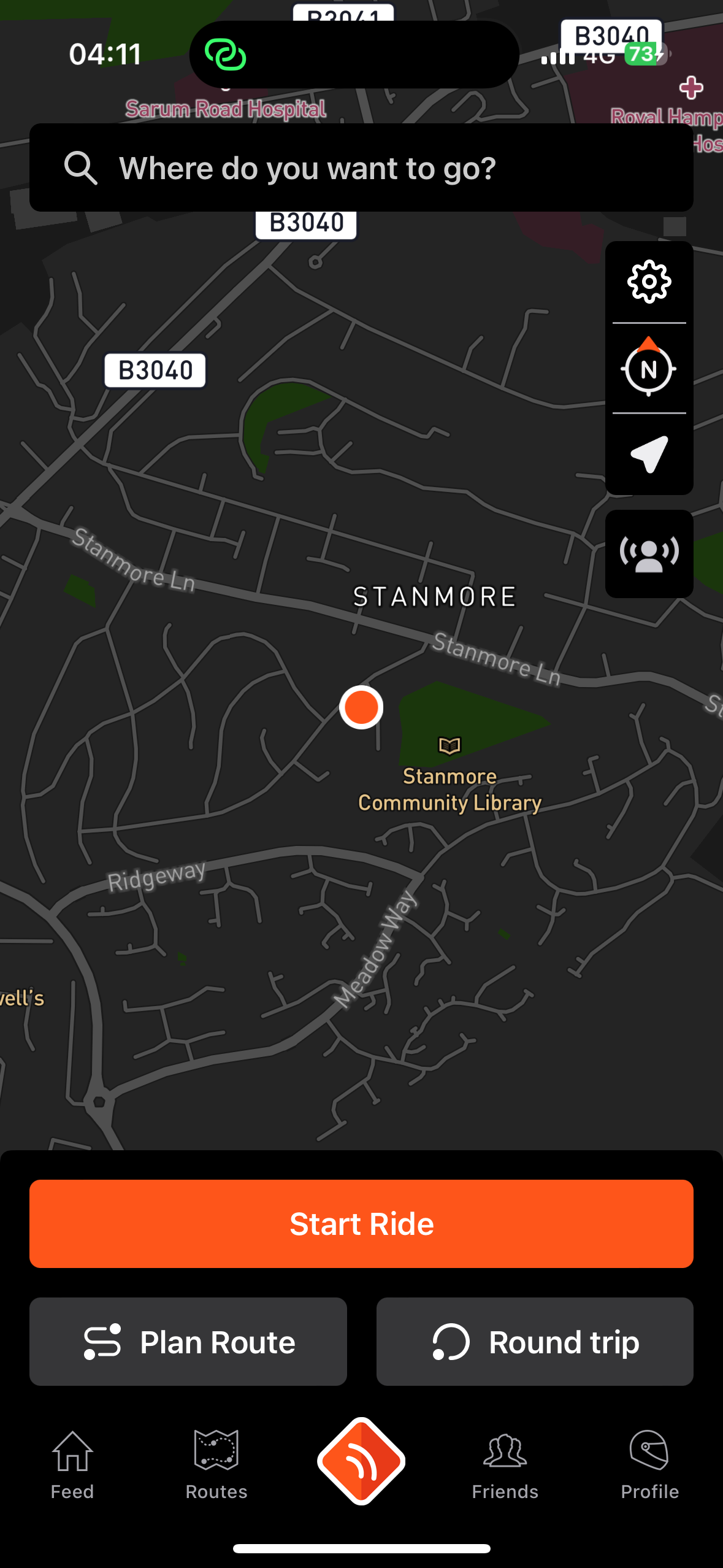
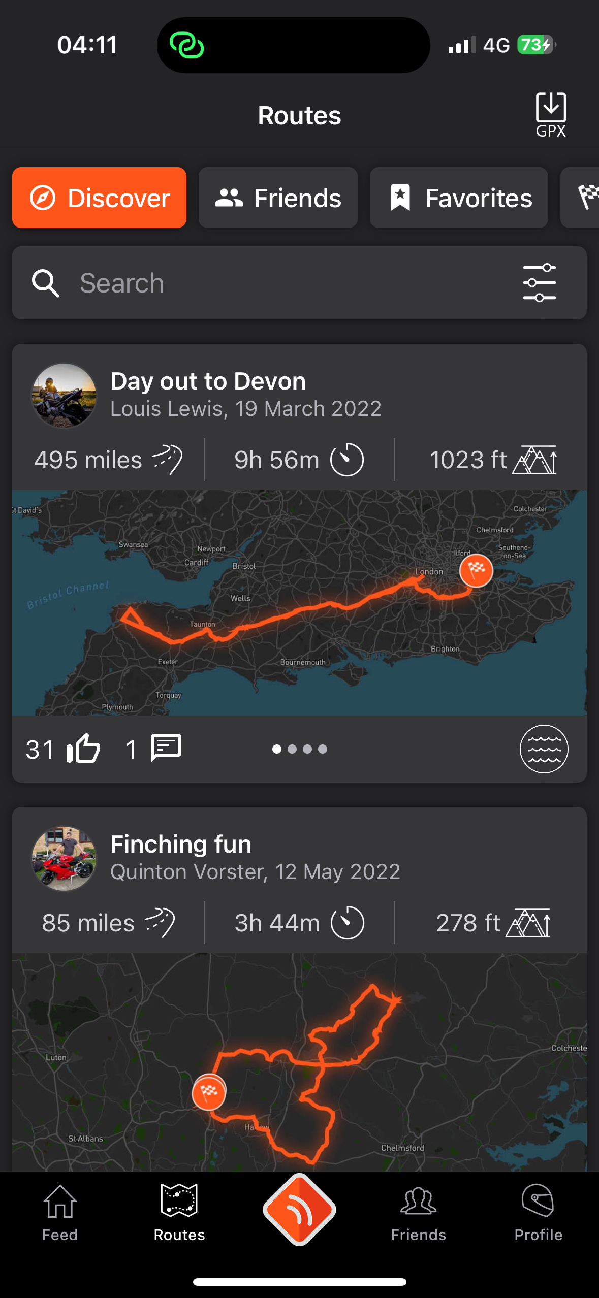
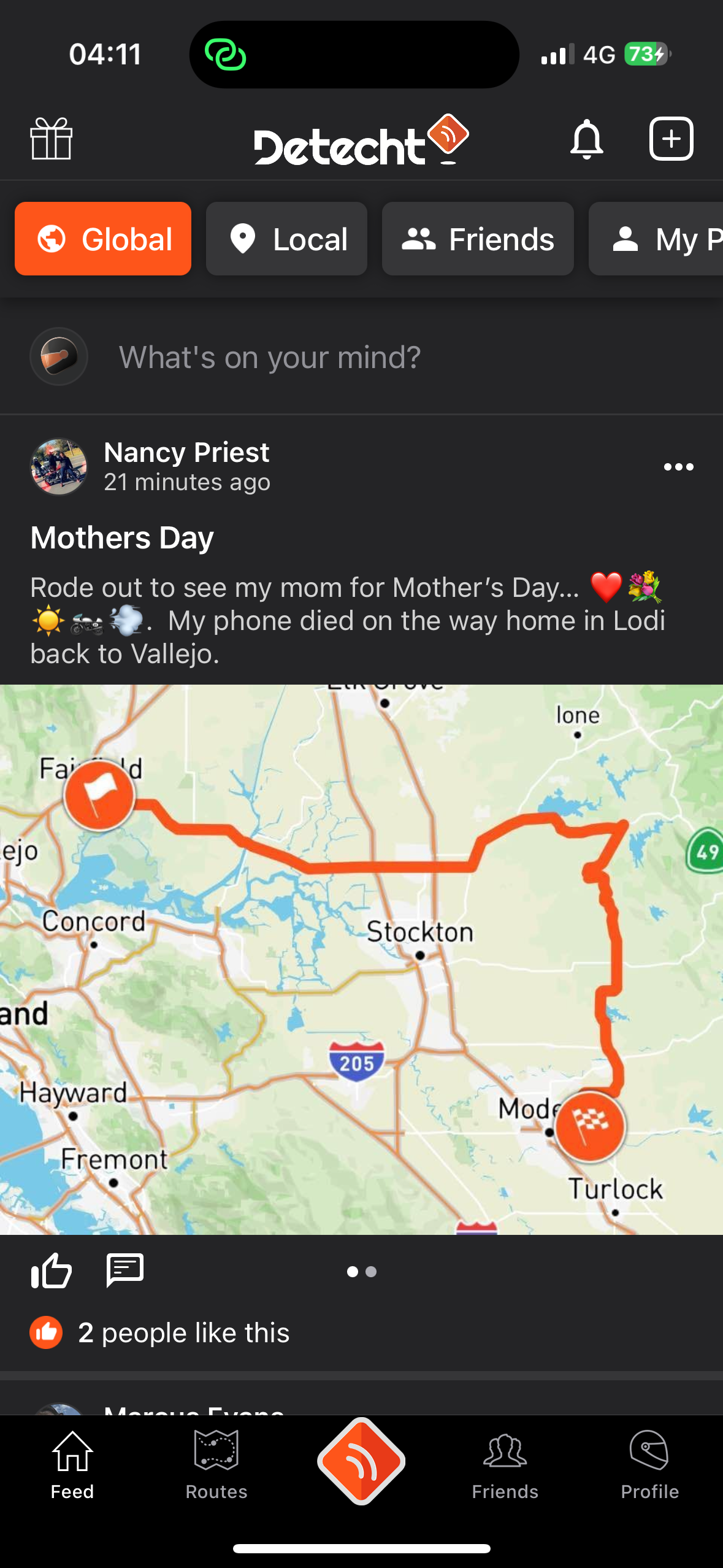
The app used for the direct comparison is Detecht. The landing page is very similar to Torque being a map view and urging the user to plan their route. The hot bar offers ‘Feed’ which is similar to a native social media to the app - this is aimed to be achieved through Discord with the Torque community. ‘Routes’ which is similar in design to ‘Favourites’ within the Torque app. The logo acting as a home page button. ‘Friends’ which is similar to Messages within the Torque app and your own ‘Profile’ page which is dedicated to the top of the screen on the Torque app, allowing for more uses within the hot bar.
The major difference between the two apps, Detecht offers a subscription service to access all available features, such as specialising the sort of route the divers desire or to generate a random route and 5 emergency contacts that you can automatically share your journey with through the app.

Secondary
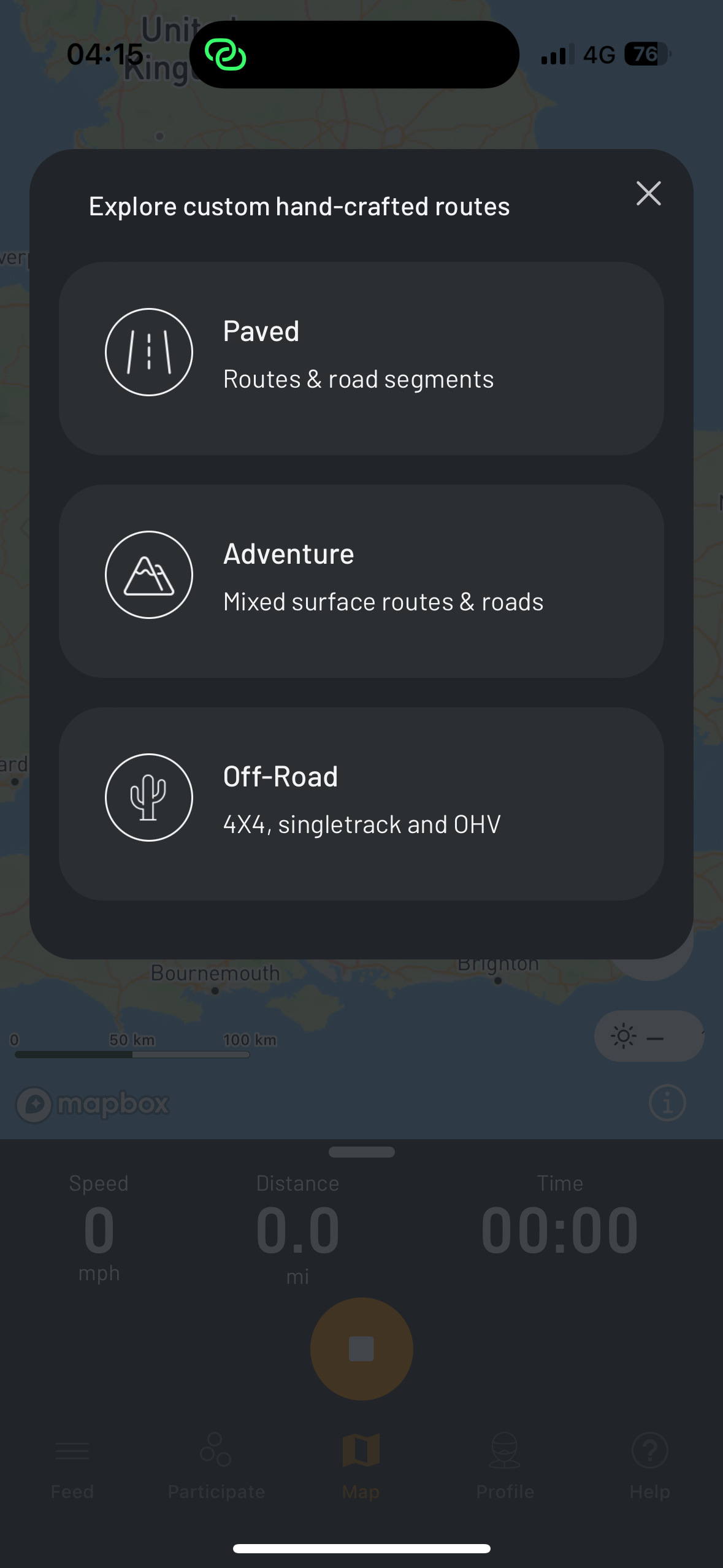
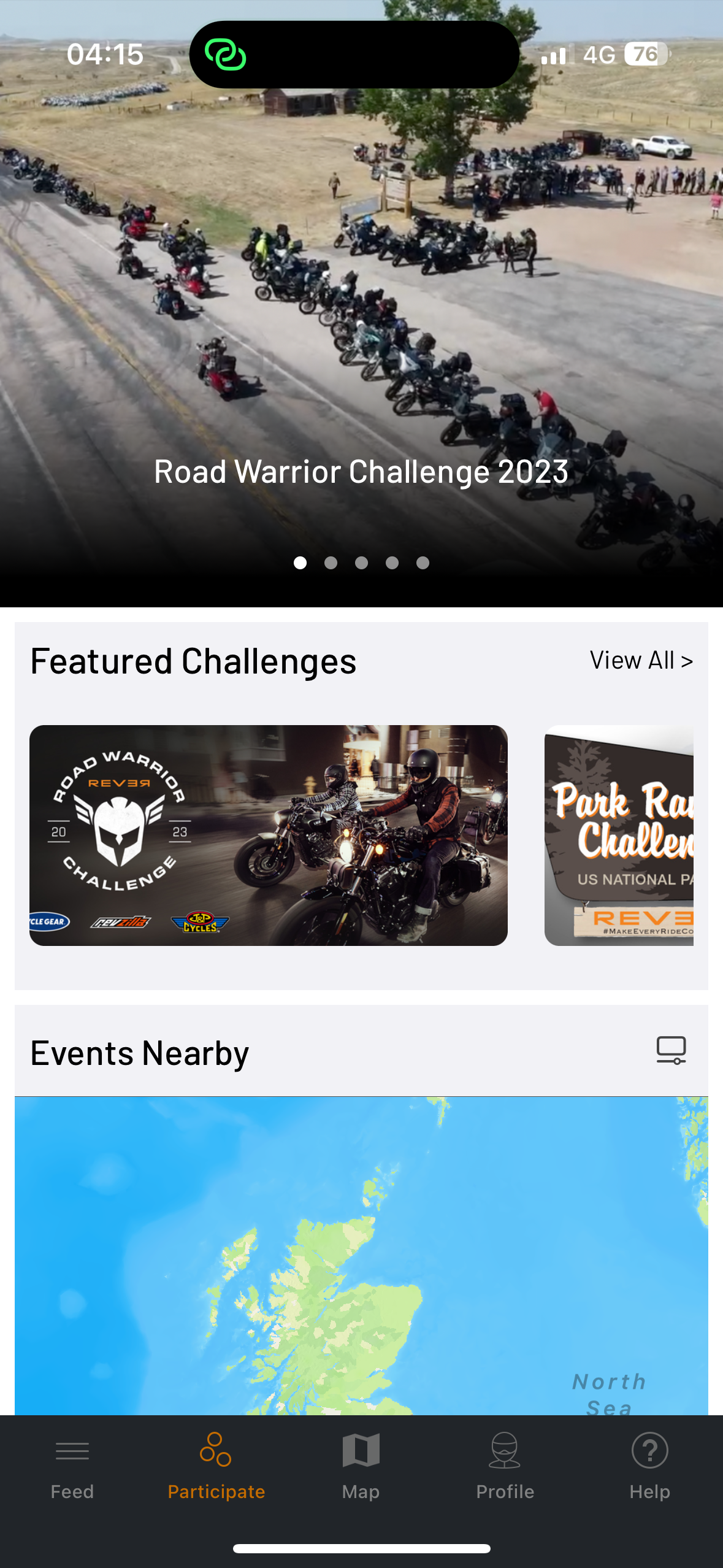
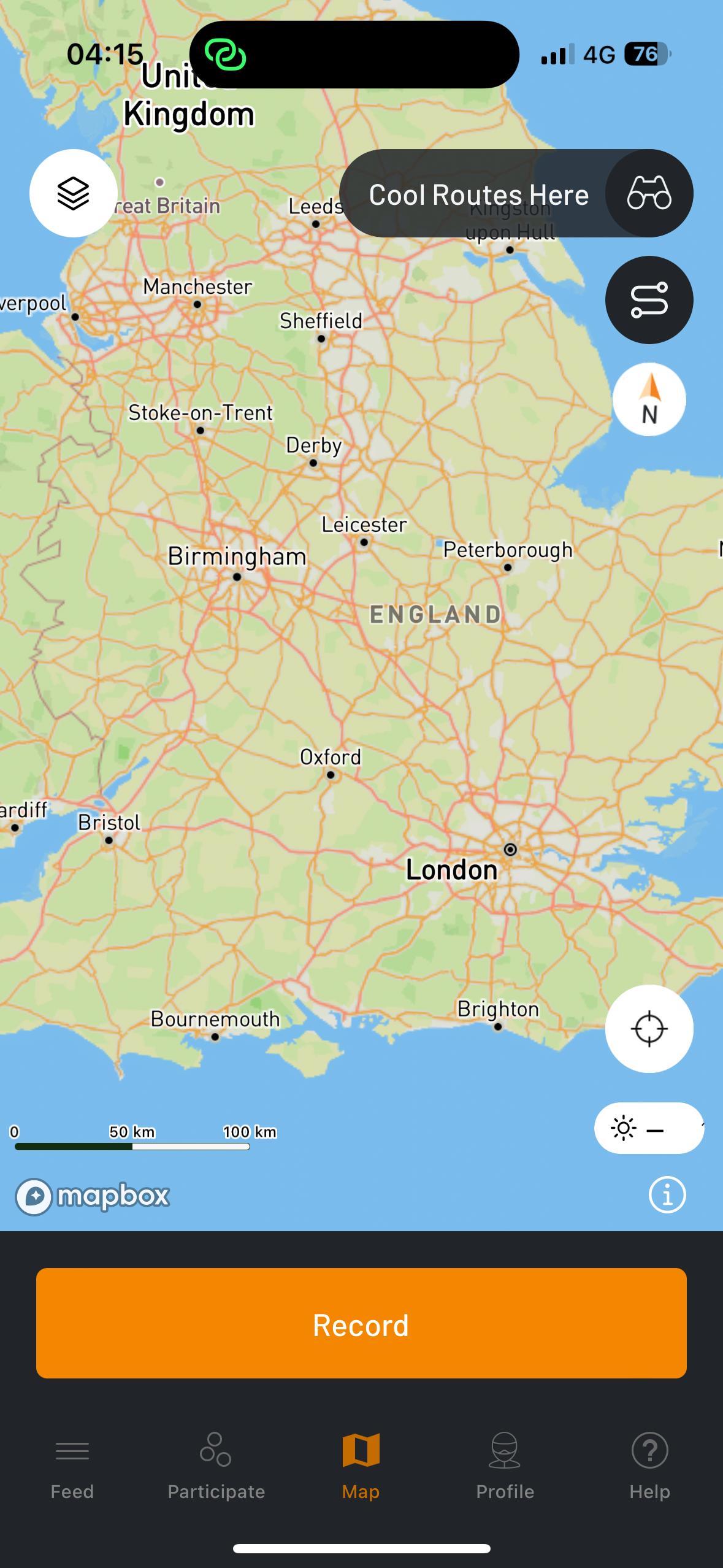
The second brand used for a comparison is Rever, which is US based. I found this app due to it being promoted on my social medias at the time of my research. It is very similar to Detecht in its features such as a native social media dn being able to create and share apps. Rever also offers a subscription service to access all features of the app. However, as this brand is only available in the US, it is not relevant to my target market. But it still works as a comparison brand.
Feedback
Throughout the project, I asked for feedback from my lecturers, classmates and friends. One friend that I asked feedback from does own multiple motorcycles and lives in the UK. I asked for feedback during the logo development and throughout the wire framing and to test the prototyping. This helped me with seeing my design through other perspectives and gain inspiration and ideas that I had not thought of. The most valuable feedback I got was during the prototyping to make sure the app worked correctly, the wireframe was linked correctly and led the user to the correct location and was clear and legible. I also got feedback from a family member suggesting other features that I could include within the app such as swapping items within the marketplace, which I would like to include if I take this project further and make it a real functional app.
Personas
For this project, I created 4 user personas that could potentially use Torque in their day to day life. Age ranging from 17 to 55 with different interests and locations. This helped me develop a target audience and gave a clear view of who Torque is for.
4 different Persona profiles
Logo


Name
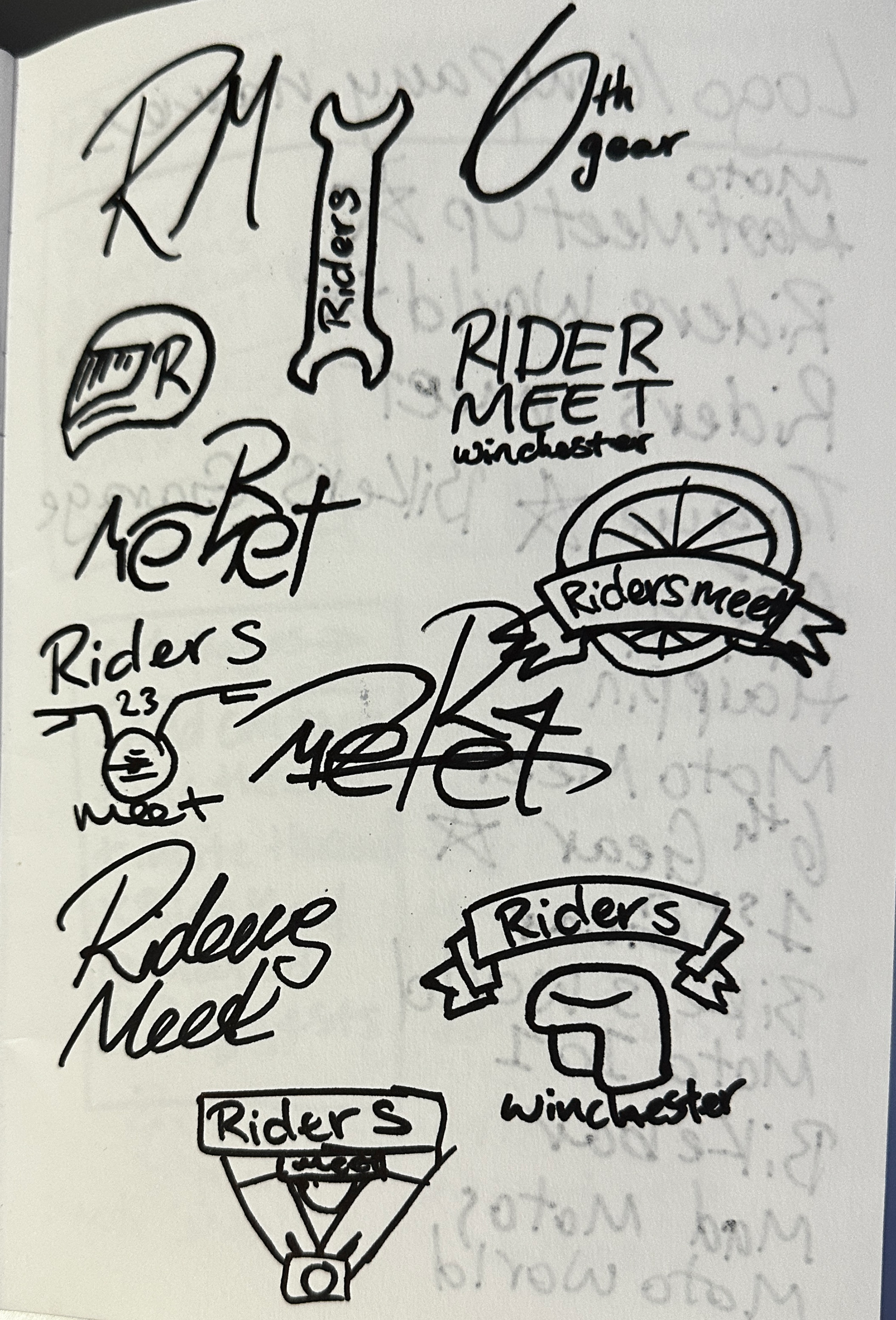
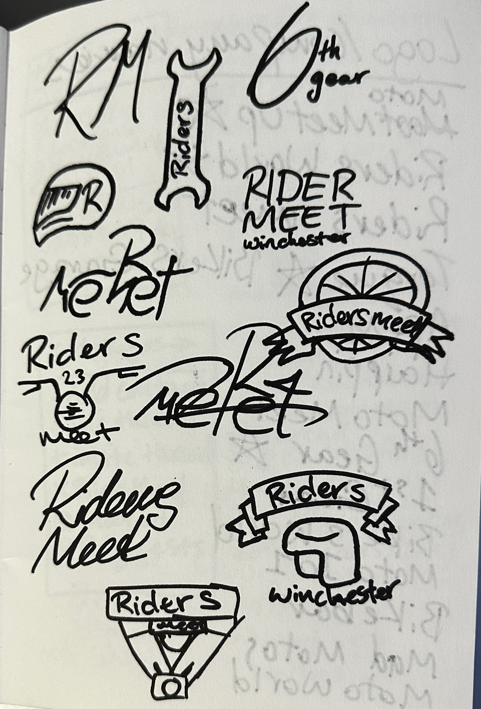
At the beginning of the project, I tried to link the name of the app and community to something that all motorcyclists will know, but also others that are looking to join the community who are just starting out. I took inspiration from the likes of MotoGP, Motocross and Top Gear. after some deliberation and feedback from my class after presenting, I settled on 'Moto Meet Up' as it rolled off the tongue well and the message was clear of what sort of community this would be. however, when it came to designing the logo, I struggled to make the name work due to the length and style of logo I wanted to design to fit the brand message. I went back to the drawing board and decided that I only wanted to use one word for the app. this made it easy to remember and easier to include within the design. I researched words that were related to the motorcycle community and found 'Torque'. I liked this word as torque is related to acceleration - thrill seekers - and the more torque you have, the faster and further a motorcycle can travel - long group rides, long journeys. I also liked how it sounds like 'talk' encouraging the users to talk to each other, meet up and create a sense of community. After more feedback from my lecturer and classmate, who thought 'Torque' worked better, that is what I settled with.
Colour Pallet
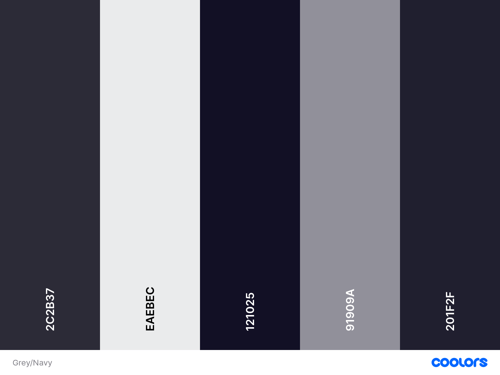
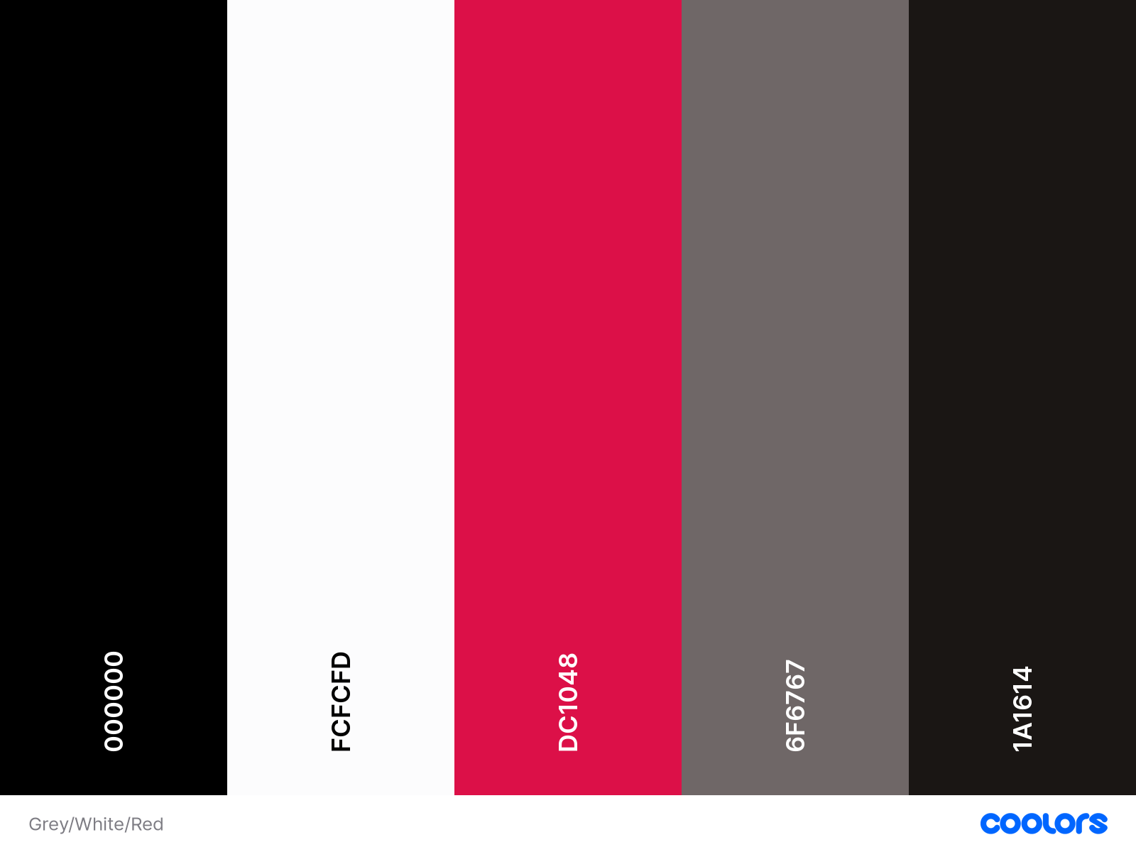
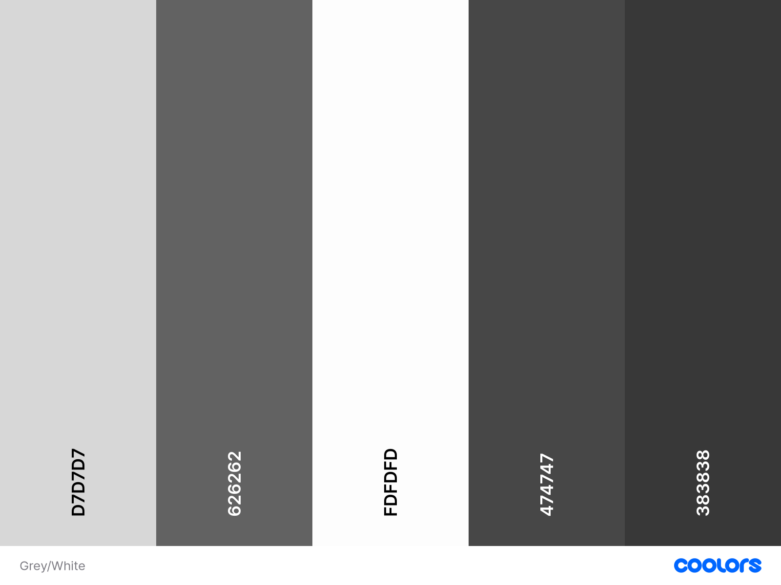
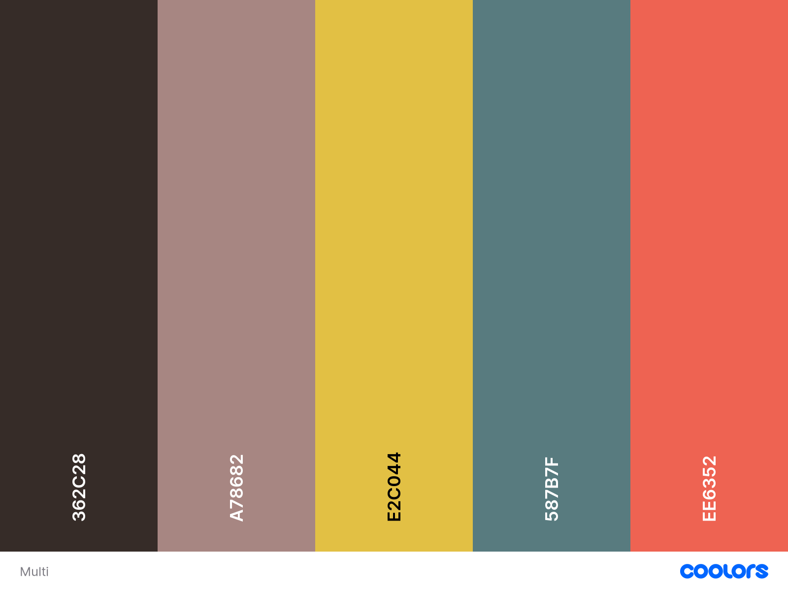
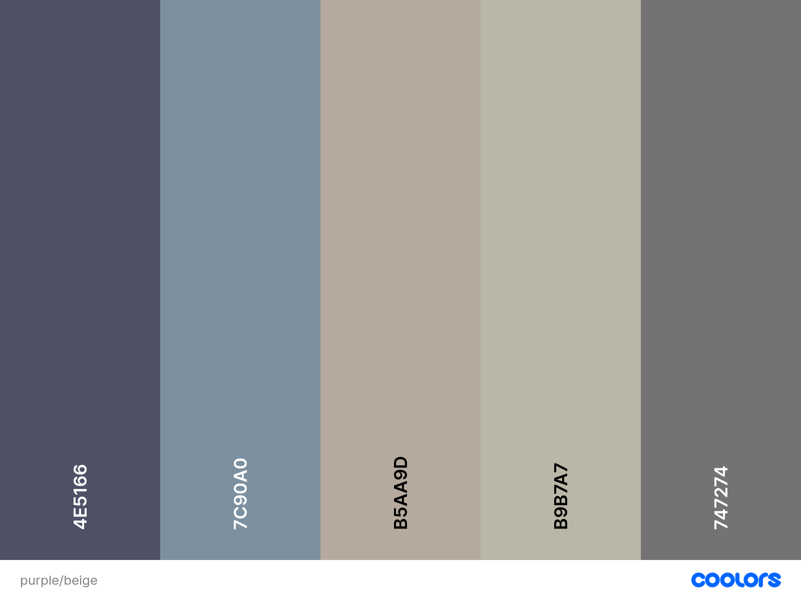
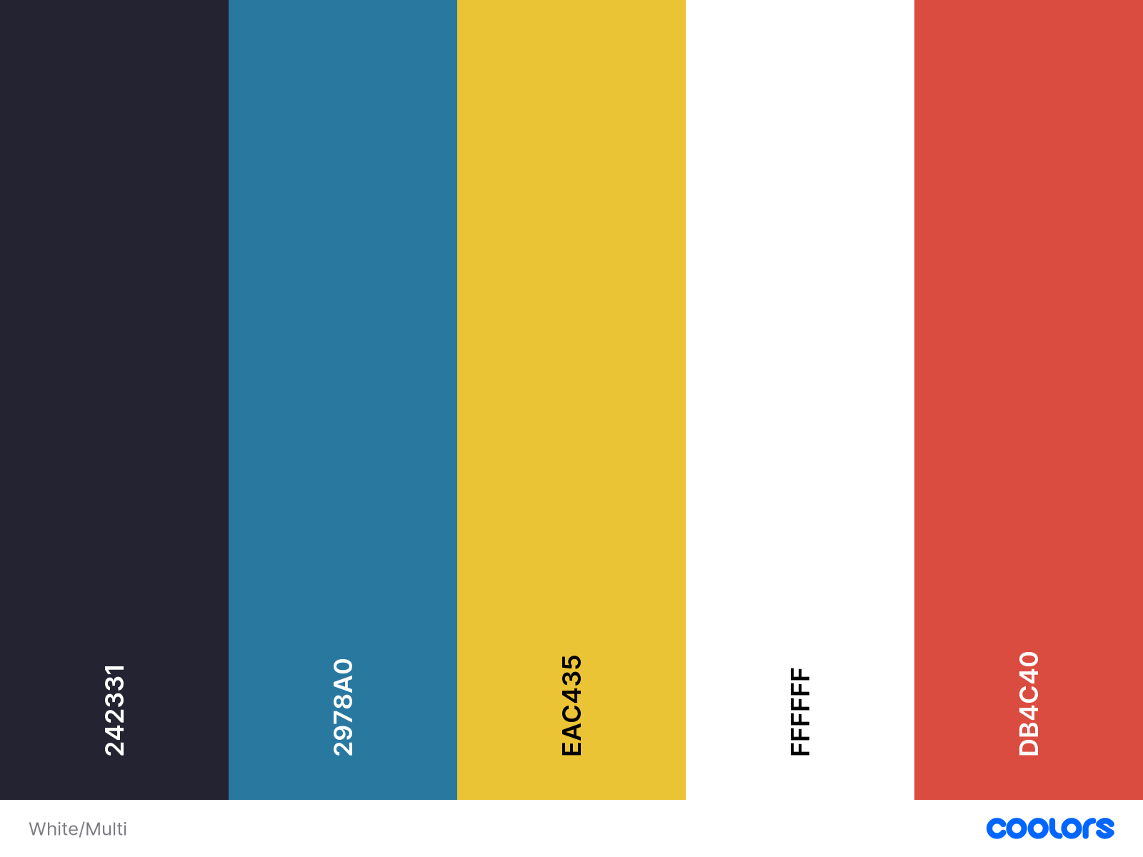
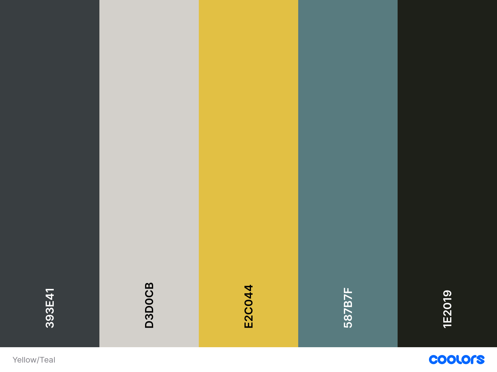
For the colour pallet, I wanted to use strong colours that complimented each other but also stood out. I originally was going to use a monotone gradient from white to black, however this made the brand feel very clinical and and dry. I created multiple colour pallets that I liked and after feedback after a class presentation, I decided on using the colours shown on the right. These stood out against each other and created a good variety to work with. The black/grey is very similar to the colour used within the dark mode setting of Discord, which is accompanying the app, making the colour great to use. The light grey is very slightly off white, making it easier against the dark background and for the eyes of the user. Using beige created a neutral colour that would stand out against the other stronger colours used such s the blue and red. The blue is used as the main accent colour throughout the brand and red is used for warnings, cancellations and the default map route colour. Using the red for the map route, makes it stand out against those such as Apple and Google who use a bright blue, but is also similar to the main competitor Detecht which uses a bright orange. I used coolors.co to generate different colour palette and to have accurate HEX, CMYK and RGB codes.

Development
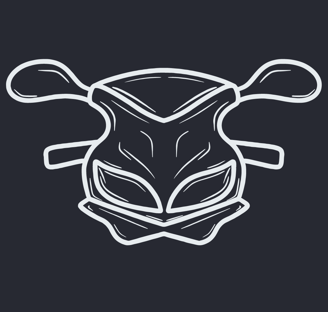
To start with the logo development, I sketched out a few rough ideas using the original name ‘Moto Meet Up’ trying to include motorcycle engines, pistons or tyres. However, after simplifying the name to ‘Torque’ I also wanted to keep the logo simple and clean, making it stand out and easier to read on posters, social media and within the app. One design that stood out to me was using the outline of the front of a motorcycle, I originally used the cruiser style of motorcycle with an exposed headlight. However, as sport bikes are more popular within the younger generations and offer more of a thrill as they generally have more power, I designed the outline of a sport bike. I liked this design as it is bold and clear and works well with typography. The sport bike design also generally has the most torque and horsepower available on the market, making the design fit the brand message even more.
After I had finished my sketches, I digitalised them using Procreate on my iPad and exported them into Illustrator to create vectors. I wanted to keep a symmetrical and even design so it was easy to work with and clear to read. I think hand drawing the shape and later vectorising it allowed me to create the curves and corners that matched the style I wanted to achieve. I created different designs within Illustrator and exported the logo on different coloured backgrounds from the colour pallet and a transparent background. This gave me the freedom of how the logo would look in different situations. When on the dark grey background, the logo outline has to be in the light grey colour, when used on different backgrounds, the logo has to be coloured in the dark grey colour.
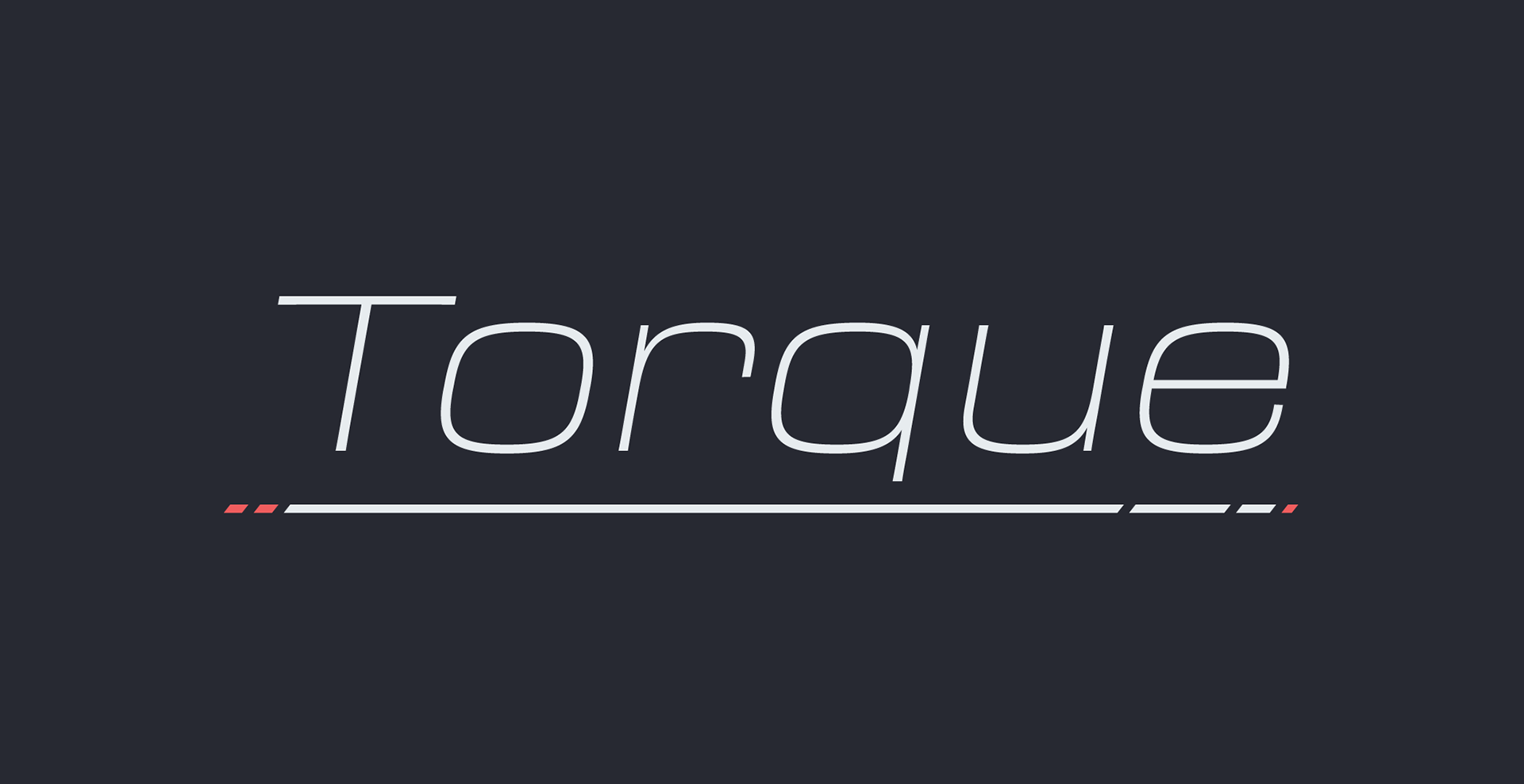
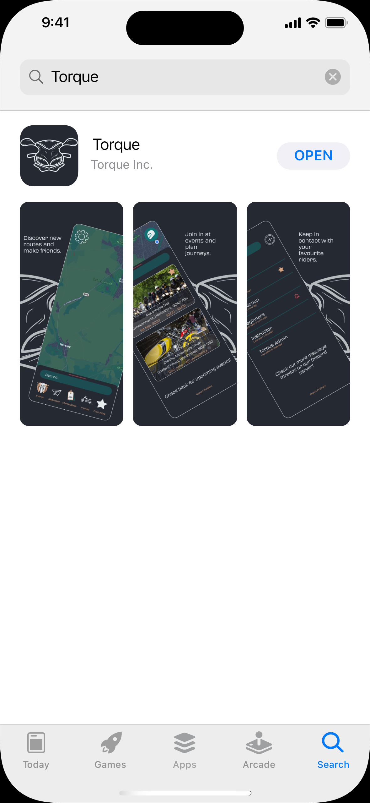
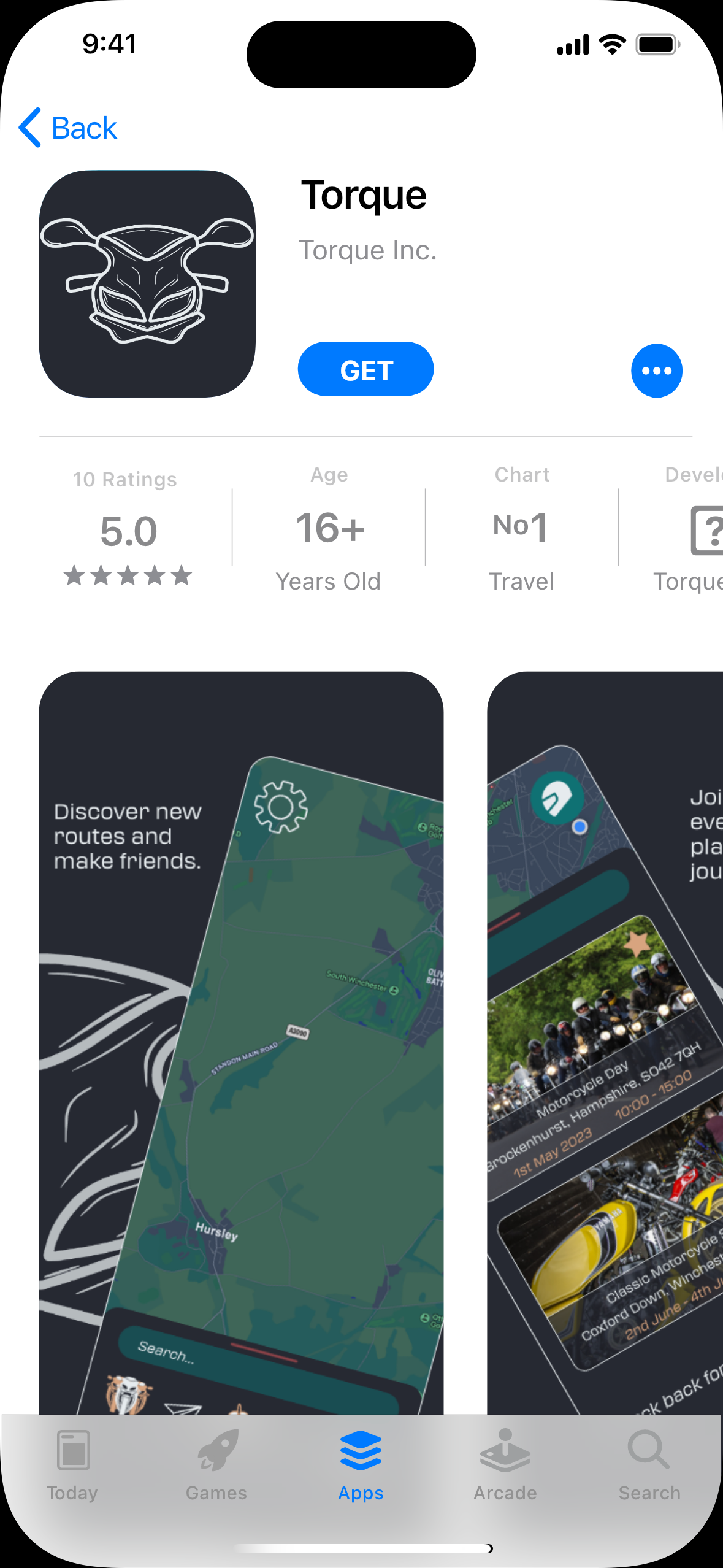
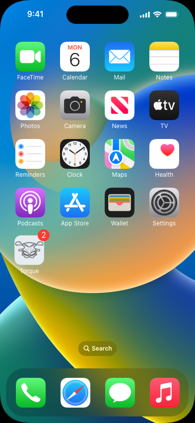
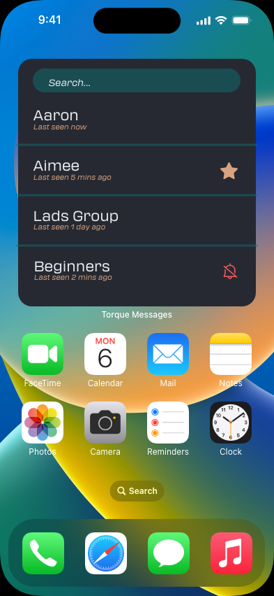
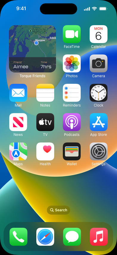
I created 4 different variations of the logo to be used for different situations. The main logo includes the outline of the sports bike and the name 'Torque' underlines. This is only used on booklets, books and for promotional purposes. The second is the word 'Torque' standalone, this is used on the loading screen of the app. The outline of the sport bike alone, this is used in multiple places such as the app logo on the homepage and for the background of images for promotional posters and the App Store pictures. The last logo is just a capital 'T' standing for 'Torque', this is only used for social media pages such as Discord, or at a later date Instagram profiles or a Facebook Group.


Branding
Brandboard
To create a consistent design and brand throughout all projects such as posters and wire framing, I made a brand board within Adobe xd. this allowed me to upload all elements, colours, fonts and assets to my creative cloud library. doing this made it easy to access all the elements I would need for my designs and they were accurate in scale and colour. this also aided in the design of the brand guidelines as all of the elements were already together and I had an understanding of how the brand message is conveyed. Creating the brand board within Adobe XD also aided me to edit it in real time, being able to add, update and remove elements as I went.
Brand board created in XD and uploaded to creative cloud library.
Brand Guidelines.
The main aim for this submission was to create an accurate and reliable brand guidelines for the brand design created. I researched other companies brand guidelines to gain some inspiration and to have an understanding of what should be included. some companies that I looked at were Spotify, Harley Davidson and Apple. They all had different levels of detail and were created in different years. However, they all included rules about the typography, logo and the colour scheme. As these stood out as the most important details, I focused on these in the brand guidelines created for Torque. I also included the elements used and the brand story.
Wireframes




Sketches
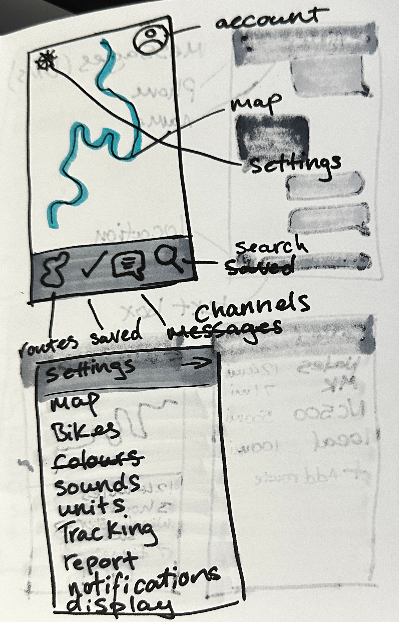
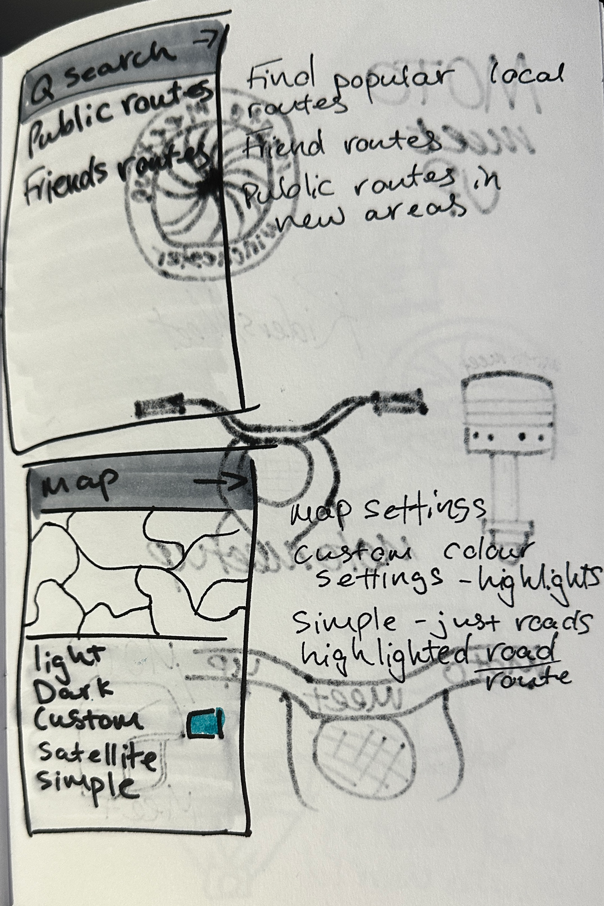
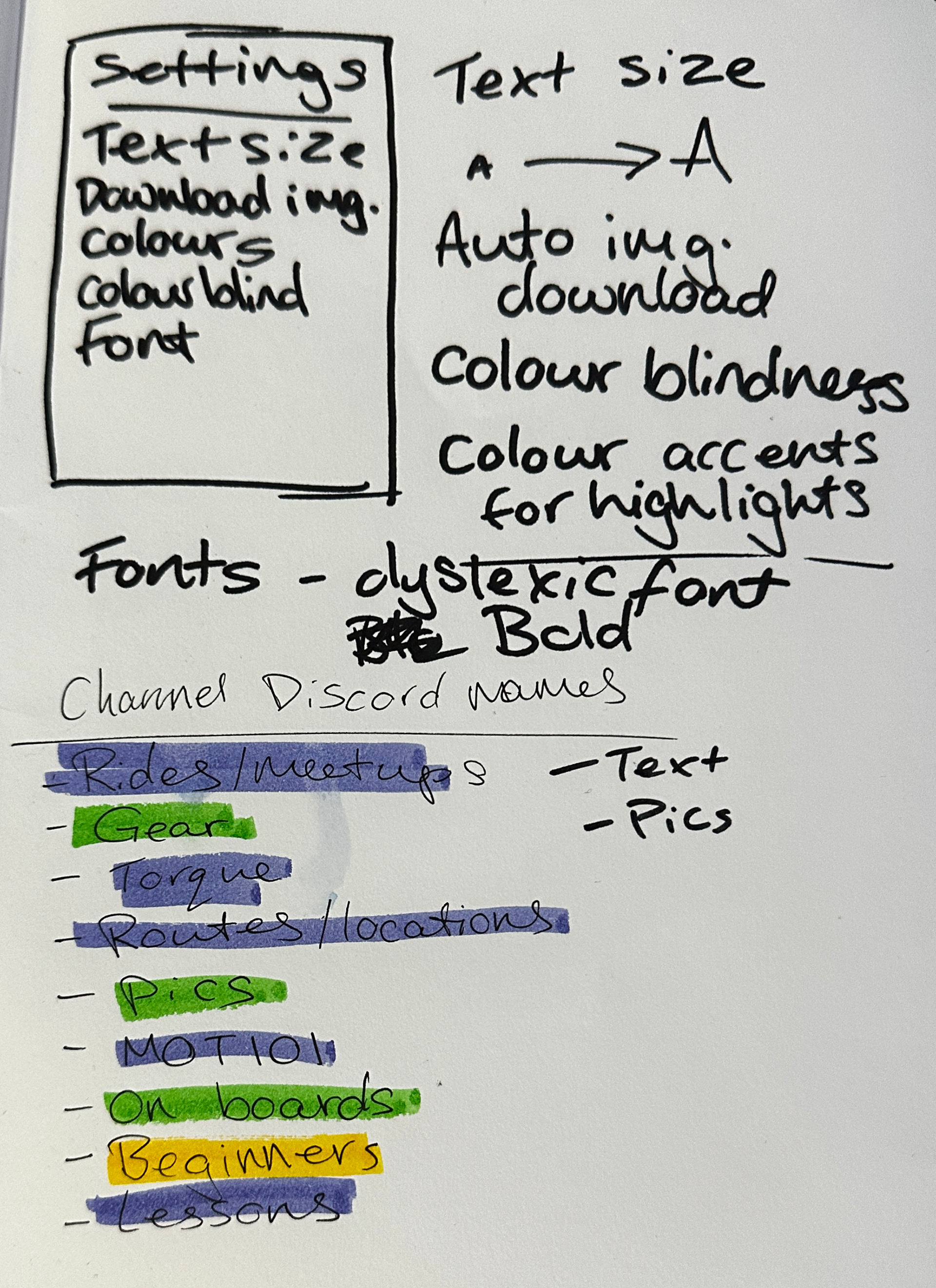
I first started sketching out the rough idea of the wireframes in my sketchbook. this helped me get all of the features down on paper and made it quicker and easier to edit on the go. Doing this also gave me a great foundation to work off when creating the prototype and finalising the design of the app. I kept the colouring simple, only colouring in the route and the colour selection tool, to make them stand out in pictures and while I was working. I planned to export these into Procreate to make mock-ups but I went straight into Adobe Xd, with pictures of the sketches as reference. I think this process worked well as it sped the project up and I was able to develop the design and brand quicker. Allowing me to get more feedback and work out kinks of the prototype.
Development
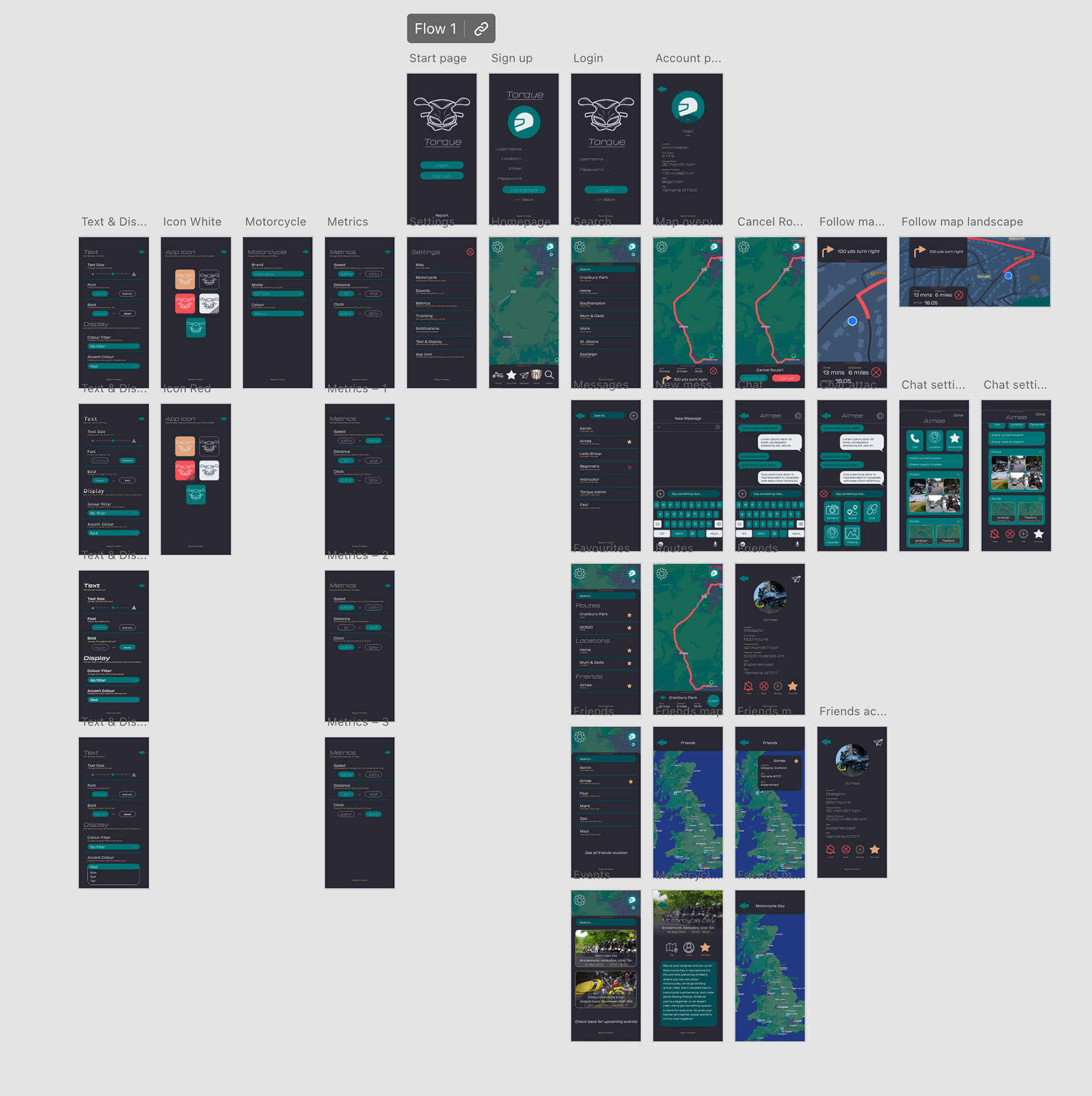
Having created the brand board within Adobe Xd, I was able to access all the elements I needed quickly and easily through the shared creative cloud library. This also meant that the colours, icons and logos used were correct and accurate. I asked for feedback throughout the development and design of the wire framing, asking what else to include, how it looks and if the routing is correct. I worked outwards from the homepage of the app, focusing on the main features such as messages, routing planning and friends location and location sharing. I screen captured some of the process to show development and to work back on incase there was any mistakes or altercations made. Screen capturing also gives a good sense of how the design process went and how long the process took. I will continue to use this method in my other projects as it is a good reference for myself and my employers.
FInal Prototype
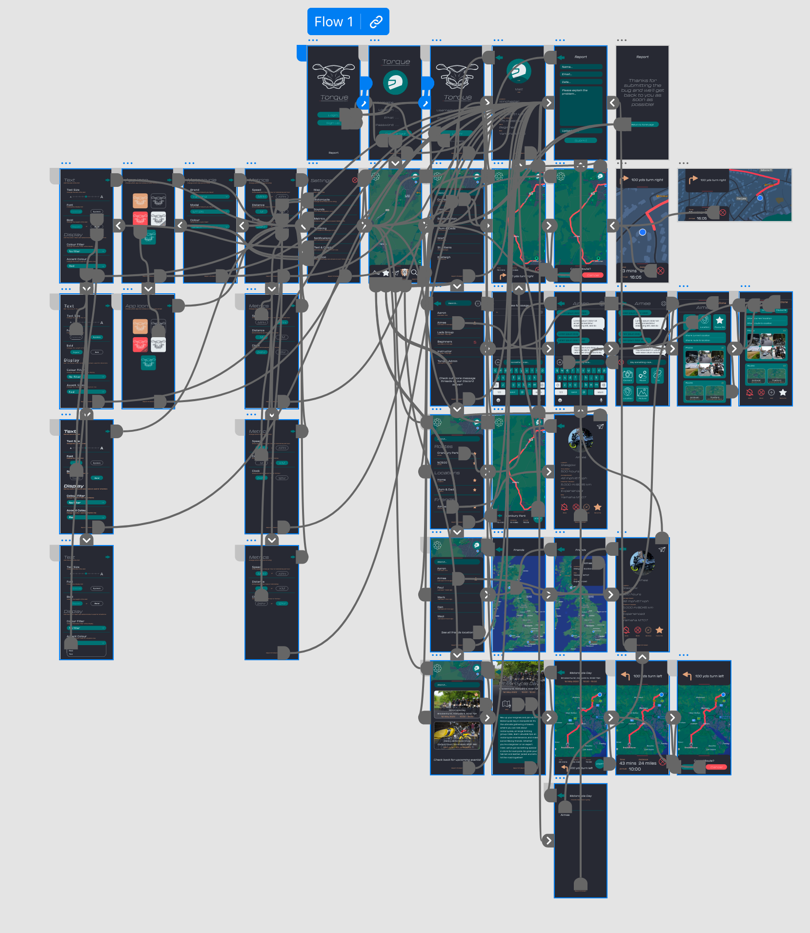
The final prototype shows the final design and brand message to the users. It is a fully working prototype made in Adobe Xd, there are a few pages left to design and route, however, due to the time line and time management of the project, they have not been completed.
Posters
Development
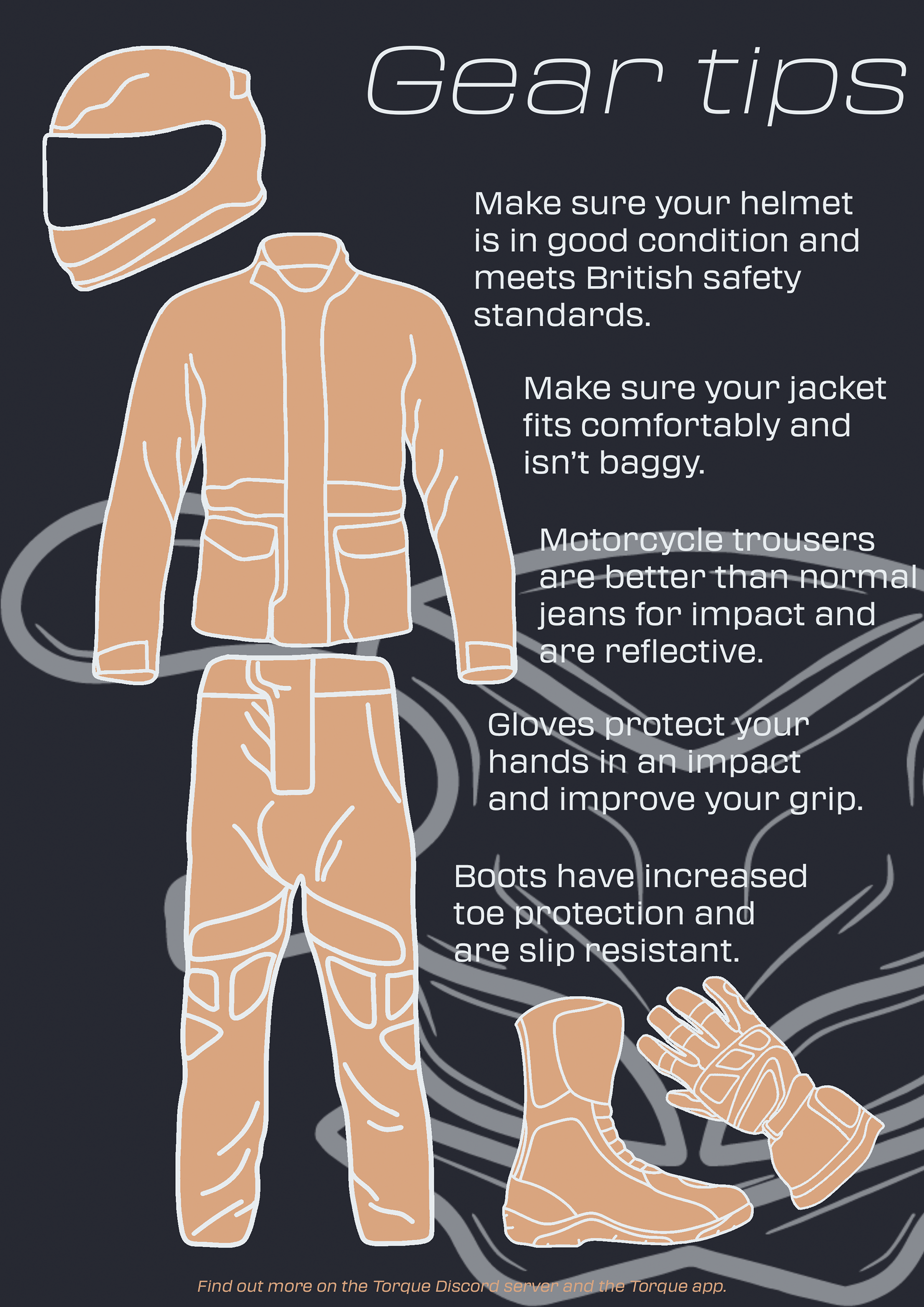
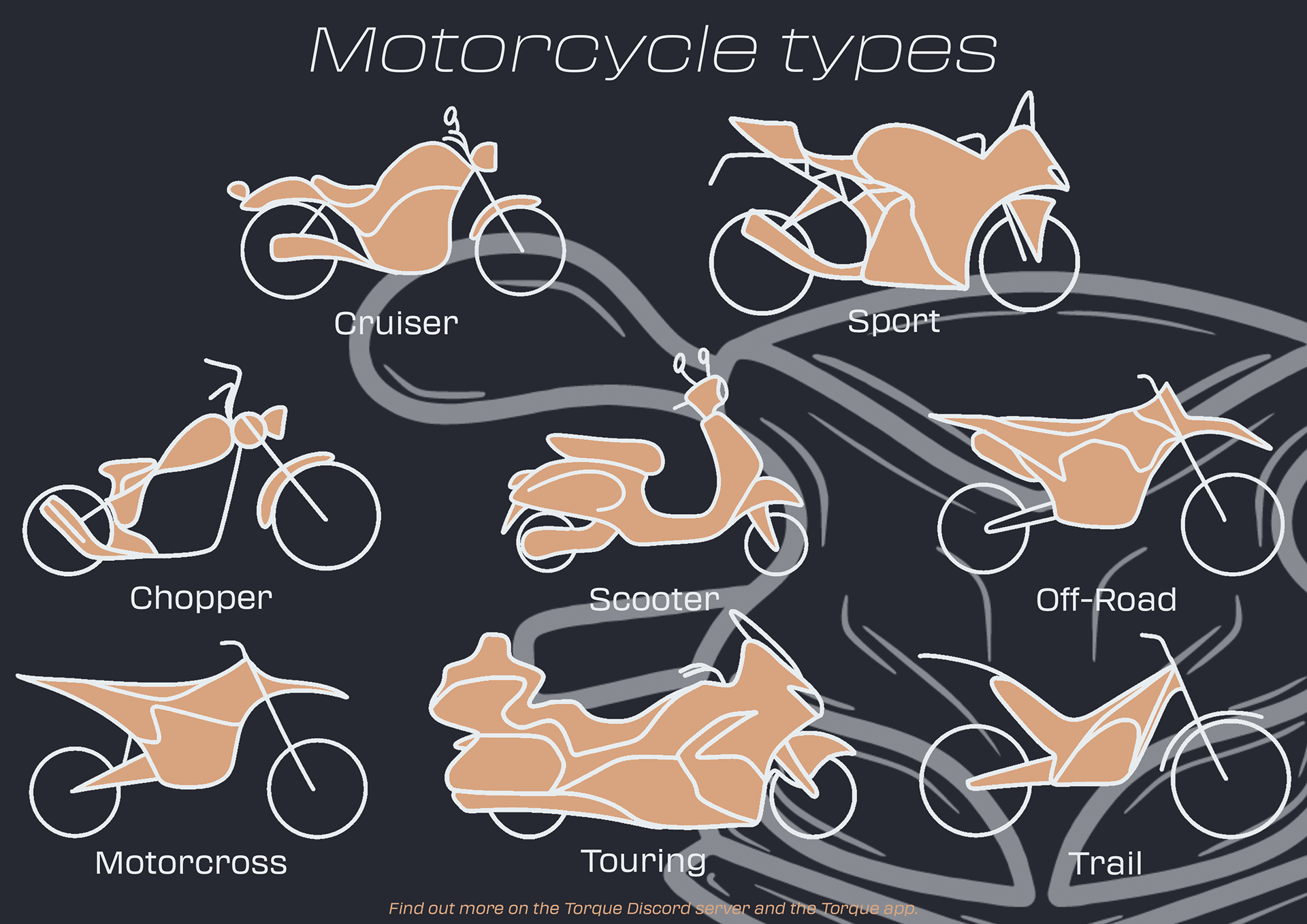
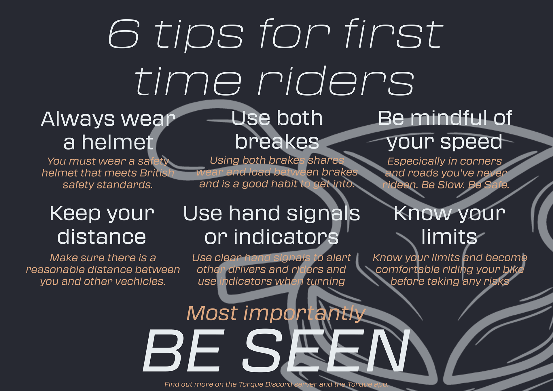
For the poster designs, I created ones that are useful not only to beginners but also to others who want to learn more about motorcycles or to be placed in training centres. I decided to focus on motorcycle styles, helmet styles, gestures when riding and what basic gear riders need for the UK roads to have safety when riding. I researched reference images to use and other posters that have already been created for similar reasons. I designed and drew most of the elements in Procreate on the iPad before exporting them to softwares such as Illustrator to create vectors and InDesign and Photoshop to create the final layout of the posters, making sure the design is consistent and accurate to the brands tone of voice.
Final posters
The image poster designs are very similar to the design of the app, creating a consistent brand image. They also include the link to the discord page and encourage the audience to download Torque to become apart of the community. The designs stand out well against the dark background using the beige colour and they also follow the brand guidelines.

Reflection
Overall, I believe the project went well and I would like to continue the project after university as I believe it could be useful to many people within the motorcycle community, or those wishing to join it.
The time management of the project worked well as the tasks were completed in a linear timeline and projects such as the wire framing and posters could be started as soon as the research was completed with enough time to gather feedback and make adjustments.
If I were to do this again, I would release the designs via a survey to gain more feedback other than classmates and friends. I would also expand on the prototype more, making it run smoother and add more settings that the user can adjust while testing out the prototype. I would also create a social media page on Instagram to promote the app to the target audience and share the survey. This would also spread the brand message more to the target audience and give a sense of how the app and community would function if the app were to be released on the app store, while also gaining members on the Discord server.
Reference list
All links used for research, background reading and images.
